Following the people and events that make up the research community at Duke

Students exploring the Innovation Co-Lab

Category: Visualization Page 2 of 10

Who Makes Duke? Visualizing 50 Years of Enrollment Data

Millions of data points. Ten weeks. Three Duke undergraduates. Two faculty facilitators. One project manager and one pretty cool data visualization website.

Meet 2020 Data+ team “On Being a Blue Devil: Visualizing the Makeup of Duke Students.”

Undergraduates Katherine Cottrell (’21), Michaela Kotarba (’22) and Alexander Burgin (’23) spent the last two and a half months looking at changes in Duke’s student body enrollment over the last 50 years. The cohort, working with project manager Anna Holleman, professor Don Taylor and university archivist Valerie Gillispie, used data from each of Duke’s colleges spanning back to 1970. Within the project, the students converted 30 years of on-paper data to machine-readable data which was a hefty task. “On Being a Blue Devil” presented their final product during a Zoom-style showcase Friday, July 31: An interactive data-visualization website. The site is live now but is still being edited as errors are found and clarifications are added.

The cover page of the launched interactive application.

The team highlighted a few findings. Over the last 20 years, there has been a massive surge in Duke enrollment of students from North Carolina. Looking more closely, it is possible that grad enrollment drives this spike due to the tendency for grad students to record North Carolina as their home-state following the first year of their program. Within the Pratt School of Engineering, the number of female students is on an upward trend. There is still a prevalent but closing gap in the distribution between male and female undergraduate engineering enrollment. A significant drop in grad school and international student enrollment in 2008 corresponds to the financial crisis of that year. The team believes there may be similar, interesting effects for 2020 enrollment due to COVID-19.

However, the majority of the presentation focused on the website and all of its handy features. The overall goal for the project was to create engaging visualizations that enable users to dive into and explore the historic data for themselves. Presentation attendees got a behind-the-scenes look at each of the site’s pages.

Breakdown of enrollment by region within different countries outside of the United States.

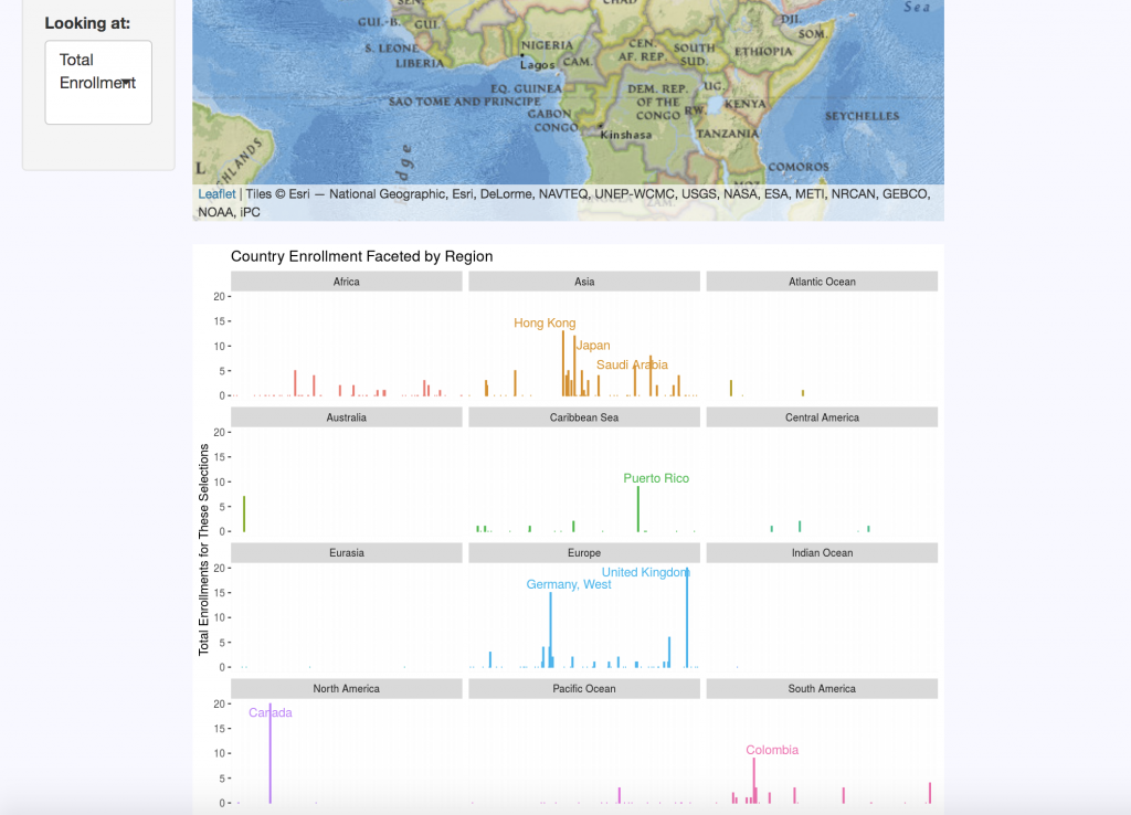
The “Domestic Map” allows website visitors to select the school, year, sex, semester, and state they wish to view. The “International Map” displays the same categories, with regional data replacing state distributions for international countries. Each query returns summary statistics on the number of students enrolled per state or region for the criteria selected.

A “Changes Over Time” tab clarifies data by keeping track of country and territory name changes, as well as changes in programs over the five decades of data. For example, Duke’s nursing program data is a bit complicated: One of its programs ended, then restarted a few years later, there are both undergraduate and graduate nursing schools, and over a decade’s worth of male nursing students are not accounted for in the data sets.

The “Enrollment by Sex” tab displays breakdown of enrollment using the Duke-established binary of male and female categories. This data is visualized in pie charts but can also be viewed as line graphs to look at trends over time and compare trends between schools.

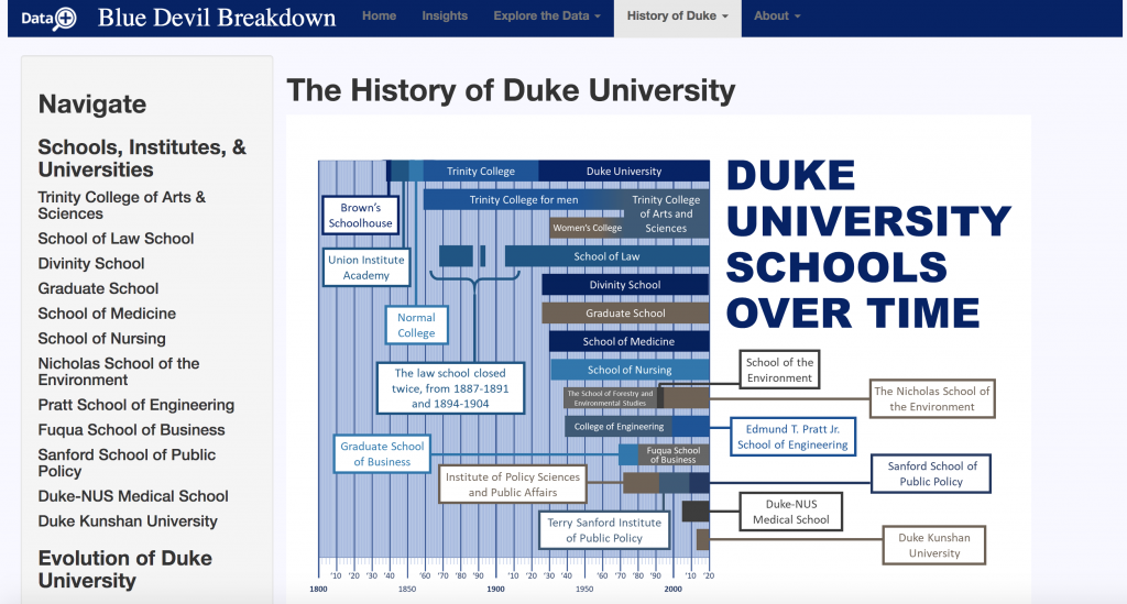
“History of Duke” offers an interactive timeline that contextualizes the origins of each of Duke’s schools and includes a short blurb on their histories. There are also timelines for the history of race and ethnicity at Duke, as well as Duke’s LGBTQ history. Currently, no data on gender identity instead of legal sex was made available for the team. This is why they sought to contextualize the data that they do have. If the project continues, Cottrell, Kotarba, and Burgin strongly suggest that gender identity data be made accessible and included on the site. Racial data is also a top priority for the group, but they simply did not have access to this resource for during the duration of their summer project.  

Timeline of Duke’s various schools since it was founded in the 1830’s.

Of course, like most good websites, there is an “About” section. Here users can meet the incredible team who put this all together, look over frequently asked questions, and even dive deeper into the data with the chance to look at original documents used in the research.

Each of the three undergrads of the “On Being a Blue Devil” team gained valuable transferable skills – as is a goal of Duke’s Data+ program. But the tool they created is likely to go far beyond their quarantined summer. Their website is a unique product that makes data fun to play with and will drive a push for more data to be collected and included. Future researchers could add many more metrics, years, and data points to the tool, causing it to grow exponentially.

Many Duke faculty members are already vying for a chance to talk with the team about their work.  

World Bank takes on big data for development

Apparently, data is the new oil.

Like oil, data might be considered a productive asset capable of generating innovation and profit. It also needs to be refined to be useful. And according to Haishan Fu, Director of the World Bank’s Development Data Group, data is, much like oil, a development issue. She was the keynote speaker for a Feb. 25 program at Duke, “Rethinking Development: Big Data for Development.”

Image
Haishan Fu, Director of the World Bank Development Data Group

While big data is… well, big, Fu explains that it has a more focused quality as well. “When you go deeper, you can see something really personal,” she says. Numbers don’t have to be quite so intimidating in their largesse and clutter: everything is integrated in some way. All of the numbers address the same questions: who, what, when, where?

That’s why the World Bank and countless other organizations and individuals across the globe have begun moving toward big data for the purpose of social and economic development studies. It helps tackle the whowhat-when-where of real and complex global issues with increased precision, greater efficiency, and a fresh perspective.

For example, the World Bank’s 2019 Tanzania Poverty Assessment integrated household survey results and geospatial data to estimate poverty within a small region of Tanzania. Despite lacking exact data for that area, using big data to make this estimation was still extremely powerful. In fact, its precision increase was equivalent to doubling the survey’s sample size.

A bit further northwest in Africa, the World Bank has also been using big data in Cote d’Ivoire to predict population density based on cellphone subscriber data.

In Cote d’Ivoire, making predictions from big data (figure on right) has actually allowed for more precision than predictions from census data (left).

In Yemen, integrated data from multiple sources is being used to determine road networks and physical accessibility of hospitals. The World Bank can estimate this kind of information without actually having any ground contact, improving both time- and money-efficiency. Studies have made it evident that less road access is linked to poverty, so they’re hoping to improve road networks as well as update population estimates and further other local developments.

And Brazil has served as a case study in “how social media can provide economic insight,” Fu explains. There, the World Bank has been using Twitter to detect early variations in labor market activities, searching for key words and hashtags in tweets and determining if users’ later employment statuses future have any sort of relationship to the content of their earlier tweets. Interestingly, the Twitter index and unemployment rates in Brazil display similar trends.

These examples are just a few of many big data initiatives the World Bank has been working toward. And though they have proven valuable for lower-income countries across the world, the lack of data in certain areas still poses a huge problem. The data deficit has been contributing to global inequalities, with higher-income countries being able to provide and have access to more data and thus also new improvement technologies. Ending poverty requires eradicating data deprivation, Fu says.

Image result for world bank twin goals
The World Bank’s twin goals: (1) end poverty, (2) promoted shared prosperity.
Image from the World Bank

Eradicating data deprivation is a collaborative effort between the public and private sectors, which is also an issue of its own. On the one hand, there’s a major under-investment in public sector data. On the other, today’s winner-take-most economics and the dominance of select superstar firms have led some private companies to avoid sharing data and favored only those companies able to produce the biggest of datasets.

Fu says working toward data partnerships is a learning process for everyone involved; it’s still a work in progress and probably will be for a while. The potential of big data is already there—it’s just waiting to be totally harnessed. “We will collectively have this platform to increase efficiency, promote responsible use, and come up with sustainable initiatives,” Fu says of the future.

In other words, the World Bank is just getting started.

by Irene Park

Squirmy Science

Unearthing A New Way Of Studying Biology

Yes, students, worms will be on the test. 

Eric Hastie, a post-doctoral researcher in the David Sherwood Lab, has designed a hands-on course for undergraduates at Duke University in which biology students get to genetically modify worms. Hastie calls the course a C.U.R.E. — a course-based undergraduate experience. The proposed course is designed as a hands-on, semester-long exploration of molecular biology and CRISPR genome editing.

An image taken of the adult gonad structure of a C. elegans worm in the Sherwood Lab,

In the course, the students will learn the science behind genome editing before getting to actually try it themselves. Ideally, at the course’s end, each student will have modified the genome of the C. elegans worm species in some way. Over the course of the semester, they will isolate a specific gene within one of these worms by tagging it with a colored marker. Then they will be able to trace the inserted marker in the offspring of the worm by observing it through a microscope, allowing for clear imaging and observation of the chosen characteristic.

When taught, the course will be the third in the nation of its kind, offering undergraduates an interactive and impactful research experience. Hastie designed the course with the intention of giving students transferrable skills, even if they choose careers or future coursework outside of research.

“For students who may not be considering a future in research, this proposed class provides an experience where they can explore, question, test, and learn without the pressures of joining a faculty research lab,” he told me.

Why worms? Perhaps not an age-old question, but one that piqued my interest all the same. According to Hastie, worms and undergraduate scientific research pair particularly well: worms are cost-effective, readily available, take up little space (the adults only grow to be 1mm long!), and boast effortless upkeep. Even among worms, the C. elegans species makes a particularly strong case for its use. They are clear, giving them a ‘leg up’ on some of their nematode colleagues—transparency allows for easy visibility of the inserted colored markers under a microscope. Additionally, because the markers inserted into the parent worm will only be visible in its offspring, C. elegans’ hermaphroditic reproductive cycle is also essential to the success of the class curricula.  

Undergraduate researcher David Chen studying one of his worm strains under a microscope.

“It’s hard to say what will eventually come of our current research into C. elegans, but that’s honestly what makes science exciting,” says undergraduate researcher David Chen, who works alongside Hastie.  “Maybe through our understanding of how certain proteins degrade over time in aging worms, we can better understand aging in humans and how we can live longer, healthier lives.”

The kind of research Hastie’s class proposes has the potential to impact research into the human genome. Human biology and that of the transparent, microscopic worms have more in common than you might think— the results derived from the use of worms such as C. elegans in pharmaceutical trials are often shown to be applicable to humans. Already, some students working with Hastie have received requests from other labs at other universities to test their flagged worms. So perhaps, with the help of Hastie’s class, these students can alter the course of science.

“I certainly contribute to science with my work in the lab,” said junior Ryan Sellers, a research contributor. “Whether it’s investigating a gene involved in a specific cancer pathway or helping shape Dr. Hastie’s future course, I am adding to the collective body of knowledge known as science.”

Post by Rebecca Williamson

Undergraduate Research in Duke’s Wired! Lab

Meet Jules Nasco, a sophomore studying Political Science and Philosophy, Politics, and Economics.

Jules is intrigued by the theories behind “how and why people form governments.” Yet, beyond her participation in various theatrical performances, commitment to several social and living-learning communities, and multiple campus jobs — from being a tour guide to editing Twitter and the Medium blog for DukeStudents — Jules also brandishes the role of undergraduate researcher in the Wired! Lab.

Duke’s Wired Lab is dedicated to digital art history and visual culture. The group – facilitated by Olga Grlic and Bill Broom and comprised of three current undergraduates – works in conjunction with the University of Catania in Italy and senior researchers around the world. Jules works specifically on the Medieval Kingdom of Sicily database, “a collection of historic images of the medieval monuments and cities in the Kingdom of Sicily, available as an open-source resource for travelers, researchers, academics, and anyone curious about the history of this part of the world!”

Since the spring semester of her first year at Duke, Jules has been searching high and low through public and private “collections, museums, archives, libraries, and publications in search of relevant paintings, drawing, etchings, photographs, or other images for the database.” She says that this can be as straightforward and easy as checking the permissions of a digital photo and downloading it or as complicated as contacting persons about image rights or scanning and editing photos from old books. Jules also collects metadata about the images she compiles such as artist or photographer, the date it was produced, the reason for production, or any relevant notes about the work. This data is then reviewed and added onto by senior researchers before being added to the public database.

The work can lead to “super-duper cool discoveries.” Earlier this year, Jules found an illustration of Salerno in a book that was drawn over 500 years ago, which led the team to a collection containing another illustration – likely by the same unknown author – likely drawn solely to depict the event of someone’s execution. However, the execution drawing is now the oldest depiction collected by the Wired! Lab of Castel Nuovo in Naples, which is one of the most prominent monuments studied by the lab.

The photo of Castel Nuovo in Naples that undergraduate researcher Jules found.

Though she admits that more career-focused endeavors may eventually take precedence over her work in the database, it’s her passion for art history that initially drew Jules into the research. Knowing that other pursuits would fill her time at Duke, she wanted to keep her interests alive in other ways. After participating in the Medieval and Renaissance Europe FOCUS program, Jules’ professor introduced her to Olga and Bill and the project. “The rest is art history!”

Jules’ favorite part of the work is the feeling that she is “meaningfully contributing to a community of interested travelers, researchers, and academics.”

Jules is able to provide people globally with information about a part of the world that she believes may otherwise be too hard to find. Her work facilitates and spreads knowledge in an interactive way, which she says makes the sometimes-tedious parts all worth it. In their data review at the end of each semester, Jules is able to see where in the world the database has been accessed and finds it awesome to know that people in Africa, Asia, and Australia use the information she has helped provide.

Post by Cydney Livingston

Visualizing Climate Change, Self, and Existential Crises

Nothing excites Heather Gordon like old Duke Forest archives do. (“Forestry porn,” she calls it.) Except maybe the question of whether a copy is inherently worse than its original. Or the fear of unperceived existence and dying into oblivion. Or a lot of things, actually.

Gordon, a visiting artist at Duke’s Rubenstein Arts Center, is blending data and art through origami folding patterns. She doesn’t usually fold her designs into three-dimensional figures (“I hate sculptures”), but the outcome is nevertheless just as—perhaps even more—exciting that way.

Heather Gordon, Durham artist
Heather Gordon, visiting artist at the Rubenstein Arts Center.
Photo by Michelle Lotker

Gordon happened to stumble upon the idea simply by proceeding through day-to-day life. Namely, she found herself growing increasingly frustrated by online security questions. “They’re always asking stupid things like ‘what’s your favorite pet’s name?’, and I can’t remember what I put 10 years ago,” she said. (And Gordon says she loves all her pets equally.)

Instead, she thought that data visualizations could make for a much more effective security protocol by making use of personal data that only the individual in question would know and remember. “A shape could define you,” she said.

Most recently at the Ruby, Gordon worked with the David M. Rubenstein Rare Book & Manuscript Library and the Duke University Archives to collect old photographs, spreadsheets, letters, and other documents that would contribute to her arts project. Gordon says she knew it was something she had to do when she found an archived letter addressed to Duke’s Dr. Clarence Korstian reading, “Thanks very much for the two shipments of twigs.” 

But what was most artistically compelling to Gordon was the light intensity data. Using the documented entries and calculations, she noticed that there were four quadrants in each plot, with 10 readings in each quadrant. Given this, Gordon used a compass to create a series of concentric arcs reminiscent of ripples in a pond. The final product put all four quadrants together to create a painting.

abstract painting
This pattern was derived from archival data on light intensity in the Duke Forest.
Photo by Robert Zimmerman

The second half of the Ruby project is directly linked to its title, UNLESS. Inspired by Dr. Seuss’ The Lorax, Gordon took the word “UNLESS,” converted each letter into its respective ASCII value, and mapped those numbers into a tree pattern. As in The Lorax, she hoped to tackle issues of resource management and climate change and the idea that unless something is done, climate collapse remains imminent.

For the final product, Gordon used tape to display the tree patterns in colored stripes onto the glass windows of the Ruby. The trees will remain on display into Spring 2020.

tape piece on the Ruby's windows
Gordon’s UNLESS on display at the Rubenstein Arts Center.
Photo by Robert Zimmerman

Yet Gordon’s portfolio neither begins nor ends with UNLESS.

For instance, she’s created an installation called ECHO, inspired by an old personal project of mapping a series of mostly failed “intimate communications” over the course of a year. “I realized I was just seeing what I wanted to see,” Gordon said, reflecting on the project. And thus ECHO was born as an examination of self-awareness, reflection, and authenticity.

The installation itself used strips of mirror tape in a pattern derived from dates of correspondence with Gordon’s close friends. With dancer Justin Tornow, she also put on a dance performance within the space. Unintentionally, ECHO also became a case study in the perception of copies versus originals; a hundred or so audience members chose to crowd around a tiny door to watch Tornow dance, even though the exact same performance was being broadcast live on TVs just a few feet away.

ECHO_Company_092
Tornow’s dance performance.
Photo courtesy of Heather Gordon

In another project, titled And Then The Sun Swallowed Me, Gordon revisits a childhood fear: “I was obsessed with the idea that the sun could go into supernova at any moment, and you wouldn’t know,” she explained. Even now, a similar panic persists. “I’m afraid of unperceived existence,” Gordon said. “No one will know about me 3,000 years later, and I stress about it.”

The folding pattern was made using the atomic radii of elements in suns that are capable of supernovas. Wrapped in black tape around the walls of a large room, the installation is explosive. In the center, a projection shows a swimmer swimming, though moving neither forward nor backward. It’s a Sisyphian swimmer, Gordon explains, forced to go through the motions but unable to find purpose.

And Then The Sun Swallowed Me, featuring a projected Sisyphian swimmer.
Photo courtesy of Heather Gordon

Gordon finds connections where most people can’t. There has long existed a gap between the sciences and the arts, but she seems to suggest that there need no longer be. And she also somehow manages to blend philosophy and existentialism quite gracefully with humor, youthfulness, and creativity. 

In essence, Gordon knows that there’s a lot in this world that’s worth freaking out over, but she handles it quite expertly.

By Irene Park

The Making of queerXscape

Sinan Goknur

On September 10th, queerXscape, a new exhibit in The Murthy Agora Studio at the Rubenstein Arts Center, opened. Sinan Goknur and Max Symuleski, PhD candidates in the Computational Media, Arts & Cultures Program, created the installation with digital prints of collages, cardboard structures, videos, and audio. Max explains that this multi-media approach transforms the studio from a room into a landscape which provides an immersive experience.

Max Symuleski

The two artists combined their experiences with changing urban environments when planning this exhibit. Sinan reflects on his time in Turkey where he saw constant construction and destruction, resulting in a quickly shifting landscape. While processing all of this displacement, he began taking pictures as “a way of coping with the world.” These pictures later become layers in the collages he designed with Max.

Meanwhile, Max used their time in New York City where they had to move from neighborhood to neighborhood as gentrification raised prices. Approaching this project, they wondered, “What does queer mean in this changing landscape? What does it mean to queer something? Where are our spaces? Where do we need them to survive?” They had previously worked on smaller collages made from magazines that inspired the pair of artists to try larger-scale works.  

Both Sinan and Max have watched the exploding growth in Durham while studying at Duke. From this perspective, they were able to tackle this project while living in a city that exemplifies the themes they explore in their work.

One of the cardboard structures

Using a video that Sinan had made as inspiration for the exhibit, they began assembling four large digital collages. To collaborate on the pieces, they would send the documents back and forth while making edits. When it became time to assemble their work, they had to print the collage in large strips and then careful glue them together. Through this process, they learned the importance of researching materials and experimented with the best way to smoothly place the strips together. While putting together mound-like cardboard structures of building, tire, and ice cube cut-outs, Max realized that, “we’re now doing construction.” Consulting with friends who do small construction and maintenance jobs for a living also helped them assemble and install the large-scale murals in the space. The installation process for them was yet another example of the tension between various drives for and scales of constructions taking place around them.

While collage and video may seem like an odd combination, they work together in this exhibit to surround the viewer and appeal to both the eyes and ears. Both artists share a background in queer performance and are driven to the rough aesthetics of photo collage and paper. The show brings together aspects of their experience in drag performance, collage, video, photography, and paper sculpture of a balanced collaboration. Their work demonstrates the value of partnership that crosses genres.

Poster for the exhibit

When concluding their discussion of changing spaces, Max mentioned that, “our sense of resilience is tied to the domains where we could be queer.” Finding an environment where you belong becomes even more difficult when your landscape resembles shifting sand. Max and Sinan give a glimpse into the many effects of gentrification, destruction, and growth within the urban context. 

The exhibit will be open until October 6. If you want to see the results of weeks of collaging, printing, cutting, and pasting together photography accumulated from near and far, stop by the Ruby.

Post by Lydia Goff

Kicking Off a Summer of Research With Data+

If the May 28 kickoff meeting was any indication, it’s going to be a busy summer for the more than 80 students participating in Duke’s summer research program, Data+.

Offered through the Rhodes Information Initiative at Duke  (iiD), Data+ is a 10-week summer program with a focus on data-driven research. Participants come from varied backgrounds in terms of majors and experience. Project themes range  from health, public policy, energy and environment, and interdisciplinary inquiry.

“It’s like a language immersion camp, but for data science,” said Ariel Dawn, Rhodes iiD Events & Communication Specialist. “The kids are going to have to learn some of those [programming] languages like Java or Python to have their projects completed,” Dawn said.

Dawn, who previously worked for the Office of the Vice Provost for Research, arrived during the program’s humble beginnings in 2015. Data+ began in 2014 as a small summer project in Duke’s math department funded by a grant from the National Science Foundation. The following year the program grew to 40 students, and it has grown every year since.

Today, the program also collaborates with the Code+ and CS+ summer programs, with  more than 100 students participating. Sponsors have grown to include major corporations such as Exxonmobil, which will fund two Data+ projects on oil research within the Gulf of Mexico and the United Kingdom in 2019.

“It’s different than an internship, because an internship you’re kind of told what to do,” said Kathy Peterson, Rhodes iiD Business Manager. “This is where the students have to work through different things and make discoveries along the way,” Peterson said.

From late May to July, undergraduates work on a research project under the supervision of a graduate student or faculty advisor. This year, Data+ chose more than 80 eager students out of a pool of over 350 applicants. There are 27 projects being featured in the program.

Over the summer, students are given a crash course in data science, how to conduct their study and present their work in front of peers. Data+ prioritizes collaboration as students are split into teams while working in a communal environment.

“Data is collected on you every day in so many different ways, sometimes we can do a lot of interesting things with that,” Dawn said.  “You can collect all this information that’s really granular and relates to you as an individual, but in a large group it shows trends and what the big picture is.”

Data+ students also delve into real world issues. Since 2013, Duke professor Jonathan Mattingly has led a student-run investigation on gerrymandering in political redistricting plans through Data+ and Bass Connections. Their analysis became part of a 205-page Supreme Court ruling.

The program has also made strides to connect with the Durham community. In collaboration with local company DataWorks NC, students will examine Durham’s eviction data to help identify policy changes that could help residents stay in their homes.

“It [Data+] gives students an edge when they go look for a job,” Dawn said. “We hear from so many students who’ve gotten jobs, and [at] some point during their interview employers said, ‘Please tell us about your Data+ experience.’”

From finding better sustainable energy to examining story adaptations within books and films, the projects cover many topics.

A project entitled “Invisible Adaptations: From Hamlet to the Avengers,” blends algorithms with storytelling. Led by UNC-Chapel Hill grad student Grant Class, students will make comparisons between Shakespeare’s work and today’s “Avengers” franchise.

“It’s a much different vibe,” said computer science major Katherine Cottrell. “I feel during the school year there’s a lot of pressure and now we’re focusing on productivity which feels really good.”

Cottrell and her group are examining the responses to lakes affected by multiple stressors.

Data+ concludes with a final poster session on Friday, August 2, from 2 p.m. to 4 p.m. in the Gross Hall Energy Hub. Everyone in the Duke Community and beyond is invited to attend. Students will present their findings along with sister programs Code+ and the summer Computer Science Program.

Writing by Deja Finch (left)
Art by Maya O’Neal (right)

What Happens When Data Scientists Crunch Through Three Centuries of Robinson Crusoe?

Reading 1,400-plus editions of “Robinson Crusoe” in one summer is impossible. So one team of students tried to train computers to do it for them.

Reading 1,400-plus editions of “Robinson Crusoe” in one summer is impossible. So one team of students tried to train computers to do it for them.

Since Daniel Defoe’s shipwreck tale “Robinson Crusoe” was first published nearly 300 years ago, thousands of editions and spinoff versions have been published, in hundreds of languages.

A research team led by Grant Glass, a Ph.D. student in English and comparative literature at the University of North Carolina at Chapel Hill, wanted to know how the story changed as it went through various editions, imitations and translations, and to see which parts stood the test of time.

Reading through them all at a pace of one a day would take years. Instead, the researchers are training computers to do it for them.

This summer, Glass’ team in the Data+ summer research program used computer algorithms and machine learning techniques to sift through 1,482 full-text versions of Robinson Crusoe, compiled from online archives.

“A lot of times we think of a book as set in stone,” Glass said. “But a project like this shows you it’s messy. There’s a lot of variance to it.”

“When you pick up a book it’s important to know what copy it is, because that can affect the way you think about the story,” Glass said.

Just getting the texts into a form that a computer could process proved half the battle, said undergraduate team member Orgil Batzaya, a Duke double major in math and computer science.

The books were already scanned and posted online, so the students used software to download the scans from the internet, via a process called “scraping.” But processing the scanned pages of old printed books, some of which had smudges, specks or worn type, and converting them to a machine-readable format proved trickier than they thought.

The software struggled to decode the strange spellings (“deliver’d,” “wish’d,” “perswasions,” “shore” versus “shoar”), different typefaces between editions, and other quirks.

Special characters unique to 18th century fonts, such as the curious f-shaped version of the letter “s,” make even humans read “diftance” and “poffible” with a mental lisp.

Their first attempts came up with gobbledygook. “The resulting optical character recognition was completely unusable,” said team member and Duke senior Gabriel Guedes.

At a Data+ poster session in August, Guedes, Batzaya and history and computer science double major Lucian Li presented their initial results: a collection of colorful scatter plots, maps, flowcharts and line graphs.

Guedes pointed to clusters of dots on a network graph. “Here, the red editions are American, the blue editions are from the U.K.,” Guedes said. “The network graph recognizes the similarity between all these editions and clumps them together.”

Once they turned the scanned pages into machine-readable texts, the team fed them into a machine learning algorithm that measures the similarity between documents.

The algorithm takes in chunks of texts — sentences, paragraphs, even entire novels — and converts them to high-dimensional vectors.

Creating this numeric representation of each book, Guedes said, made it possible to perform mathematical operations on them. They added up the vectors for each book to find their sum, calculated the mean, and looked to see which edition was closest to the “average” edition. It turned out to be a version of Robinson Crusoe published in Glasgow in 1875.

They also analyzed the importance of specific plot points in determining a given edition’s closeness to the “average” edition: what about the moment when Crusoe spots a footprint in the sand and realizes that he’s not alone? Or the time when Crusoe and Friday, after leaving the island, battle hungry wolves in the Pyrenees?

The team’s results might be jarring to those unaccustomed to seeing 300 years of publishing reduced to a bar chart. But by using computers to compare thousands of books at a time, “digital humanities” scholars say it’s possible to trace large-scale patterns and trends that humans poring over individual books can’t.

“This is really something only a computer can do,” Guedes said, pointing to a time-lapse map showing how the Crusoe story spread across the globe, built from data on the place and date of publication for 15,000 editions.

“It’s a form of ‘distant reading’,” Guedes said. “You use this massive amount of information to help draw conclusions about publication history, the movement of ideas, and knowledge in general across time.”

This project was organized in collaboration with Charlotte Sussman (English) and Astrid Giugni (English, ISS). Check out the team’s results at https://orgilbatzaya.github.io/pirating-texts-site/

Data+ is sponsored by Bass Connections, the Information Initiative at Duke, the Social Science Research Institute, the departments of Mathematics and Statistical Science and MEDx. This project team was also supported by the Duke Office of Information Technology.

Other Duke sponsors include DTECH, Duke Health, Sanford School of Public Policy, Nicholas School of the Environment, Development and Alumni Affairs, Energy Initiative, Franklin Humanities Institute, Duke Forge, Duke Clinical Research, Office for Information Technology and the Office of the Provost, as well as the departments of Electrical & Computer Engineering, Computer Science, Biomedical Engineering, Biostatistics & Bioinformatics and Biology.

Government funding comes from the National Science Foundation.

Outside funding comes from Lenovo, Power for All and SAS.

Community partnerships, data and interesting problems come from the Durham Police and Sheriff’s Department, Glenn Elementary PTA, and the City of Durham.

Videos by Paschalia Nsato and Julian Santos; writing by Robin Smith

Researcher Turns Wood Into Larger-Than-Life Insects

Duke biologist Alejandro Berrio creates larger-than-life insect sculptures. This wooden mantis was exhibited at the Art Science Gallery in Austin, Texas in 2013.

Duke biologist Alejandro Berrio creates larger-than-life insect sculptures. This wooden mantis was exhibited at the Art Science Gallery in Austin, Texas in 2013.

On a recent spring morning, biologist Alejandro Berrio took a break from running genetic analyses on a supercomputer to talk about an unusual passion: creating larger-than-life insect sculptures.

Berrio is a postdoctoral associate in professor Greg Wray’s lab at Duke. He’s also a woodcarver, having exhibited his shoebox-sized models of praying mantises, wasps, crickets and other creatures in museums and galleries in his hometown and in Austin, Texas, where his earned his Ph.D.

The Colombia-born scientist started carving wood in his early teens, when he got interested in model airplanes. He built them out of pieces of lightweight balsa wood that he bought in craft shops.

When he got to college at the University of Antioquia in Medellín, Colombia’s second-largest city, he joined an entomology lab. “One of my first introductions to science was watching insects in the lab and drawing them,” Berrio said. “One day I had an ‘aha’ moment and thought: I can make this. I can make an insect with wings the same way I used to make airplanes.”

Beetle carved by Duke biologist Alejandro Berrio.

His first carvings were of mosquitoes — the main insect in his lab — hand carved from soft balsa wood with an X-Acto knife.

Using photographs for reference, he would sketch the insects from different positions before he started carving.

He worked at his kitchen table, shaping the body from balsa wood or basswood. “I might start with a power saw to make the general form, and then with sandpaper until I started getting the shape I wanted,” Berrio said.

He used metal to join and position the segments in the legs and antennae, then set the joints in place with glue.

“People loved them,” Berrio said. “Scientists were like: Oh, I want a fly. I want a beetle. My professors were giving them to their friends. So I started making them for people and selling them.”

Soon Berrio was carving wooden fungi, dragons, turtles, a snail. “Whatever people wanted me to make,” Berrio said.

He earned just enough money to pay for his lunch, or the bus ride to school.

Duke biologist Alejandro Berrio carved this butterfly using balsa wood for the body and legs, and paper for the wings.

His pieces can take anywhere from a week to two months to complete. “This butterfly was the most time-consuming,” he said, pointing to a model with translucent veined wings.

Since moving to Durham in 2016, he has devoted less time to his hobby than he once did. “Last year I made a crab for a friend who studies crustaceans,” Berrio said. “She got married and that was my wedding gift.”

Still no apes, or finches, or prairie voles — all subjects of his current research. “But I’m planning to restart,” Berrio said. “Every time I go home to Colombia I bring back some wood, or my favorite glue, or one of my carving tools.”

Insect sculptures by Duke biologist Alejandro Berrio.

Insect sculptures by Duke biologist Alejandro Berrio.

Explore more of Berrio’s sculpture and photography at https://www.flickr.com/photos/alejoberrio/.

by Robin Smith

by Robin Smith

“I Heart Tech Fair” Showcases Cutting-Edge VR and More

Duke’s tech game is stronger than you might think.

OIT held an “I Love Tech Fair” in the Technology Engagement Center / Co-Lab on Feb. 6 that was open to anyone to come check out things like 3D printers and augmented reality, while munching on some Chick-fil-a and cookies. There was a raffle for some sweet prizes, too.

I got a full demonstration of the 3D printing process—it’s so easy! It requires some really expensive software called Fusion, but thankfully Duke is awesome and students can get it for free. You can make some killer stuff 3D printing, the technology is so advanced now. I’ve seen all kinds of things: models of my friend’s head, a doorstop made out of someone’s name … one guy even made a working ukulele apparently!

One of the cooler things at the fair was Augmented Reality books. These books look like ordinary picture books, but looking at a page through your phone’s camera, the image suddenly comes to life in 3D with tons of detail and color, seemingly floating above the book! All you have to do is download an app and get the right book. Augmented reality is only getting better as time goes on and will soon be a primary tool in education and gaming, which is why Duke Digital Initiative (DDI) wanted to show it off.

By far my favorite exhibit at the tech fair was  virtual reality. Throw on a headset and some bulky goggles, grab a controller in each hand, and suddenly you’re in another world. The guy running the station, Mark McGill, had actually hand-built the machine that ran it all. Very impressive guy. He told me the machine is the most expensive and important part, since it accounts for how smooth the immersion is. The smoother the immersion, the more realistic the experience. And boy, was it smooth. A couple years ago I experienced virtual reality at my high school and thought it was cool (I did get a little nauseous), but after Mark set me up with the “HTC Vive” connected to his sophisticated machine, it blew me away (with no nausea, too).

I smiled the whole time playing “Super Hot,” where I killed incoming waves of people in slow motion with ninja stars, guns, and rocks. Mark had tons of other games too, all downloaded from Steam, for both entertainment and educational purposes. One called “Organon” lets you examine human anatomy inside and out, and you can even upload your own MRIs. There’s an unbelievable amount of possibilities VR offers. You could conquer your fear of public speaking by being simulated in front of a crowd, or realistically tour “the VR Museum of Fine Art.” Games like these just aren’t the same were you to play them on, say, an Xbox, because it simply doesn’t have that key factor of feeling like you’re there. In Fallout 4, your heart pounds fast in your chest as you blast away Feral Ghouls and Super Mutants right in front of you. But in reality, you’re just standing in a green room with stupid looking goggles on. Awesome!

There’s another place on campus — the Bolt VR in Edens residence hall — that also has a cutting-edge VR setup going. Mark explained to me that Duke wants people to get experience with VR, as it will soon be a huge part of our lives. Having exposure now could give Duke graduates a very valuable head start in their career (while also making Duke look good). Plus, it’s nice to have on campus for offering students a fun break from all the hard work we put in.

If you’re bummed you missed out, or even if you don’t “love tech,” I recommend checking out the Tech Fair next time — February 13, from 6-8pm. See you there.

Post By Will Sheehan

Will Sheehan

Page 2 of 10

Powered by WordPress & Theme by Anders Norén