Millions of data points. Ten weeks. Three Duke undergraduates. Two faculty facilitators. One project manager and one pretty cool data visualization website.
Meet 2020 Data+ team “On Being a Blue Devil: Visualizing the Makeup of Duke Students.”
Undergraduates Katherine Cottrell (’21), Michaela Kotarba (’22) and Alexander Burgin (’23) spent the last two and a half months looking at changes in Duke’s student body enrollment over the last 50 years. The cohort, working with project manager Anna Holleman, professor Don Taylor and university archivist Valerie Gillispie, used data from each of Duke’s colleges spanning back to 1970. Within the project, the students converted 30 years of on-paper data to machine-readable data which was a hefty task. “On Being a Blue Devil” presented their final product during a Zoom-style showcase Friday, July 31: An interactive data-visualization website. The site is live now but is still being edited as errors are found and clarifications are added.

The team highlighted a few findings. Over the last 20 years, there has been a massive surge in Duke enrollment of students from North Carolina. Looking more closely, it is possible that grad enrollment drives this spike due to the tendency for grad students to record North Carolina as their home-state following the first year of their program. Within the Pratt School of Engineering, the number of female students is on an upward trend. There is still a prevalent but closing gap in the distribution between male and female undergraduate engineering enrollment. A significant drop in grad school and international student enrollment in 2008 corresponds to the financial crisis of that year. The team believes there may be similar, interesting effects for 2020 enrollment due to COVID-19.
However, the majority of the presentation focused on the website and all of its handy features. The overall goal for the project was to create engaging visualizations that enable users to dive into and explore the historic data for themselves. Presentation attendees got a behind-the-scenes look at each of the site’s pages.

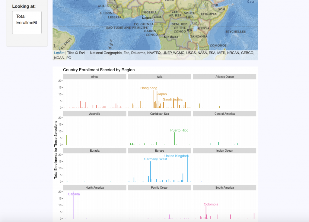
The “Domestic Map” allows website visitors to select the school, year, sex, semester, and state they wish to view. The “International Map” displays the same categories, with regional data replacing state distributions for international countries. Each query returns summary statistics on the number of students enrolled per state or region for the criteria selected.
A “Changes Over Time” tab clarifies data by keeping track of country and territory name changes, as well as changes in programs over the five decades of data. For example, Duke’s nursing program data is a bit complicated: One of its programs ended, then restarted a few years later, there are both undergraduate and graduate nursing schools, and over a decade’s worth of male nursing students are not accounted for in the data sets.
The “Enrollment by Sex” tab displays breakdown of enrollment using the Duke-established binary of male and female categories. This data is visualized in pie charts but can also be viewed as line graphs to look at trends over time and compare trends between schools.
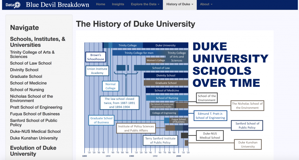
“History of Duke” offers an interactive timeline that contextualizes the origins of each of Duke’s schools and includes a short blurb on their histories. There are also timelines for the history of race and ethnicity at Duke, as well as Duke’s LGBTQ history. Currently, no data on gender identity instead of legal sex was made available for the team. This is why they sought to contextualize the data that they do have. If the project continues, Cottrell, Kotarba, and Burgin strongly suggest that gender identity data be made accessible and included on the site. Racial data is also a top priority for the group, but they simply did not have access to this resource for during the duration of their summer project.

Of course, like most good websites, there is an “About” section. Here users can meet the incredible team who put this all together, look over frequently asked questions, and even dive deeper into the data with the chance to look at original documents used in the research.
Each of the three undergrads of the “On Being a Blue Devil” team gained valuable transferable skills – as is a goal of Duke’s Data+ program. But the tool they created is likely to go far beyond their quarantined summer. Their website is a unique product that makes data fun to play with and will drive a push for more data to be collected and included. Future researchers could add many more metrics, years, and data points to the tool, causing it to grow exponentially.
Many Duke faculty members are already vying for a chance to talk with the team about their work.


