
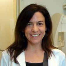
Professor Tracey Holloway researches air quality at the University of Wisconsin-Madison.
Satellite data are contributing more and more to understanding air quality trends, and professor Tracey Holloway wants the world to know.
As a professor of the Department of Atmospheric and Oceanic Science at University of Wisconsin-Madison and the current Team Lead of the NASA Health and Air Quality Applied Sciences Team (HAQAST), she not only helps with the science related to satellites, but also the communication of findings to larger audiences.
Historically, ground-based monitors have provided estimates on changes in concentrations of air pollutants, Holloway explained in her March 2, 2018 seminar, “Connecting Science with Stakeholders,” organized by Duke’s Earth and Ocean Sciences department.
Despite the valuable information ground-based monitors provide, however, factors like high costs limit their widespread use. For example, only about 400 ground-based monitors for nitrogen dioxide currently exist, with many states in the U.S. entirely lacking even a single one. Almost no information on nitrogen dioxide levels had therefore existed before satellites came into the picture.
To close the gap, HAQAST employed earth-observing and polar-orbiting satellites — with fruitful results. Not only have they provided enough data to make more comprehensive maps showing nitrogen dioxide distributions and concentrations, but they also have detected formaldehyde, one of the top causes of cancer, in our atmosphere for the first time.
Satellites have additional long-term benefits. They can help determine potential monitoring sites before actually having to invest large amounts of resources. In the case of formaldehyde, satellite-generated information located areas of higher concentrations — or formaldehyde “hotspots” — in which HAQAST can now prioritize placing a ground-based monitor. Once established, the site can evaluate air dispersion models, provide air quality information to the public and add to scientific research.
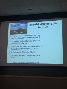
A slide from Holloway’s presentation, in the LSRC A building on March 2, explaining the purposes of a monitoring site.
Holloway underscored the importance of effectively communicating science. She explained that many policymakers don’t have the strong science backgrounds and therefore need quick and friendly explanations of research from scientists.
Perhaps more significant, though, is the fact that some people don’t even realize that information exists. Specifically, people don’t realize that more satellites are producing new information every day; Holloway has made it a personal goal to have more one-on-one conversations with stakeholders to increase transparency.
Breakthroughs in science aren’t made by individuals: science and change are collaborative. And for Holloway, stakeholders also include the general public. She founded the Earth Science Women’s Network, with one of her goals being to change the vision of what a “scientist” looks like. Through photo campaigns and other communication and engagement activities, she interacted with adults and children to make science more appealing. By making science more sexy, it would be easier to inspire new and continue old discussions, create a more diverse research environment, and make the field more open for all.

Professor Tracey Holloway, air quality researcher at University of Wisconsin-Madison, presented her research at Duke on March 2, 2018.

Post by Stella Wang, class of 2019

 Wharton finally transitioned to discussing one of her favorite models of all time, a model of the Istanbul

 Simple, right? Multiply that by 500,000 users worldwide, though, and it’s easy to see why researchers like Loarie are excited by the possibilities an app like this can offer. The software first went live in 2008, and since then its user base has roughly doubled each year. This has meant the generation of over 8 million data points of 150,000 different species, including one-third of all known vertebrate species and 40% of all known species of mammal. Every day, the app catalogues around 15 new species.
 It’s this kind of interconnectivity that demonstrates not just the potential of apps like iNaturalist, but also the power of collaboration and the possibilities symposia like Duke Blueprint offer. Bridging gaps, tearing down boundaries, building up bonds—these are the heart of conservationism’s future. Nature and Progress, working together, pulling us forward into a brighter world.
 Post by Daniel Egitto

 researcher and professor of Computer Science at Duke. One of his latest projects is


 research between
 With incredible increases in life expectancy, from
  Post by Lydia Goff
 (
(


 Post by Daniel Egitto