Following the people and events that make up the research community at Duke

Students exploring the Innovation Co-Lab

Category: Data Page 8 of 11

Durham Traffic Data Reveal Clues to Safer Streets

Ghost bikes are a haunting site. The white-painted bicycles, often decorated with flowers or photographs, mark the locations where cyclists have been hit and killed on the street.

A white-painted bike next to a street.

A Ghost Bike located in Chapel Hill, NC.

Four of these memorials currently line the streets of Durham, and the statistics on non-fatal crashes in the community are equally sobering. According to data gathered by the North Carolina Department of Transportation, Durham county averaged 23 bicycle and 116 pedestrian crashes per year between 2011 and 2015.

But a team of Duke researchers say these grim crash data may also reveal clues for how to make Durham’s streets safer for bikers, walkers, and drivers.

This summer, a team of Duke students partnered with Durham’s Department of Transportation to analyze and map pedestrian, bicycle and motor vehicle crash data as part of the 10-week Data+ summer research program.

In the Ghost Bikes project, the team created an interactive website that allows users to explore how different factors such as the time-of-day, weather conditions, and sociodemographics affect crash risk. Insights from the data also allowed the team to develop policy recommendations for improving the safety of Durham’s streets.

“Ideally this could help make things safer, help people stay out of hospitals and save lives,” said Lauren Fox, a Duke cultural anthropology major who graduated this spring, and a member of the DATA+ Ghost Bikes team.

A map of Durham county with dots showing the locations of bicycle crashes

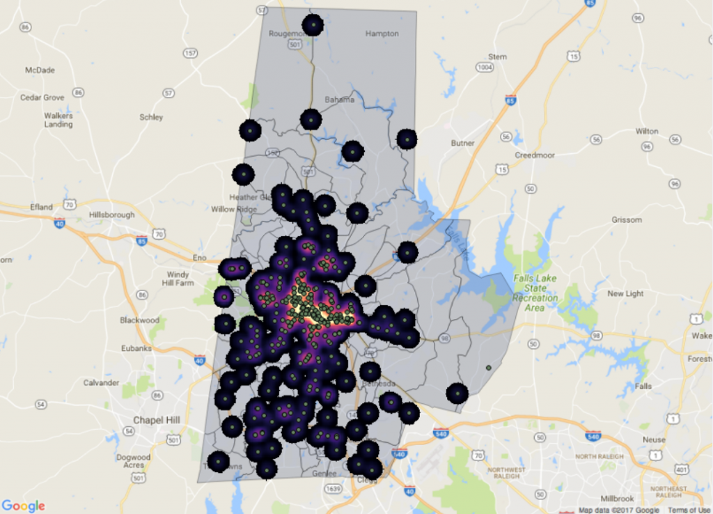
A heat map from the team’s interactive website shows areas with the highest density of bicycle crashes, overlaid with the locations of individual bicycle crashes.

The final analysis showed some surprising trends.

“For pedestrians the most common crash isn’t actually happening at intersections, it is happening at what is called mid-block crossings, which happen when someone is crossing in the middle of the road,” Fox said.

To mitigate the risks, the team’s Executive Summary includes recommendations to install crosswalks, median islands and bike lanes to roads with a high density of crashes.

They also found that males, who make up about two-thirds of bicycle commuters over the age of 16, are involved in 75% of bicycle crashes.

“We found that male cyclists over age 16 actually are hit at a statistically higher rate,” said Elizabeth Ratliff, a junior majoring in statistical science. “But we don’t know why. We don’t know if this is because males are riskier bikers, if it is because they are physically bigger objects to hit, or if it just happens to be a statistical coincidence of a very unlikely nature.”

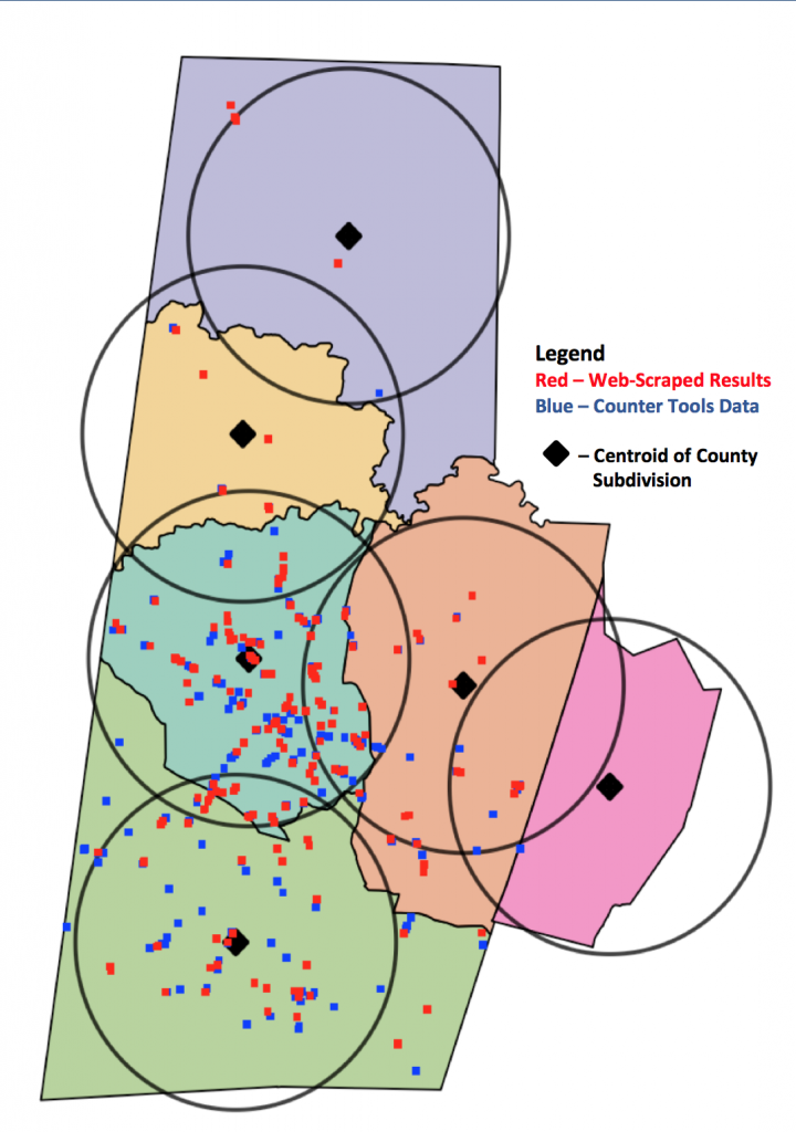
To build their website, the team integrated more than 20 sets of crash data from a wide variety of different sources, including city, county, regional and state reports, and in an array of formats, from maps to Excel spreadsheets.

“They had to fit together many different data sources that don’t necessarily speak to each other,” said faculty advisor Harris Solomon, an associate professor of cultural anthropology and global health at Duke.  The Ghost Bikes project arose out of Solomon’s research on traffic accidents in India, supported by the National Science Foundation Cultural Anthropology Program.

In Solomon’s Spring 2017 anthropology and global health seminar, students explored the role of the ghost bikes as memorials in the Durham community. The Data+ team approached the same issues from a more quantitative angle, Solomon said.

“The bikes are a very concrete reminder that the data are about lives and deaths,” Solomon said. “By visiting the bikes, the team was able to think about the very human aspects of data work.”

“I was surprised to see how many stakeholders there are in biking,” Fox said. For example, she added, the simple act of adding a bike lane requires balancing the needs of bicyclists, nearby residents concerned with home values or parking spots, and buses or ambulances who require access to the road.

“I hadn’t seen policy work that closely in my classes, so it was interesting to see that there aren’t really simple solutions,” Fox said.

[youtube https://www.youtube.com/watch?v=YHIRqhdb7YQ&w=629&h=354]


Data+ is sponsored by Bass Connections, the Information Initiative at Duke, the Social Science Research Institute, the departments of Mathematics and Statistical Science and MEDx.

Other Duke sponsors include DTECH, Duke Health, Sanford School of Public Policy, Nicholas School of the Environment, Development and Alumni Affairs, Energy Initiative, Franklin Humanities Institute, Duke Institute for Brain Sciences, Office for Information Technology and the Office of the Provost, as well as the departments of Electrical & Computer Engineering, Computer Science, Biomedical Engineering, Biostatistics & Bioinformatics and Biology.

Government funding comes from the National Science Foundation. Outside funding comes from Accenture, Academic Analytics, Counter Tools and an anonymous donation.

Community partnerships, data and interesting problems come from the Durham Police Department, Durham Neighborhood Compass, Cary Institute of Ecosystem Studies, Duke Marine Lab, Center for Child and Family Policy, Northeast Ohio Medical University, TD Bank, Epsilon, Duke School of Nursing, University of Southern California, Durham Bicycle and Pedestrian Advisory Commission, Duke Surgery, MyHealth Teams, North Carolina Museum of Art and Scholars@Duke.

Writing by Kara Manke; video by Lauren Mueller and Summer Dunsmore

Pinpointing Where Durham’s Nicotine Addicts Get Their Fix

DURHAM, N.C. — It’s been five years since Durham expanded its smoking ban beyond bars and restaurants to include public parks, bus stops, even sidewalks.

While smoking in the state overall may be down, 19 percent of North Carolinians still light up, particularly the poor and those without a high school or college diploma.

Among North Carolina teens, consumption of electronic cigarettes in particular more than doubled between 2013 and 2015.

Now, new maps created by students in the Data+ summer research program show where nicotine addicts can get their fix.

Studies suggest that tobacco retailers are disproportionately located in low-income neighborhoods.

Living in a neighborhood with easy access to stores that sell tobacco makes it easier to start young and harder to quit.

The end result is that smoking, secondhand smoke exposure, and smoking-related diseases such as lung cancer, are concentrated among the most socially disadvantaged communities.

If you’re poor and lack a high school or college diploma, you’re more likely to live near a store that sells tobacco.

If you’re poor and lack a high school or college diploma, you’re more likely to live near a store that sells tobacco. Photo from Pixabay.

Where stores that sell tobacco are located matters for health, but for many states such data are hard to come by, said Duke statistics major James Wang.

Tobacco products bring in more than a third of in-store sales revenue at U.S. convenience stores — more than food, beverages, candy, snacks or beer. Despite big profits, more than a dozen states don’t require businesses to get a special license or permit to sell tobacco. North Carolina is one of them.

For these states, there is no convenient spreadsheet from the local licensing agency identifying all the businesses that sell tobacco, said Duke undergraduate Nikhil Pulimood. Previous attempts to collect such data in Virginia involved searching for tobacco retail stores by car.

“They had people physically drive across every single road in the state to collect the data. It took three years,” said team member and Duke undergraduate Felicia Chen.

Led by UNC PhD student in epidemiology Mike Dolan Fliss, the Duke team tried to come up with an easier way.

Instead of collecting data on the ground, they wrote an automated web-crawler program to extract the data from the Yellow Pages websites, using a technique called Web scraping.

By telling the software the type of business and location, they were able to create a database that included the names, addresses, phone numbers and other information for 266 potential tobacco retailers in Durham County and more than 15,500 statewide, including chains such as Family Fare, Circle K and others.

Map showing the locations of tobacco retail stores in Durham County, North Carolina.

Map showing the locations of tobacco retail stores in Durham County, North Carolina.

When they compared their web-scraped data with a pre-existing dataset for Durham County, compiled by a nonprofit called Counter Tools, hundreds of previously hidden retailers emerged on the map.

To determine which stores actually sold tobacco, they fed a computer algorithm data from more than 19,000 businesses outside North Carolina so it could learn how to distinguish say, convenience stores from grocery stores. When the algorithm received store names from North Carolina, it predicted tobacco retailers correctly 85 percent of the time.

“For example we could predict that if a store has the word “7-Eleven” in it, it probably sells tobacco,” Chen said.

As a final step, they also crosschecked their results by paying people a small fee to search for the stores online to verify that they exist, and call them to ask if they actually sell tobacco, using a crowdsourcing service called Amazon Mechanical Turk.

Ultimately, the team hopes their methods will help map the more than 336,000 tobacco retailers nationwide.

“With a complete dataset for tobacco retailers around the nation, public health experts will be able to see where tobacco retailers are located relative to parks and schools, and how store density changes from one neighborhood to another,” Wang said.

The team presented their work at the Data+ Final Symposium on July 28 in Gross Hall.

Data+ is sponsored by Bass Connections, the Information Initiative at Duke, the Social Science Research Institute, the departments of mathematics and statistical science and MEDx. This project team was also supported by Counter Tools, a non-profit based in Carrboro, NC.

Writing by Robin Smith; video by Lauren Mueller and Summer Dunsmore

Sizing Up Hollywood's Gender Gap

DURHAM, N.C. — A mere seven-plus decades after she first appeared in comic books in the early 1940s, Wonder Woman finally has her own movie.

In the two months since it premiered, the film has brought in more than $785 million worldwide, making it the highest grossing movie of the summer.

But if Hollywood has seen a number of recent hits with strong female leads, from “Wonder Woman” and “Atomic Blonde” to “Hidden Figures,” it doesn’t signal a change in how women are depicted on screen — at least not yet.

Those are the conclusions of three students who spent ten weeks this summer compiling and analyzing data on women’s roles in American film, through the Data+ summer research program.

The team relied on a measure called the Bechdel test, first depicted by the cartoonist Alison Bechdel in 1985.

Bechdel test

The “Bechdel test” asks whether a movie features at least two women who talk to each other about anything besides a man. Surprisingly, a lot of films fail. Art by Srravya [CC0], via Wikimedia Commons.

To pass the Bechdel test, a movie must satisfy three basic requirements: it must have at least two named women in it, they must talk to each other, and their conversation must be about something other than a man.

It’s a low bar. The female characters don’t have to have power, or purpose, or buck gender stereotypes.

Even a movie in which two women only speak to each other briefly in one scene, about nail polish — as was the case with “American Hustle” —  gets a passing grade.

And yet more than 40 percent of all U.S. films fail.

The team used data from the bechdeltest.com website, a user-compiled database of over 7,000 movies where volunteers rate films based on the Bechdel criteria. The number of criteria a film passes adds up to its Bechdel score.

“Spider Man,” “The Jungle Book,” “Star Trek Beyond” and “The Hobbit” all fail by at least one of the criteria.

Films are more likely to pass today than they were in the 1970s, according to a 2014 study by FiveThirtyEight, the data journalism site created by Nate Silver.

The authors of that study analyzed 1,794 movies released between 1970 and 2013. They found that the number of passing films rose steadily from 1970 to 1995 but then began to stall.

In the past two decades, the proportion of passing films hasn’t budged.

Since the mid-1990s, the proportion of films that pass the Bechdel test has flatlined at about 50 percent.

Since the mid-1990s, the proportion of films that pass the Bechdel test has flatlined at about 50 percent.

The Duke team was also able to obtain data from a 2016 study of the gender breakdown of movie dialogue in roughly 2,000 screenplays.

Men played two out of three top speaking roles in more than 80 percent of films, according to that study.

Using data from the screenplay study, the students plotted the relationship between a movie’s Bechdel score and the number of words spoken by female characters. Perhaps not surprisingly, films with higher Bechdel scores were also more likely to achieve gender parity in terms of speaking roles.

“The Bechdel test doesn’t really tell you if a film is feminist,” but it’s a good indicator of how much women speak, said team member Sammy Garland, a Duke sophomore majoring in statistics and Chinese.

Previous studies suggest that men do twice as much talking in most films — a proportion that has remained largely unchanged since 1995. The reason, researchers say, is not because male characters are more talkative individually, but because there are simply more male roles.

“To close the gap of speaking time, we just need more female characters,” said team member Selen Berkman, a sophomore majoring in math and computer science.

Achieving that, they say, ultimately comes down to who writes the script and chooses the cast.

The team did a network analysis of patterns of collaboration among 10,000 directors, writers and producers. Two people are joined whenever they worked together on the same movie. The 13 most influential and well-connected people in the American film industry were all men, whose films had average Bechdel scores ranging from 1.5 to 2.6 — meaning no top producer is regularly making films that pass the Bechdel test.

“What this tells us is there is no one big influential producer who is moving the needle. We have no champion,” Garland said.

Men and women were equally represented in fewer than 10 percent of production crews.

But assembling a more gender-balanced production team in the early stages of a film can make a difference, research shows. Films with more women in top production roles have female characters who speak more too.

“To better represent women on screen you need more women behind the scenes,” Garland said.

Dollar for dollar, making an effort to close the Hollywood gender gap can mean better returns at the box office too. Films that pass the Bechdel test earn $2.68 for every dollar spent, compared with $2.45 for films that fail — a 23-cent better return on investment, according to FiveThirtyEight.

Other versions of the Bechdel test have been proposed to measure race and gender in film more broadly. The advantage of analyzing the Bechdel data is that thousands of films have already been scored, said English major and Data+ team member Aaron VanSteinberg.

“We tried to watch a movie a week, but we just didn’t have time to watch thousands of movies,” VanSteinberg said.

A new report on diversity in Hollywood from the University of Southern California suggests the same lack of progress is true for other groups as well. In nearly 900 top-grossing films from 2007 to 2016, disabled, Latino and LGBTQ characters were consistently underrepresented relative to their makeup in the U.S. population.

Berkman, Garland and VanSteinberg were among more than 70 students selected for the 2017 Data+ program, which included data-driven projects on photojournalism, art restoration, public policy and more.

They presented their work at the Data+ Final Symposium on July 28 in Gross Hall.

Data+ is sponsored by Bass Connections, the Information Initiative at Duke, the Social Science Research Institute, the departments of mathematics and statistical science and MEDx. 

Writing by Robin Smith; video by Lauren Mueller and Summer Dunsmore

Mapping Electricity Access for a Sixth of the World's People

DURHAM, N.C. — Most Americans can charge their cell phones, raid the fridge or boot up their laptops at any time without a second thought.

Not so for the 1.2 billion people — roughly 16 percent of the world’s population — with no access to electricity.

Despite improvements over the past two decades, an estimated 780 million people will still be without power by 2030, especially in rural parts of sub-Saharan Africa, Asia and the Pacific.

To get power to these people, first officials need to locate them. But for much of the developing world, reliable, up-to-date data on electricity access is hard to come by.

Researchers say remote sensing can help.

For ten weeks from May through July, a team of Duke students in the Data+ summer research program worked on developing ways to assess electricity access automatically, using satellite imagery.

“Ground surveys take a lot of time, money and manpower,” said Data+ team member Ben Brigman. “As it is now, the only way to figure out if a village has electricity is to send someone out there to check. You can’t call them up or put out an online poll, because they won’t be able to answer.”

India at night

Satellite image of India at night. Large parts of the Indian countryside still aren’t connected to the grid, but remote sensing, machine learning could help pinpoint people living without power. Credits: NASA Earth Observatory images by Joshua Stevens, using Suomi NPP VIIRS data from Miguel Román, NASA’s Goddard Space Flight Center

Led by researchers in the Energy Data Analytics Lab and the Sustainable Energy Transitions Initiative, “the initial goal was to create a map of India, showing every village or town that does or does not have access to electricity,” said team member Trishul Nagenalli.

Electricity makes it possible to pump groundwater for crops, refrigerate food and medicines, and study or work after dark. But in parts of rural India, where Nagenalli’s parents grew up, many households use kerosene lamps to light homes at night, and wood or animal dung as cooking fuel.

Fires from overturned kerosene lamps are not uncommon, and indoor air pollution from cooking with solid fuels contributes to low birth weight, pneumonia and other health problems.

In 2005, the Indian government set out to provide electricity to all households within five years. Yet a quarter of India’s population still lives without power.

Ultimately, the goal is to create a machine learning algorithm — basically a set of instructions for a computer to follow — that can recognize power plants, irrigated fields and other indicators of electricity in satellite images, much like the algorithms that recognize your face on Facebook.

Rather than being programmed with specific instructions, machine learning algorithms “learn” from large amounts of data.

This summer the researchers focused on the unsung first step in the process: preparing the training data.

Phoenix power plant

Satellite image of a power plant in Phoenix, Arizona

Fellow Duke students Gouttham Chandrasekar, Shamikh Hossain and Boning Li were also part of the effort. First they compiled publicly available satellite images of U.S. power plants. Rather than painstakingly framing and labeling the plants in each photo themselves, they tapped the powers of the Internet to outsource the task and hired other people to annotate the images for them, using a crowdsourcing service called Amazon Mechanical Turk.

So far, they have collected more than 8,500 image annotations of different kinds of power plants, including oil, natural gas, hydroelectric and solar.

The team also compiled firsthand observations of the electrification rate for more than 36,000 villages in the Indian state of Bihar, which has one of the lowest electrification rates in the country. For each village, they also gathered satellite images showing light intensity at night, along with density of green land and other indicators of irrigated farms, as proxies for electricity consumption.

Using these data sets, the goal is to develop a computer algorithm which, through machine learning, teaches itself to detect similar features in unlabeled images, and distinguishes towns and villages that are connected to the grid from those that aren’t.

“We would like to develop our final algorithm to essentially go into a developing country and analyze whether or not a community there has access to electricity, and if so what kind,” Chandrasekar said.

Electrification map of Bihar, India

The proportion of households connected to the grid in more than 36,000 villages in Bihar, India

The project is far from finished. During the 2017-2018 school year, a Bass Connections team will continue to build on their work.

The summer team presented their research at the Data+ Final Symposium on July 28 in Gross Hall.

Data+ is sponsored by Bass Connections, the Information Initiative at Duke, the Social Science Research Institute, the departments of mathematics and statistical science and MEDx. This project team was also supported by the Duke University Energy Initiative.

Writing by Robin Smith; video by Lauren Mueller and Summer Dunsmore

Energy Program on Chopping Block, But New Data Suggest It Works

Duke research yields new data about energy efficiency program slated for elimination

Do energy efficiency “audits” really benefit companies over time? An interdisciplinary team of Duke researchers (economist Gale Boyd, statistician Jerome “Jerry” Reiter, and doctoral student Nicole Dalzell) have been tackling this question as it applies to a long-running Department of Energy (DOE) effort that is slated for elimination under President Trump’s proposed budget.

Evaluating a long-running energy efficiency effort

Since 1976, the DOE’s Industrial Assessments Centers (IAC) program has aimed to help small- and medium-sized manufacturers to become more energy-efficient by providing free energy “audits” from universities across the country. (Currently, 28 universities take part, including North Carolina State University.)

Gale Boyd

Gale Boyd is a Duke Economist

The Duke researchers’ project, supported by an Energy Research Seed Fund grant, has yielded a statistically sound new technique for matching publicly available IAC data with confidential plant information collected in the U.S. Census of Manufacturing (CMF).

The team has created a groundbreaking linked database that will be available in the Federal Statistical Research Data Center network for use by other researchers. Currently the database links IAC data from 2007 and confidential plant data from the 2012 CMF, but it can be expanded to include additional years.

The team’s analysis of this linked data indicate that companies participating in the DOE’s IAC program do become more efficient and improve in efficiency ranking over time when compared to peer companies in the same industry. Additional analysis could reveal the characteristics of companies that benefit most and the interventions that are most effective.

Applications for government, industry, utilities, researchers

This data could be used to inform the DOE’s IAC program, if the program is not eliminated.

But the data have other potential applications, too, says Boyd.

Individual companies who took part in the DOE program could discover the relative yields of their own energy efficiency measures: savings over time as well as how their efficiency ranking among peers has shifted.

Researchers, states, and utilities could use the data to identify manufacturing sectors and types of businesses that benefit most from information about energy efficiency measures, the specific measures connected with savings, and non-energy benefits of energy efficiency, e.g. on productivity.

Meanwhile, the probabilistic matching techniques developed as part of the project could help researchers in a range of fields—from public health to education—to build a better understanding of populations by linking data sets in statistically sound ways.

An interdisciplinary team leveraging Duke talent and resources

Boyd—a Duke economist who previously spent two decades doing applied policy evaluation at Argonne National Laboratory—has been using Census data to study energy efficiency and productivity for more than fifteen years. Boyd has co-appointments in Duke’s Social Science Research Institute and Department of Economics. He now directs the Triangle Research Data Center (TRDC), a partnership between the U.S. Census Bureau and Duke University in cooperation with the University of North Carolina and Research Triangle Institute.

The TRDC (located in Gross Hall for Interdisciplinary Innovation) is one of more than 30 locations in the country where researchers can access the confidential micro-data collected by the Federal Statistical System.

Jerry Reiter is a Duke statistician.

Jerry Reiter is a professor in Duke’s Department of Statistical Science, associate director of the Information Initiative at Duke (iiD), and a Duke alumnus (B.S’92). Reiter was dissertation supervisor for Nicole Dalzell, who completed her Ph.D. at Duke this spring and will be an assistant teaching professor in the Department of Mathematics and Statistics at Wake Forest University in the fall.

Boyd reports, “The opportunity to work in an interdisciplinary team with Jerry (one of the nation’s leading researchers on imputation and synthetic data) and Nicole (one of Duke’s bright new minds in this field) has opened my eyes a bit about how cavalier some researchers are with respect to uncertainty when we link datasets. Statisticians’ expertise in these areas can help the rest of us do better research, making it as sound and defensible as possible.”

What’s next for the project

The collaboration was made by possible by the Duke University Energy Initiative’s Energy Research Seed Fund, which supports new interdisciplinary research teams to secure preliminary results that can help secure external funding. The grant was co-funded by the Pratt School of Engineering and Information Initiative at Duke (iiD).

Given the potential uses of the team’s results by the private sector (particularly by electric utilities), other funding possibilities are likely to emerge.

Boyd, Reiter, and Dalzell have submitted an article to the journal Energy Policy and are discussing future research application of this data with colleagues in the field of energy efficiency and policy. Their working paper is available as part of the Environmental and Energy Economics Working Paper Series organized by the Energy Initiative and the Nicholas Institute for Environmental Policy Solutions.

Energy Efficiency Graphic

For more information, contact Gale Boyd: gale.boyd@duke.edu.

Guest Post from Braden Welborn, Duke University Energy Initiative

Students Share Research Journeys at Bass Connections Showcase

From the highlands of north central Peru to high schools in North Carolina, student researchers in Duke’s Bass Connections program are gathering data in all sorts of unique places.

As the school year winds down, they packed into Duke’s Scharf Hall last week to hear one another’s stories.

Students and faculty gathered in Scharf Hall to learn about each other’s research at this year’s Bass Connections showcase. Photo by Jared Lazarus/Duke Photography.

The Bass Connections program brings together interdisciplinary teams of undergraduates, graduate students and professors to tackle big questions in research. This year’s showcase, which featured poster presentations and five “lightning talks,” was the first to include teams spanning all five of the program’s diverse themes: Brain and Society; Information, Society and Culture; Global Health; Education and Human Development; and Energy.

“The students wanted an opportunity to learn from one another about what they had been working on across all the different themes over the course of the year,” said Lori Bennear, associate professor of environmental economics and policy at the Nicholas School, during the opening remarks.

Students seized the chance, eagerly perusing peers’ posters and gathering for standing-room-only viewings of other team’s talks.

The different investigations took students from rural areas of Peru, where teams interviewed local residents to better understand the transmission of deadly diseases like malaria and leishmaniasis, to the North Carolina Museum of Art, where mathematicians and engineers worked side-by-side with artists to restore paintings.

Machine learning algorithms created by the Energy Data Analytics Lab can pick out buildings from a satellite image and estimate their energy consumption. Image courtesy Hoël Wiesner.

Students in the Energy Data Analytics Lab didn’t have to look much farther than their smart phones for the data they needed to better understand energy use.

“Here you can see a satellite image, very similar to one you can find on Google maps,” said Eric Peshkin, a junior mathematics major, as he showed an aerial photo of an urban area featuring buildings and a highway. “The question is how can this be useful to us as researchers?”

With the help of new machine-learning algorithms, images like these could soon give researchers oodles of valuable information about energy consumption, Peshkin said.

“For example, what if we could pick out buildings and estimate their energy usage on a per-building level?” said Hoël Wiesner, a second year master’s student at the Nicholas School. “There is not really a good data set for this out there because utilities that do have this information tend to keep it private for commercial reasons.”

The lab has had success developing algorithms that can estimate the size and location of solar panels from aerial photos. Peshkin and Wiesner described how they are now creating new algorithms that can first identify the size and locations of buildings in satellite imagery, and then estimate their energy usage. These tools could provide a quick and easy way to evaluate the total energy needs in any neighborhood, town or city in the U.S. or around the world.

“It’s not just that we can take one city, say Norfolk, Virginia, and estimate the buildings there. If you give us Reno, Tuscaloosa, Las Vegas, Pheonix — my hometown — you can absolutely get the per-building energy estimations,” Peshkin said. “And what that means is that policy makers will be more informed, NGOs will have the ability to best service their community, and more efficient, more accurate energy policy can be implemented.”

Some students’ research took them to the sidelines of local sports fields. Joost Op’t Eynde, a master’s student in biomedical engineering, described how he and his colleagues on a Brain and Society team are working with high school and youth football leagues to sort out what exactly happens to the brain during a high-impact sports game.

While a particularly nasty hit to the head might cause clear symptoms that can be diagnosed as a concussion, the accumulation of lesser impacts over the course of a game or season may also affect the brain. Eynde and his team are developing a set of tools to monitor both these impacts and their effects.

A standing-room only crowd listened to a team present on their work “Tackling Concussions.” Photo by Jared Lazarus/Duke Photography.

“We talk about inputs and outputs — what happens, and what are the results,” Eynde said. “For the inputs, we want to actually see when somebody gets hit, how they get hit, what kinds of things they experience, and what is going on in the head. And the output is we want to look at a way to assess objectively.”

The tools include surveys to estimate how often a player is impacted, an in-ear accelerometer called the DASHR that measures the intensity of jostles to the head, and tests of players’ performance on eye-tracking tasks.

“Right now we are looking on the scale of a season, maybe two seasons,” Eynde said. “What we would like to do in the future is actually follow some of these students throughout their career and get the full data for four years or however long they are involved in the program, and find out more of the long-term effects of what they experience.”

Kara J. Manke, PhD

Post by Kara Manke

Data Geeks Go Head to Head

For North Carolina college students, “big data” is becoming a big deal. The proof: signups for DataFest, a 48-hour number-crunching competition held at Duke last weekend, set a record for the third time in a row this year.

DataFest 2017

More than 350 data geeks swarmed Bostock Library this weekend for a 48-hour number-crunching competition called DataFest. Photo by Loreanne Oh, Duke University.

Expected turnout was so high that event organizer and Duke statistics professor Mine Cetinkaya-Rundel was even required by state fire code to sign up for “crowd manager” safety training — her certificate of completion is still proudly displayed on her Twitter feed.

Nearly 350 students from 10 schools across North Carolina, California and elsewhere flocked to Duke’s West Campus from Friday, March 31 to Sunday, April 2 to compete in the annual event.

Teams of two to five students worked around the clock over the weekend to make sense of a single real-world data set. “It’s an incredible opportunity to apply the modeling and computing skills we learn in class to actual business problems,” said Duke junior Angie Shen, who participated in DataFest for the second time this year.

The surprise dataset was revealed Friday night. Just taming it into a form that could be analyzed was a challenge. Containing millions of data points from an online booking site, it was too large to open in Excel. “It was bigger than anything I’ve worked with before,” said NC State statistics major Michael Burton.

DataFest 2017

The mystery data set was revealed Friday night in Gross Hall. Photo by Loreanne Oh.

Because of its size, even simple procedures took a long time to run. “The dataset was so large that we actually spent the first half of the competition fixing our crushed software and did not arrive at any concrete finding until late afternoon on Saturday,” said Duke junior Tianlin Duan.

The organizers of DataFest don’t specify research questions in advance. Participants are given free rein to analyze the data however they choose.

“We were overwhelmed with the possibilities. There was so much data and so little time,” said NCSU psychology major Chandani Kumar.

“While for the most part data analysis was decided by our teachers before now, this time we had to make all of the decisions ourselves,” said Kumar’s teammate Aleksey Fayuk, a statistics major at NCSU.

As a result, these budding data scientists don’t just write code. They form theories, find patterns, test hunches. Before the weekend is over they also visualize their findings, make recommendations and communicate them to stakeholders.

This year’s participants came from more than 10 schools, including Duke, UNC, NC State and North Carolina A&T. Students from UC Davis and UC Berkeley also made the trek. Photo by Loreanne Oh.

“The most memorable moment was when we finally got our model to start generating predictions,” said Duke neuroscience and computer science double major Luke Farrell. “It was really exciting to see all of our work come together a few hours before the presentations were due.”

Consultants are available throughout the weekend to help with any questions participants might have. Recruiters from both start-ups and well-established companies were also on site for participants looking to network or share their resumes.

“Even as late as 11 p.m. on Saturday we were still able to find a professor from the Duke statistics department at the Edge to help us,” said Duke junior Yuqi Yun, whose team presented their results in a winning interactive visualization. “The organizers treat the event not merely as a contest but more of a learning experience for everyone.”

Caffeine was critical. “By 3 a.m. on Sunday morning, we ended initial analysis with what we had, hoped for the best, and went for a five-hour sleep in the library,” said NCSU’s Fayuk, whose team DataWolves went on to win best use of outside data.

By Sunday afternoon, every surface of The Edge in Bostock Library was littered with coffee cups, laptops, nacho crumbs, pizza boxes and candy wrappers. White boards were covered in scribbles from late-night brainstorming sessions.

“My team encouraged everyone to contribute ideas. I loved how everyone was treated as a valuable team member,” said Duke computer science and political science major Pim Chuaylua. She decided to sign up when a friend asked if she wanted to join their team. “I was hesitant at first because I’m the only non-stats major in the team, but I encouraged myself to get out of my comfort zone,” Chuaylua said.

“I learned so much from everyone since we all have different expertise and skills that we contributed to the discussion,” said Shen, whose teammates were majors in statistics, computer science and engineering. Students majoring in math, economics and biology were also well represented.

At the end, each team was allowed four minutes and at most three slides to present their findings to a panel of judges. Prizes were awarded in several categories, including “best insight,” “best visualization” and “best use of outside data.”

Duke is among more than 30 schools hosting similar events this year, coordinated by the American Statistical Association (ASA). The winning presentations and mystery data source will be posted on the DataFest website in May after all events are over.

The registration deadline for the next Duke DataFest will be March 2018.

DataFest 2017

Bleary-eyed contestants pose for a group photo at Duke DataFest 2017. Photo by Loreanne Oh.

s200_robin.smith

Post by Robin Smith

Creating Technology That Understands Human Emotions

“If you – as a human – want to know how somebody feels, for what might you look?” Professor Shaundra Daily asked the audience during an ECE seminar last week.

“Facial expressions.”
“Body Language.”
“Tone of voice.”
“They could tell you!”

Over 50 students and faculty gathered over cookies and fruits for Dr. Daily’s talk on designing applications to support personal growth. Dr. Daily is an Associate Professor in the Department of Computer and Information Science and Engineering at the University of Florida interested in affective computing and STEM education.

Dr. Daily explaining the various types of devices used to analyze people’s feelings and emotions. For example, pressure sensors on a computer mouse helped measure the frustration of participants as they filled out an online form.

Affective Computing

The visual and auditory cues proposed above give a human clues about the emotions of another human. Can we use technology to better understand our mental state? Is it possible to develop software applications that can play a role in supporting emotional self-awareness and empathy development?

Until recently, technologists have largely ignored emotion in understanding human learning and communication processes, partly because it has been misunderstood and hard to measure. Asking the questions above, affective computing researchers use pattern analysis, signal processing, and machine learning to extract affective information from signals that human beings express. This is integral to restore a proper balance between emotion and cognition in designing technologies to address human needs.

Dr. Daily and her group of researchers used skin conductance as a measure of engagement and memory stimulation. Changes in skin conductance, or the measure of sweat secretion from sweat gland, are triggered by arousal. For example, a nervous person produces more sweat than a sleeping or calm individual, resulting in an increase in skin conductance.

Galvactivators, devices that sense and communicate skin conductivity, are often placed on the palms, which have a high density of the eccrine sweat glands.

Applying this knowledge to the field of education, can we give a teacher physiologically-based information on student engagement during class lectures? Dr. Daily initiated Project EngageMe by placing galvactivators like the one in the picture above on the palms of students in a college classroom. Professors were able to use the results chart to reflect on different parts and types of lectures based on the responses from the class as a whole, as well as analyze specific students to better understand the effects of their teaching methods.

Project EngageMe: Screenshot of digital prototype of the reading from the galvactivator of an individual student.

The project ended up causing quite a bit of controversy, however, due to privacy issues as well our understanding of skin conductance. Skin conductance can increase due to a variety of reasons – a student watching a funny video on Facebook might display similar levels of conductance as an attentive student. Thus, the results on the graph are not necessarily correlated with events in the classroom.

Educational Research

Daily’s research blends computational learning with social and emotional learning. Her projects encourage students to develop computational thinking through reflecting on the community with digital storytelling in MIT’s Scratch, learning to use 3D printers and laser cutters, and expressing ideas using robotics and sensors attached to their body.

VENVI, Dr. Daily’s latest research, uses dance to teach basic computational concepts. By allowing users to program a 3D virtual character that follows dance movements, VENVI reinforces important programming concepts such as step sequences, ‘for’ and ‘while’ loops of repeated moves, and functions with conditions for which the character can do the steps created!


Dr. Daily and her research group observed increased interest from students in pursuing STEM fields as well as a shift in their opinion of computer science. Drawings from Dr. Daily’s Women in STEM camp completed on the first day consisted of computer scientist representations as primarily frazzled males coding in a small office, while those drawn after learning with VENVI included more females and engagement in collaborative activities.

VENVI is a programming software that allows users to program a virtual character to perform a sequence of steps in a 3D virtual environment!

In human-to-human interactions, we are able draw on our experiences to connect and empathize with each other. As robots and virtual machines grow to take increasing roles in our daily lives, it’s time to start designing emotionally intelligent devices that can learn to empathize with us as well.

Post by Anika Radiya-Dixit

Using the Statistics of Disorder to Unravel Real-World Chaos

What do election polls, hospital records, and the Syrian conflict have in common? How can a hospital use a patient’s vital signs to calculate their risk of cardiac arrest in real time?

Duke statistical science professor Rebecca Steorts

Duke statistical science professor Rebecca Steorts

Statistician Rebecca Steorts is developing advanced data analysis methods to answer these questions and other pressing real-world problems. Her research has taken her from computer science to biostatistics and hospital care to human rights.

One major focus of Steorts’ research has been estimating death counts in the Syrian civil war. She is working with her research group at Duke and the Human Rights Data Analysis Group (https://hrdag.org/) on combining databases of death records into a single master list of deaths in the conflict, a task known as record linkage.

“The key problem of record linkage is this: you have this duplicated information, how do you remove it?” explained Steorts. For example, journalists from different organizations might independently record the same death in their databases. Those duplicates have to be removed before an accurate death toll can be determined.

At first glance, this might seem like an easy task. But typographic errors, missing information, and inconsistent record-keeping make hunting for duplicates a complex and time consuming problem; a simple algorithm would require days to sort through all the records. So Steorts and her collaborators designed software to sift through the different databases using powerful machine learning techniques. In 2015, she was named one of MIT Technology Review’s 35 Innovators Under 35 for her work on the Syrian conflict. She credits a number of colleagues and students for their contributions to the project, including Anshumali Shrivastava (Rice University), Megan Price (HRDAG), Brenda Betancourt and Abbas Zaid (Duke University), Jeff Miller (Harvard Biostatistics, formerly Duke University), Hanna Wallach (Microsoft Research), and Giacomo Zanella (University of Bocconi and Visitor of Duke University in 2016).

Steorts’ work towards estimating death counts in the Syrian conflict is still ongoing, but human rights isn’t the only field that she plans to study. “I think of my work as very interdisciplinary,” she said. “For me, it’s all about the applications.”

Recently, Steorts, colleague Ben Goldstein, and students Reuben McCreanor and Angie Shen have been applying statistical methods to medical data from the Duke healthcare system. Her ultimate goal is to find techniques that can be used for many different applications and data sets.

cof

Guest post by Angela Deng, North Carolina School of Science and Math, Class of 2017

Mapping the Brain With Stories

alex-huth_

Dr. Alex Huth. Image courtesy of The Gallant Lab.

On October 15, I attended a presentation on “Using Stories to Understand How The Brain Represents Words,” sponsored by the Franklin Humanities Institute and Neurohumanities Research Group and presented by Dr. Alex Huth. Dr. Huth is a neuroscience postdoc who works in the Gallant Lab at UC Berkeley and was here on behalf of Dr. Jack Gallant.

Dr. Huth started off the lecture by discussing how semantic tasks activate huge swaths of the cortex. The semantic system places importance on stories. The issue was in understanding “how the brain represents words.”

To investigate this, the Gallant Lab designed a natural language experiment. Subjects lay in an fMRI scanner and listened to 72 hours’ worth of ten naturally spoken narratives, or stories. They heard many different words and concepts. Using an imaging technique called GE-EPI fMRI, the researchers were able to record BOLD responses from the whole brain.

Dr. Huth explaining the process of obtaining the new colored models that revealed semantic "maps are consistent across subjects."

Dr. Huth explaining the process of obtaining the new colored models that revealed semantic “maps are consistent across subjects.”

Dr. Huth showed a scan and said, “So looking…at this volume of 3D space, which is what you get from an fMRI scan…is actually not that useful to understanding how things are related across the surface of the cortex.” This limitation led the researchers to improve upon their methods by reconstructing the cortical surface and manipulating it to create a 2D image that reveals what is going on throughout the brain.  This approach would allow them to see where in the brain the relationship between what the subject was hearing and what was happening was occurring.

A model was then created that would require voxel interpretation, which “is hard and lots of work,” said Dr. Huth, “There’s a lot of subjectivity that goes into this.” In order to simplify voxel interpretation, the researchers simplified the dimensional subspace to find the classes of voxels using principal components analysis. This meant that they took data, found the important factors that were similar across the subjects, and interpreted the meaning of the components. To visualize these components, researchers sorted words into twelve different categories.

img_2431

The Four Categories of Words Sorted in an X,Y-like Axis

These categories were then further simplified into four “areas” on what might resemble an x , y axis. On the top right was where violent words were located. The top left held social perceptual words. The lower left held words relating to “social.” The lower right held emotional words. Instead of x , y axis labels, there were PC labels. The words from the study were then colored based on where they appeared in the PC space.

By using this model, the Gallant could identify which patches of the brain were doing different things. Small patches of color showed which “things” the brain was “doing” or “relating.” The researchers found that the complex cortical maps showing semantic information among the subjects was consistent.

These responses were then used to create models that could predict BOLD responses from the semantic content in stories. The result of the study was that the parietal cortex, temporal cortex, and prefrontal cortex represent the semantics of narratives.

meg_shieh_100hedPost by Meg Shieh

Page 8 of 11

Powered by WordPress & Theme by Anders Norén