Following the people and events that make up the research community at Duke

Students exploring the Innovation Co-Lab

Category: Visualization Page 4 of 10

Cooking Up “Frustrated” Magnets in Search of Superconductivity

Sara Haravifard

A simplified version of Sara Haravifard’s recipe for new superconductors, by the National High Magnetic Field Laboratory

Duke physics professor Sara Haravifard is mixing, cooking, squishing and freezing “frustrated” magnetic crystals in search of the origins of superconductivity.

Superconductivity refers to the ability of electrons to travel endlessly through certain materials, called superconductors, without adding any energy — think of a car that can drive forever with no gas or electricity. And just the way gas-less, charge-less cars would make travel vastly cheaper, superconductivity has the potential to revolutionize electronics and energy industry.

But superconductors are extremely rare, and are usually only superconductive at extremely cold temperatures — too cold for any but a few highly specialized applications. A few “high-temperature” superconductors have been discovered, but scientists are still flummoxed at why and how these superconductors exist.

Haravifard hopes that her magnet experiments will reveal the origins of high-temperature superconductivity so that researchers can design and build new materials with this amazing property. In the process, her team may also discover materials that are useful in quantum computing, or even entirely new states of matter.

Learn more about their journey on this fascinating infographic by The National High Magnetic Field Laboratory.

Infographic describing magnetic crystal research

Infographic courtesy of the National High Magnetic Field Laboratory

Kara J. Manke, PhD

Post by Kara Manke

Visualizing the Fourth Dimension

Living in a 3-dimensional world, we can easily visualize objects in 2 and 3 dimensions. But as a mathematician, playing with only 3 dimensions is limiting, Dr. Henry Segerman laments.  An Assistant Professor in Mathematics at Oklahoma State University, Segerman spoke to Duke students and faculty on visualizing 4-dimensional space as part of the PLUM lecture series on April 18.

What exactly is the 4th dimension?

Let’s break down spatial dimensions into what we know. We can describe a point in 2-dimensional space with two numbers x and y, visualizing an object in the xy plane, and a point in 3D space with 3 numbers in the xyz coordinate system.

Plotting three dimensions in the xyz coordinate system.

While the green right-angle markers are not actually 90 degrees, we are able to infer the 3-dimensional geometry as shown on a 2-dimensional screen.

Likewise, we can describe a point in 4-dimensional space with four numbers – x, y, z, and w – where the purple w-axis is at a right angle to the other regions; in other words, we can visualize 4 dimensions by squishing it down to three.

Plotting four dimensions in the xyzw coordinate system.

One commonly explored 4D object we can attempt to visualize is known as a hypercube. A hypercube is analogous to a cube in 3 dimensions, just as a cube is to a square.

How do we make a hypercube?

To create a 1D line, we take a point, make a copy, move the copied point parallely to some distance away, and then connect the two points with a line.

Similarly, a square can be formed by making a copy of a line and connecting them to add the second dimension.

So, to create a hypercube, we move identical 3D cubes parallel to each other, and then connect them with four lines, as depicted in the image below.

To create an n–dimensional cube, we take 2 copies of the (n−1)–dimensional cube and connecting corresponding corners.

Even with a 3D-printed model, trying to visualize the hypercube can get confusing. 

How can we make a better picture of a hypercube? “You sort of cheat,” Dr. Segerman explained. One way to cheat is by casting shadows.

Parallel projection shadows, depicted in the figure below, are caused by rays of light falling at a  right angle to the plane of the table. We can see that some of the edges of the shadow are parallel, which is also true of the physical object. However, some of the edges that collide in the 2D cast don’t actually collide in the 3D object, making the projection more complicated to map back to the 3D object.

Parallel projection of a cube on a transparent sheet of plastic above the table.

One way to cast shadows with no collisions is through stereographic projection as depicted below.

The stereographic projection is a mapping (function) that projects a sphere onto a plane. The projection is defined on the entire sphere, except the point at the top of the sphere.

For the object below, the curves on the sphere cast shadows, mapping them to a straight line grid on the plane. With stereographic projection, each side of the 3D object maps to a different point on the plane so that we can view all sides of the original object.

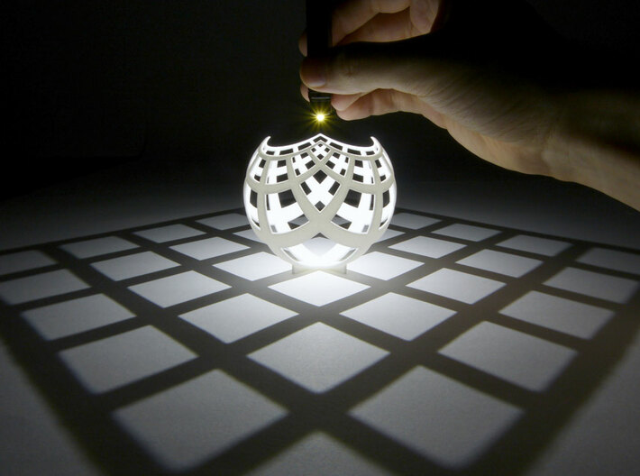
Stereographic projection of a grid pattern onto the plane. 3D print the model at Duke’s Co-Lab!

Just as shadows of 3D objects are images formed on a 2D surface, our retina has only a 2D surface area to detect light entering the eye, so we actually see a 2D projection of our 3D world. Our minds are computationally able to reconstruct the 3D world around us by using previous experience and information from the 2D images such as light, shade, and parallax.

Projection of a 3D object on a 2D surface.

Projection of a 4D object on a 3D world

How can we visualize the 4-dimensional hypercube?

To use stereographic projection, we radially project the edges of a 3D cube (left of the image below) to the surface of a sphere to form a “beach ball cube” (right).

The faces of the cube radially projected onto the sphere.

Placing a point light source at the north pole of the bloated cube, we can obtain the projection onto a 2D plane as shown below.

Stereographic projection of the “beach ball cube” pattern to the plane. View the 3D model here.

Applied to one dimension higher, we can theoretically blow a 4-dimensional shape up into a ball, and then place a light at the top of the object, and project the image down into 3 dimensions.

Left: 3D print of the stereographic projection of a “beach ball hypercube” to 3-dimensional space. Right: computer render of the same, including the 2-dimensional square faces.

Forming n–dimensional cubes from (n−1)–dimensional renderings.

Thus, the constructed 3D model of the “beach ball cube” shadow is the projection of the hypercube into 3-dimensional space. Here the 4-dimensional edges of the hypercube become distorted cubes instead of strips.

Just as the edges of the top object in the figure can be connected together by folding the squares through the 3rd dimension to form a cube, the edges of the bottom object can be connected through the 4th dimension

Why are we trying to understand things in 4 dimensions?

As far as we know, the space around us consists of only 3 dimensions. Mathematically, however, there is no reason to limit our understanding of higher-dimensional geometry and space to only 3, since there is nothing special about the number 3 that makes it the only possible number of dimensions space can have.

From a physics perspective, Einstein’s theory of Special Relativity suggests a connection between space and time, so the space-time continuum consists of 3 spatial dimensions and 1 temporal dimension. For example, consider a blooming flower. The flower’s position it not changing: it is not moving up or sideways. Yet, we can observe the transformation, which is proof that an additional dimension exists. Equating time with the 4th dimension is one example, but the 4th dimension can also be positional like the first 3. While it is possible to visualize space-time by examining snapshots of the flower with time as a constant, it is also useful to understand how space and time interrelate geometrically.

Explore more in the 4th dimension with Hypernom or Dr. Segerman’s book “Visualizing Mathematics with 3D Printing“!

https://youtu.be/Hg9-0dLDgJo

Post by Anika Radiya-Dixit.


Data Geeks Go Head to Head

For North Carolina college students, “big data” is becoming a big deal. The proof: signups for DataFest, a 48-hour number-crunching competition held at Duke last weekend, set a record for the third time in a row this year.

DataFest 2017

More than 350 data geeks swarmed Bostock Library this weekend for a 48-hour number-crunching competition called DataFest. Photo by Loreanne Oh, Duke University.

Expected turnout was so high that event organizer and Duke statistics professor Mine Cetinkaya-Rundel was even required by state fire code to sign up for “crowd manager” safety training — her certificate of completion is still proudly displayed on her Twitter feed.

Nearly 350 students from 10 schools across North Carolina, California and elsewhere flocked to Duke’s West Campus from Friday, March 31 to Sunday, April 2 to compete in the annual event.

Teams of two to five students worked around the clock over the weekend to make sense of a single real-world data set. “It’s an incredible opportunity to apply the modeling and computing skills we learn in class to actual business problems,” said Duke junior Angie Shen, who participated in DataFest for the second time this year.

The surprise dataset was revealed Friday night. Just taming it into a form that could be analyzed was a challenge. Containing millions of data points from an online booking site, it was too large to open in Excel. “It was bigger than anything I’ve worked with before,” said NC State statistics major Michael Burton.

DataFest 2017

The mystery data set was revealed Friday night in Gross Hall. Photo by Loreanne Oh.

Because of its size, even simple procedures took a long time to run. “The dataset was so large that we actually spent the first half of the competition fixing our crushed software and did not arrive at any concrete finding until late afternoon on Saturday,” said Duke junior Tianlin Duan.

The organizers of DataFest don’t specify research questions in advance. Participants are given free rein to analyze the data however they choose.

“We were overwhelmed with the possibilities. There was so much data and so little time,” said NCSU psychology major Chandani Kumar.

“While for the most part data analysis was decided by our teachers before now, this time we had to make all of the decisions ourselves,” said Kumar’s teammate Aleksey Fayuk, a statistics major at NCSU.

As a result, these budding data scientists don’t just write code. They form theories, find patterns, test hunches. Before the weekend is over they also visualize their findings, make recommendations and communicate them to stakeholders.

This year’s participants came from more than 10 schools, including Duke, UNC, NC State and North Carolina A&T. Students from UC Davis and UC Berkeley also made the trek. Photo by Loreanne Oh.

“The most memorable moment was when we finally got our model to start generating predictions,” said Duke neuroscience and computer science double major Luke Farrell. “It was really exciting to see all of our work come together a few hours before the presentations were due.”

Consultants are available throughout the weekend to help with any questions participants might have. Recruiters from both start-ups and well-established companies were also on site for participants looking to network or share their resumes.

“Even as late as 11 p.m. on Saturday we were still able to find a professor from the Duke statistics department at the Edge to help us,” said Duke junior Yuqi Yun, whose team presented their results in a winning interactive visualization. “The organizers treat the event not merely as a contest but more of a learning experience for everyone.”

Caffeine was critical. “By 3 a.m. on Sunday morning, we ended initial analysis with what we had, hoped for the best, and went for a five-hour sleep in the library,” said NCSU’s Fayuk, whose team DataWolves went on to win best use of outside data.

By Sunday afternoon, every surface of The Edge in Bostock Library was littered with coffee cups, laptops, nacho crumbs, pizza boxes and candy wrappers. White boards were covered in scribbles from late-night brainstorming sessions.

“My team encouraged everyone to contribute ideas. I loved how everyone was treated as a valuable team member,” said Duke computer science and political science major Pim Chuaylua. She decided to sign up when a friend asked if she wanted to join their team. “I was hesitant at first because I’m the only non-stats major in the team, but I encouraged myself to get out of my comfort zone,” Chuaylua said.

“I learned so much from everyone since we all have different expertise and skills that we contributed to the discussion,” said Shen, whose teammates were majors in statistics, computer science and engineering. Students majoring in math, economics and biology were also well represented.

At the end, each team was allowed four minutes and at most three slides to present their findings to a panel of judges. Prizes were awarded in several categories, including “best insight,” “best visualization” and “best use of outside data.”

Duke is among more than 30 schools hosting similar events this year, coordinated by the American Statistical Association (ASA). The winning presentations and mystery data source will be posted on the DataFest website in May after all events are over.

The registration deadline for the next Duke DataFest will be March 2018.

DataFest 2017

Bleary-eyed contestants pose for a group photo at Duke DataFest 2017. Photo by Loreanne Oh.

s200_robin.smith

Post by Robin Smith

Creating Technology That Understands Human Emotions

“If you – as a human – want to know how somebody feels, for what might you look?” Professor Shaundra Daily asked the audience during an ECE seminar last week.

“Facial expressions.”
“Body Language.”
“Tone of voice.”
“They could tell you!”

Over 50 students and faculty gathered over cookies and fruits for Dr. Daily’s talk on designing applications to support personal growth. Dr. Daily is an Associate Professor in the Department of Computer and Information Science and Engineering at the University of Florida interested in affective computing and STEM education.

Dr. Daily explaining the various types of devices used to analyze people’s feelings and emotions. For example, pressure sensors on a computer mouse helped measure the frustration of participants as they filled out an online form.

Affective Computing

The visual and auditory cues proposed above give a human clues about the emotions of another human. Can we use technology to better understand our mental state? Is it possible to develop software applications that can play a role in supporting emotional self-awareness and empathy development?

Until recently, technologists have largely ignored emotion in understanding human learning and communication processes, partly because it has been misunderstood and hard to measure. Asking the questions above, affective computing researchers use pattern analysis, signal processing, and machine learning to extract affective information from signals that human beings express. This is integral to restore a proper balance between emotion and cognition in designing technologies to address human needs.

Dr. Daily and her group of researchers used skin conductance as a measure of engagement and memory stimulation. Changes in skin conductance, or the measure of sweat secretion from sweat gland, are triggered by arousal. For example, a nervous person produces more sweat than a sleeping or calm individual, resulting in an increase in skin conductance.

Galvactivators, devices that sense and communicate skin conductivity, are often placed on the palms, which have a high density of the eccrine sweat glands.

Applying this knowledge to the field of education, can we give a teacher physiologically-based information on student engagement during class lectures? Dr. Daily initiated Project EngageMe by placing galvactivators like the one in the picture above on the palms of students in a college classroom. Professors were able to use the results chart to reflect on different parts and types of lectures based on the responses from the class as a whole, as well as analyze specific students to better understand the effects of their teaching methods.

Project EngageMe: Screenshot of digital prototype of the reading from the galvactivator of an individual student.

The project ended up causing quite a bit of controversy, however, due to privacy issues as well our understanding of skin conductance. Skin conductance can increase due to a variety of reasons – a student watching a funny video on Facebook might display similar levels of conductance as an attentive student. Thus, the results on the graph are not necessarily correlated with events in the classroom.

Educational Research

Daily’s research blends computational learning with social and emotional learning. Her projects encourage students to develop computational thinking through reflecting on the community with digital storytelling in MIT’s Scratch, learning to use 3D printers and laser cutters, and expressing ideas using robotics and sensors attached to their body.

VENVI, Dr. Daily’s latest research, uses dance to teach basic computational concepts. By allowing users to program a 3D virtual character that follows dance movements, VENVI reinforces important programming concepts such as step sequences, ‘for’ and ‘while’ loops of repeated moves, and functions with conditions for which the character can do the steps created!


Dr. Daily and her research group observed increased interest from students in pursuing STEM fields as well as a shift in their opinion of computer science. Drawings from Dr. Daily’s Women in STEM camp completed on the first day consisted of computer scientist representations as primarily frazzled males coding in a small office, while those drawn after learning with VENVI included more females and engagement in collaborative activities.

VENVI is a programming software that allows users to program a virtual character to perform a sequence of steps in a 3D virtual environment!

In human-to-human interactions, we are able draw on our experiences to connect and empathize with each other. As robots and virtual machines grow to take increasing roles in our daily lives, it’s time to start designing emotionally intelligent devices that can learn to empathize with us as well.

Post by Anika Radiya-Dixit

Seeing Nano

Take pictures at more than 300,000 times magnification with electron microscopes at Duke

Sewer gnat head

An image of a sewer gnat’s head taken through a scanning electron microscope. Courtesy of Fred Nijhout.

The sewer gnat is a common nuisance around kitchen and bathroom drains that’s no bigger than a pea. But magnified thousands of times, its compound eyes and bushy antennae resemble a first place winner in a Movember mustache contest.

Sewer gnats’ larger cousins, horseflies are known for their painful bite. Zoom in and it’s easy to see how they hold onto their furry livestock prey:  the tiny hooked hairs on their feet look like Velcro.

Students in professor Fred Nijhout’s entomology class photograph these and other specimens at more than 300,000 times magnification at Duke’s Shared Material & Instrumentation Facility (SMIF).

There the insects are dried, coated in gold and palladium, and then bombarded with a beam of electrons from a scanning electron microscope, which can resolve structures tens of thousands of times smaller than the width of a human hair.

From a ladybug’s leg to a weevil’s suit of armor, the bristly, bumpy, pitted surfaces of insects are surprisingly beautiful when viewed up close.

“The students have come to treat travels across the surface of an insect as the exploration of a different planet,” Nijhout said.

Horsefly foot

The foot of a horsefly is equipped with menacing claws and Velcro-like hairs that help them hang onto fur. Photo by Valerie Tornini.

Weevil

The hard outer skeleton of a weevil looks smooth and shiny from afar, but up close it’s covered with scales and bristles. Courtesy of Fred Nijhout.

fruit fly wing

Magnified 500 times, the rippled edges of this fruit fly wing are the result of changes in the insect’s genetic code. Courtesy of Eric Spana.

You, too, can gaze at alien worlds too small to see with the naked eye. Students and instructors across campus can use the SMIF’s high-powered microscopes and other state of the art research equipment at no charge with support from the Class-Based Explorations Program.

Biologist Eric Spana’s experimental genetics class uses the microscopes to study fruit flies that carry genetic mutations that alter the shape of their wings.

Students in professor Hadley Cocks’ mechanical engineering 415L class take lessons from objects that break. A scanning electron micrograph of a cracked cymbal once used by the Duke pep band reveals grooves and ridges consistent with the wear and tear from repeated banging.

cracked cymbal

Magnified 3000 times, the surface of this broken cymbal once used by the Duke Pep Band reveals signs of fatigue cracking. Courtesy of Hadley Cocks.

These students are among more than 200 undergraduates in eight classes who benefitted from the program last year, thanks to a grant from the Donald Alstadt Foundation.

You don’t have to be a scientist, either. Historians and art conservators have used scanning electron microscopes to study the surfaces of Bronze Age pottery, the composition of ancient paints and even dust from Egyptian mummies and the Shroud of Turin.

Instructors and undergraduates are invited to find out how they could use the microscopes and other nanotech equipement in the SMIF in their teaching and research. Queries should be directed to Dr. Mark Walters, Director of SMIF, via email at mark.walters@duke.edu.

Located on Duke’s West Campus in the Fitzpatrick Building, the SMIF is a shared use facility available to Duke researchers and educators as well as external users from other universities, government laboratories or industry through a partnership called the Research Triangle Nanotechnology Network. For more info visit http://smif.pratt.duke.edu/.

Scanning electron microscope

This scanning electron microscope could easily be mistaken for equipment from a dentist’s office.

s200_robin.smith

Post by Robin Smith

X-mas Under X-ray

If, like me, you just cannot wait until Christmas morning to find out what goodies are hiding in those shiny packages under the tree, we have just the solution for you: stick them in a MicroCT scanner.

A christmas present inside a MicroCT scanner.

Our glittery package gets the X-ray treatment inside Duke’s MicroCT scanner. Credit Justin Gladman.

Micro computed-tomography (CT) scanners use X-ray beams and sophisticated visual reconstruction software to “see” into objects and create 3D images of their insides. In recent years, Duke’s MicroCT has been used to tackle some fascinating research projects, including digitizing fossils, reconstructing towers made of stars, peaking inside of 3D-printed electronic devices, and creating a gorgeous 3D reconstruction of organs and muscle tissue inside this Southeast Asian Tree Shrew.

x-ray-view

A 20 minute scan revealed a devilish-looking rubber duck. Credit Justin Gladman.

But when engineer Justin Gladman offered to give us a demo of the machine last week, we both agreed there was only one object we wanted a glimpse inside: a sparkly holiday gift bag.

While securing the gift atop a small, rotating pedestal inside the device, Gladman explained how the device works. Like the big CT scanners you may have encountered at a hospital or clinic, the MicroCT uses X-rays to create a picture of the density of an object at different locations. By taking a series of these scans at different angles, a computer algorithm can then reconstruct a full 3D model of the density, revealing bones inside of animals, individual circuits inside electronics – or a present inside a box.

“Our machine is built to handle a lot of different specimens, from bees to mechanical parts to computer chips, so we have a little bit of a jack-of-all-trades,” Gladman said.

Within a few moments of sticking the package in the beam, a 2D image of the object in the bag appears on the screen. It looks kind of like the Stay Puft Marshmallow Man, but wait – are those horns?

Blue devil ducky in the flesh.

Blue devil ducky in the flesh.

Gladman sets up a full 3D scan of the gift package, and after 20 minutes, the contents of our holiday loot is clear. We have a blue devil rubber ducky on our hands!

Blue ducky is a fun example, but the SMIF lab always welcomes new users, Gladman says, especially students and researchers with creative new applications for the equipment. For more information on how to use Duke’s MicroCT, contact Justin Gladman or visit the Duke SMIF lab at their website, Facebook, Youtube or Instagram pages.

Kara J. Manke, PhD

Post by Kara Manke

Mapping the Brain With Stories

alex-huth_

Dr. Alex Huth. Image courtesy of The Gallant Lab.

On October 15, I attended a presentation on “Using Stories to Understand How The Brain Represents Words,” sponsored by the Franklin Humanities Institute and Neurohumanities Research Group and presented by Dr. Alex Huth. Dr. Huth is a neuroscience postdoc who works in the Gallant Lab at UC Berkeley and was here on behalf of Dr. Jack Gallant.

Dr. Huth started off the lecture by discussing how semantic tasks activate huge swaths of the cortex. The semantic system places importance on stories. The issue was in understanding “how the brain represents words.”

To investigate this, the Gallant Lab designed a natural language experiment. Subjects lay in an fMRI scanner and listened to 72 hours’ worth of ten naturally spoken narratives, or stories. They heard many different words and concepts. Using an imaging technique called GE-EPI fMRI, the researchers were able to record BOLD responses from the whole brain.

Dr. Huth explaining the process of obtaining the new colored models that revealed semantic "maps are consistent across subjects."

Dr. Huth explaining the process of obtaining the new colored models that revealed semantic “maps are consistent across subjects.”

Dr. Huth showed a scan and said, “So looking…at this volume of 3D space, which is what you get from an fMRI scan…is actually not that useful to understanding how things are related across the surface of the cortex.” This limitation led the researchers to improve upon their methods by reconstructing the cortical surface and manipulating it to create a 2D image that reveals what is going on throughout the brain.  This approach would allow them to see where in the brain the relationship between what the subject was hearing and what was happening was occurring.

A model was then created that would require voxel interpretation, which “is hard and lots of work,” said Dr. Huth, “There’s a lot of subjectivity that goes into this.” In order to simplify voxel interpretation, the researchers simplified the dimensional subspace to find the classes of voxels using principal components analysis. This meant that they took data, found the important factors that were similar across the subjects, and interpreted the meaning of the components. To visualize these components, researchers sorted words into twelve different categories.

img_2431

The Four Categories of Words Sorted in an X,Y-like Axis

These categories were then further simplified into four “areas” on what might resemble an x , y axis. On the top right was where violent words were located. The top left held social perceptual words. The lower left held words relating to “social.” The lower right held emotional words. Instead of x , y axis labels, there were PC labels. The words from the study were then colored based on where they appeared in the PC space.

By using this model, the Gallant could identify which patches of the brain were doing different things. Small patches of color showed which “things” the brain was “doing” or “relating.” The researchers found that the complex cortical maps showing semantic information among the subjects was consistent.

These responses were then used to create models that could predict BOLD responses from the semantic content in stories. The result of the study was that the parietal cortex, temporal cortex, and prefrontal cortex represent the semantics of narratives.

meg_shieh_100hedPost by Meg Shieh

Students Mine Parking Data to Help You Find a Spot

No parking spot? No problem.

A group of students has teamed up with Duke Parking and Transportation to explore how data analysis and visualization can help make parking on campus a breeze.

As part of the Information Initiative’s Data+ program, students Mitchell Parekh (’19) and Morton Mo (’19) along with IIT student Nikhil Tank (’17), spent 10 weeks over the summer poring over parking data collected at 42 of Duke’s permitted lots.

Under the mentorship of graduate student Nicolas-Aldebrando Benelli, they identified common parking patterns across the campus, with the goal of creating a “redirection” tool that could help Duke students and employees figure out the best place to park if their preferred lot is full.

A map of parking patterns at Duke

To understand parking patterns at Duke, the team created “activity” maps, where each circle represents one of Duke’s parking lots. The size of the circle indicates the size of the lot, and the color of the circle indicates how many people entered and exited the lot within a given hour.

“We envision a mobile app where, before you head out for work, you could check your lot on your phone,” Mo said, speaking with Parekh at the Sept. 23 Visualization Friday Forum. “And if the lot is full, it would give you a pass for an alternate lot.”

Starting with parking data gathered in Fall 2013, which logged permit holders “swiping” in and out from each lot, they set out to map some basic parking habits at Duke, including how full each lot is, when people usually arrive, and how long they stay.

However, the data weren’t always very agreeable, Mo said.

“One of the things we got was a historical occupancy count, which is exactly what we wanted – the number of cars in the facility at a given time – but we were seeing negative numbers,” said Mo. “So we figured that table might not be as trustworthy as we expected it to be.”

Other unexpected features, such as “passback,” which occurs when two cars enter or exit under the same pass, also created challenges with interpreting the data.

However, with some careful approximations, the team was able to estimate the occupancy of lot on campus at different times throughout an average weekday.

They then built an interactive, Matlab-based tool that would suggest up to three alternative parking locations based on the users’ location and travel time plus the utilization and physical capacity of each lot.

“Duke Parking is really happy with the interface that we built, and they want us to keep working on it,” Parekh said.

“The data team worked hard on real world challenges, and provided thoughtful insights to those challenges,” said Kyle Cavanaugh, Vice President of Administration at Duke. “The team was terrific to work with and we look forward to future collaboration.”

Hectic class schedules allowing, the team hopes to continue developing their application into a more user-friendly tool. You can watch a recording of Mo and Parekh’s Sept. 23 presentation here.

The team's algorithm recommends up to three alternative lots if a commuter's preferred lot is full. In this video, suggested alternatives to the blue lot are updated throughout the day to reflect changing traffic and parking patterns. Video courtesy of Nikhil Tank.

Kara J. Manke, PhD

Post by Kara Manke


Is Durham's Revival Pricing Some Longtime Residents Out?

When a 2015 national report on gentrification released its results for the nation’s 50 largest cities, both Charlotte and Raleigh — North Carolina’s top two biggest cities — made the list.

The result was a collection of maps and tables indicating whether various neighborhoods in each city had gentrified or not, based on changes in home values and other factors from 1990 to the present.

Soon Durham residents, business owners, policy wonks and others will have easy access to similar information about their neighborhoods too, thanks to planned updates to a web-based mapping tool called Durham Neighborhood Compass.

Two Duke students are part of the effort. For ten weeks this summer, undergraduates Anna Vivian and Vinai Oddiraju worked with Neighborhood Compass Project Manager John Killeen and Duke economics Ph.D. student Olga Kozlova to explore real-world data on Durham’s changing neighborhoods as part of a summer research program called Data+.

As a first step, they looked at recent trends in the housing market and business development.

Photo by Mark Moz.

Durham real estate and businesses are booming. A student mapping project aims to identify the neighborhoods at risk of pricing longtime residents out. Photo by Mark Moz.

Call it gentrification. Call it revitalization. Whatever you call it, there’s no denying that trendy restaurants, hotels and high-end coffee shops are popping up across Durham, and home values are on the rise.

Integrating data from the Secretary of State, the Home Mortgage Disclosure Act and local home sales, the team analyzed data for all houses sold in Durham between 2010 and 2015, including list and sale prices, days on the market, and owner demographics such as race and income.

They also looked at indicators of business development, such as the number of business openings and closings per square mile.

A senior double majoring in physics and art history, Vivian brought her GIS mapping skills to the project. Junior statistics major Oddiraju brought his know-how with computer programming languages.

To come up with averages for each neighborhood or Census block group, they first converted every street address in their dataset into latitude and longitude coordinates on a map, using a process called geocoding. The team then created city-wide maps of the data using GIS mapping software.

One of their maps shows the average listing price of homes for sale between 2014 and 2015, when housing prices in the area around Duke University’s East Campus between Broad Street and Buchanan Boulevard went up by $40,000 in a single year, the biggest spike in the city

Their web app shows that more businesses opened in downtown and in south Durham than in other parts of the city.

Duke students are developing a web app that allows users to see the number of new businesses that have been opening across Durham. The data will appear in future updates to a web-based mapping tool called Durham Neighborhood Compass.

They also used a programming language called “R” to build an interactive web app that enables users to zoom in on specific neighborhoods and see the number of new businesses that opened, compare a given neighborhood to the average for Durham county as a whole, or toggle between years to see how things changed over time.

The Durham Neighborhood Compass launched in 2014. The tool uses data from local government, the Census Bureau and other state and federal agencies to monitor nearly 50 indicators related to quality of life and access to services.

When it comes to gentrification, users can already track neighborhood-by-neighborhood changes in race, household income, and the percentage of households that are paying 30 percent or more of their income for housing — more than many people can afford.

Vivian and Oddiraju expect the scripts and methods they developed will be implemented in future updates to the tool.

When they do, the team hopes users will be able to compare the average initial asking price to the final sale price to identify neighborhoods where bidding has been the highest, or see how fast properties sell once they go on the market — good indicators of how hot they are.

Visitors will also be able to compare the median income of people buying into a neighborhood to that of the people that already live there. This will help identify neighborhoods that are at risk of pricing out residents, especially renters, who have called the city home.

Vivian and Oddiraju were among more than 60 students who shared preliminary results of their work at a poster session on Friday, July 29 in Gross Hall.

Vivian plans to continue working on the project this fall, when she hopes to comb through additional data sets they didn’t get to this summer.

“One that I’m excited about is the data on applications for renovation permits and historic tax credits,” Vivian said.

She also hopes to further develop the web app to make it possible to look at multiple variables at once. “If sale prices are rising in areas where people have also filed lots of remodeling permits, for example, that could mean that they’re flipping those houses,” Vivian said.

Data+ is sponsored by the Information Initiative at Duke, the Social Sciences Research Institute and Bass Connections. Additional funding was provided by the National Science Foundation via a grant to the departments of mathematics and statistical science.

groupshot


Writing by Robin Smith; video by Sarah Spencer and Ashlyn Nuckols

What Makes a Face? Art and Science Team Up to Find Out

From the man in the moon to the slots of an electrical outlet, people can spot faces just about everywhere.

As part of a larger Bass Connections project exploring how our brains make sense of faces, a Duke team of students and faculty is using state-of-the-art eye-tracking to examine how the presence of faces — from the purely representational to the highly abstract — influences our perception of art.

The Making Faces exhibit is on display in the Nasher Museum of Art’s Academic Focus Gallery through July 24th.

The artworks they examined are currently on display at the Nasher Museum of Art in an installation titled, “Making Faces: At the Intersection of Art and Neuroscience.”

“Faces really provide the most absorbing source of information for us as humans,” Duke junior Sophie Katz said during a gallery talk introducing the installation last week. “We are constantly attracted to faces and we see them everywhere. Artists have always had an obsession with faces, and recently scientists have also begun grappling with this obsession.”

Katz said our preoccupation with faces evolved because they provide us with key social cues, including information about another individual’s gender, identity, and emotional state. Studies using functional Magnetic Resonance Imaging (fMRI) even indicate that we have a special area of the brain, called the fusiform face area, that is specifically dedicated to processing facial information.

The team used eye-tracking in the lab and newly developed eye-tracking glasses in the Nasher Museum as volunteers viewed artworks featuring both abstract and representational images of faces. They created “heat maps” from these data to illustrate where viewers gazed most on a piece of art to explore how our facial bias might influence our perception of art.

This interactive website created by the team lets you observe these eye-tracking patterns firsthand.

When looking at faces straight-on, most people direct their attention on the eyes and the mouth, forming a triangular pattern. Katz said the team was surprised to find that this pattern held even when the faces became very abstract.

“Even in a really abstract representation of a face, people still scan it like they would a face. They are looking for the same social information regardless of how abstract the work is,” said Katz.


A demonstration of the eye-tracking technology used to track viewers gaze at the Nasher Museum of Art. Credit: Shariq Iqbal, John Pearson Lab, Duke University.

Sophomore Anuhita Basavaraju pointed out how a Lonnie Holley piece titled “My Tear Becomes the Child,” in which three overlapping faces and a seated figure emerge from a few contoured lines, demonstrates how artists are able to play with our facial perception.

“There really are very few lines being used, but at the same time it’s so intricate, and generates the interesting conversation of how many lines are there, and which face you see first,” said Basavaraju. “That’s what’s so interesting about faces. Because human evolution has made us so drawn towards faces, artists are able to create them out of really very few contours in a really intricate way.”

IMG_8354

Sophomore Anuhita Basavaraju discusses different interpretations of the face in Pablo Picasso’s “Head of a Woman.”

In addition to comparing ambiguous and representational faces, the team also examined how subtle changes to a face, like altering the color contrast or applying a mask, might influence our perception.

Sophomore Eduardo Salgado said that while features like eyes and a nose and mouth are the primary components that allow our brains to construct a face, masks may remove the subtler dimensions of facial expression that we rely on for social cues.

For instance, participants viewing a painting titled “Decompositioning” by artist Jeff Sonhouse, which features a masked man standing before an exploding piano, spent most of their time dwelling on the man’s covered face, despite the violent scene depicted on the rest of the canvas.

“When you cover a face, it’s hard to know what the person is thinking,” Salgado said. “You lack information, and that calls more attention to it. If he wasn’t masked, the focus on his face might have been less intense.”

In connection with the exhibition, Nasher MUSE, DIBS, and the Bass Connections team will host visiting illustrator Hanoch Piven this Thursday April 7th and Friday April 8th  for a lunchtime conversation and hands-on workshop about his work creating portraits with found objects.

Making Faces will be on display in the Nasher Museum of Art’s Academic Focus Gallery through July 24th.

Kara J. Manke, PhD

Post by Kara Manke

Page 4 of 10

Powered by WordPress & Theme by Anders Norén