
When a 2015 national report on gentrification released its results for the nation’s 50 largest cities, both Charlotte and Raleigh — North Carolina’s top two biggest cities — made the list.
The result was a collection of maps and tables indicating whether various neighborhoods in each city had gentrified or not, based on changes in home values and other factors from 1990 to the present.
Soon Durham residents, business owners, policy wonks and others will have easy access to similar information about their neighborhoods too, thanks to planned updates to a web-based mapping tool called Durham Neighborhood Compass.
Two Duke students are part of the effort. For ten weeks this summer, undergraduates Anna Vivian and Vinai Oddiraju worked with Neighborhood Compass Project Manager John Killeen and Duke economics Ph.D. student Olga Kozlova to explore real-world data on Durham’s changing neighborhoods as part of a summer research program called Data+.
As a first step, they looked at recent trends in the housing market and business development.
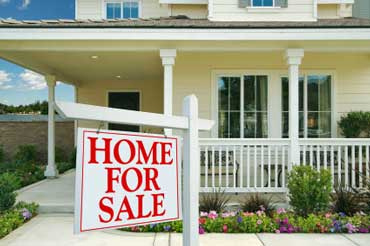
Durham real estate and businesses are booming. A student mapping project aims to identify the neighborhoods at risk of pricing longtime residents out. Photo by Mark Moz.
Call it gentrification. Call it revitalization. Whatever you call it, there’s no denying that trendy restaurants, hotels and high-end coffee shops are popping up across Durham, and home values are on the rise.
Integrating data from the Secretary of State, the Home Mortgage Disclosure Act and local home sales, the team analyzed data for all houses sold in Durham between 2010 and 2015, including list and sale prices, days on the market, and owner demographics such as race and income.
They also looked at indicators of business development, such as the number of business openings and closings per square mile.
A senior double majoring in physics and art history, Vivian brought her GIS mapping skills to the project. Junior statistics major Oddiraju brought his know-how with computer programming languages.
To come up with averages for each neighborhood or Census block group, they first converted every street address in their dataset into latitude and longitude coordinates on a map, using a process called geocoding. The team then created city-wide maps of the data using GIS mapping software.
One of their maps shows the average listing price of homes for sale between 2014 and 2015, when housing prices in the area around Duke University’s East Campus between Broad Street and Buchanan Boulevard went up by $40,000 in a single year, the biggest spike in the city
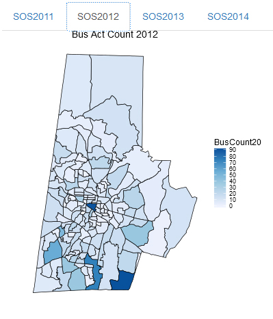
Duke students are developing a web app that allows users to see the number of new businesses that have been opening across Durham. The data will appear in future updates to a web-based mapping tool called Durham Neighborhood Compass.
They also used a programming language called “R” to build an interactive web app that enables users to zoom in on specific neighborhoods and see the number of new businesses that opened, compare a given neighborhood to the average for Durham county as a whole, or toggle between years to see how things changed over time.
The Durham Neighborhood Compass launched in 2014. The tool uses data from local government, the Census Bureau and other state and federal agencies to monitor nearly 50 indicators related to quality of life and access to services.
When it comes to gentrification, users can already track neighborhood-by-neighborhood changes in race, household income, and the percentage of households that are paying 30 percent or more of their income for housing — more than many people can afford.
Vivian and Oddiraju expect the scripts and methods they developed will be implemented in future updates to the tool.
When they do, the team hopes users will be able to compare the average initial asking price to the final sale price to identify neighborhoods where bidding has been the highest, or see how fast properties sell once they go on the market — good indicators of how hot they are.
Visitors will also be able to compare the median income of people buying into a neighborhood to that of the people that already live there. This will help identify neighborhoods that are at risk of pricing out residents, especially renters, who have called the city home.
Vivian and Oddiraju were among more than 60 students who shared preliminary results of their work at a poster session on Friday, July 29 in Gross Hall.
Vivian plans to continue working on the project this fall, when she hopes to comb through additional data sets they didn’t get to this summer.
“One that I’m excited about is the data on applications for renovation permits and historic tax credits,” Vivian said.
She also hopes to further develop the web app to make it possible to look at multiple variables at once. “If sale prices are rising in areas where people have also filed lots of remodeling permits, for example, that could mean that they’re flipping those houses,” Vivian said.
Data+ is sponsored by the Information Initiative at Duke, the Social Sciences Research Institute and Bass Connections. Additional funding was provided by the National Science Foundation via a grant to the departments of mathematics and statistical science.

Writing by Robin Smith; video by Sarah Spencer and Ashlyn Nuckols