Following the people and events that make up the research community at Duke

Students exploring the Innovation Co-Lab

Category: Mathematics Page 5 of 8

Improving Machine Learning With an Old Approach

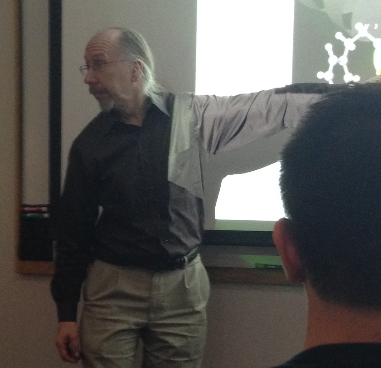
Computer scientist Rong Ge has an interesting approach to machine learning. While most machine learning specialists will build an algorithm which molds to a specific dataset, Ge builds an algorithm which he can guarantee will perform well across many datasets.

Rong Ge is an assistant professor of computer science.

Rong Ge is an assistant professor of computer science.

A paper he wrote as a postdoc at Microsoft Research,  Escaping From Saddle Points — Online Stochastic Gradient for Tensor Decomposition, describes how a programmer can use the imprecision of a common machine learning algorithm, known as stochastic gradient descent, to his advantage.

Normally this algorithm is used to speed up a slow learning process by only approximating the correct solution rather than working harder to get precision; however, Ge and his colleagues found that the small amount of “noise” created by the algorithm can be the saving grace of an algorithm which would otherwise be trapped by its own perfectionism.

“This algorithm is not normally used for this purpose,” Ge says, “It is normally used as a heuristic to approximate the solution to a problem.”

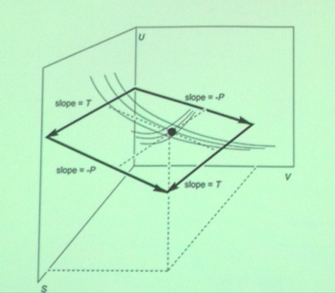
Noise allows the algorithm to escape from something called a “saddle point” on the function which the stochastic gradient is trying to optimize, which looks sort of like a sine wave. Ge describes gradient descent as being like a ball rolling down a hill. When on the slope of the hill it always seeks the lowest point, but if it is at a saddle point, a high point on a “ridge” between two different slopes, it will not start rolling.

Stochastic gradient descent remedies this problem by jostling the ball enough to start it rolling down one of the slopes. But one cannot be sure which way it will roll.

The results he has obtained relate to a certain branch of machine learning known as unsupervised learning. One common problem from unsupervised learning is “clustering,” in which the algorithm attempts to find clusters of points which are similar to each other while different from the other points in the set. The algorithm then labels each of the clusters which it has found, and returns its solution to the programmer.

A key requirement for the final result of the algorithm to be correct is that the two slopes end at low points of equal depth, which represent optimal solutions. Often two solutions will appear different at first glance, but will actually represent the same set of clusters, different only because the labels on clusters were switched. Ge said one of the hardest parts of his process was designing functions that have this property.

These results are guaranteed to hold so long as the dataset is not provided by someone who has specifically engineered it to break the algorithm. If someone has designed such a dataset the problem becomes “NP hard,” meaning that there is little hope for even the best algorithms to solve it.

Hopefully we will see more growth in this field, especially interesting results such as this which find that the weaknesses associated with a certain algorithm can actually be strengths under different circumstances.

GraysonYork

GraysonYork

Guest post by Grayson York, a junior at the North Carolina School of Science and Math

Visualizing Crystals of the Cosmos

The beautiful mathematical structure of Penrose patterns have advanced our understanding of quasicrystals, a new breed of high-tech physical materials discovered in meteorites. Like all physical materials, these are collections of one or a few types of “particles” – atoms, molecules, or larger units – that are arranged in some pattern. The most familiar patterns are crystalline arrangements in which a simple unit is repeated in a regular way.

Periodic pattern of the honeycomb

During last Friday’s Visualization Forum, Josh Socolar, a Duke physics professor, conveyed his enthusiasm for the exotic patterns generated by non-periodic crystalline structures to a large audience munching on barbecue chicken and Alfredo pasta in the LSRC (Levine Science Research Center). Unlike many of the previous talks on visualizing data, Professor Socolar is not trying to find a new technique of visualization, but rather aims to emphasize the importance of visualizing certain structures.

Equations in chemistry for calculating vibrations when a material is heated are often based on the assumption that the material has a uniform structure such as the honeycomb pattern above. However, the atoms of a non-periodic crystalline object will behave differently when heated, making it necessary to revise the simplified mathematical models – since they can no longer be applied to all physical materials.

Quasicrystals, one type of non-periodic structured material, can be represented by the picture below. The pattern contains features with 5-fold symmetry of various sizes (highlighted in red, magenta, yellow, and green).

Quasicrystal structure with 5-fold symmetry

Quasicrystal structure with 5-fold symmetry

Drawing straight lines within each tile – as shown on the bottom half of the diagram below – produces lines running straight through the material with various lengths. Professor Socolar computed the lengths of these line segments and was amazed to discover that they follow the Fibonacci sequence. This phenomenon was recently discovered to occur naturally in icosahedrite, a rare and exotic mineral found in outer space.

Lines drawn through a quasicrystal structure

Lines drawn through a quasicrystal structure

By using software programs like Mathematica, we can create 3D images and animations for the expansion of such quasicrystal structures (a) as well as computing Sierpinski patterns formed when designing other types of non-periodic tile shapes (b).

Still of animation of expanding quasicrystal tiles - that looks like a cup of coffee.

(a) Still of animation of expanding quasicrystal tiles – that looks like a cup of coffee.

(b)

(b) Sierpinski triangle pattern drawn for other non-periodic tile shapes

(b) Recolored diagram of

(b) Recolored diagram of Sierpinski triangle pattern

Most importantly, Professor Socolar concludes, neither the Fibonacci nor non-periodic Penrose patterns would have been identified in quasicrystal structures without the visualization tools we have today. With Fibonacci sequence patterns discovered in the sunflower seed spiral as well as in the structure of the icosahedrite meteorite, we have found yet another mathematical point of unity between our world and the rest of the cosmos.

Professor Socolar taking questions from the audience.

Professor Socolar taking questions from the audience.

Post by Anika Radiya-Dixit

Summer Data+ Groups Pursue Pigs and Purchases

Many students spend their summer breaks going on vacations and relaxing, but not the 40 students selected to participate in Data+, a summer research program at Duke.

They meet twice a week for lunch to share their work on the third floor of Gross Hall.

A pair of pigs and their piglets. Photo by Alan Fryer via Wikimedia commons

A pair of pigs and their piglets. Photo by Alan Fryer via Wikimedia commons

Mercy Fang and Mike Ma are working on a research project involving prolific pigs, those that make a lot of piglets. They are trying to determine if the pigs are being priced rationally, whether or not the livestock market is efficient and the number of offspring per pig.

Fang said the most challenging part is the research data. “Converting PDF files of data into words has been hard,” said Fang.
The students are using four agricultural databases to determine the information on the pigs, including pedigrees.

Most of the students in Data+ are rising sophomores and juniors majoring in a variety of majors that include math, statistics, sociology and computer science. The program started in mid-May and runs for 10 weeks and allows students to work on projects using different research methods.

Another group of student that presented on June 18 is working on a research project involving data on food choices.

A produce stand in New York City, photo by Anderskev via Wikimedia Commons.

A produce stand in New York City, photo by Anderskev via Wikimedia Commons.

Kang Ni, Kehan Zhang and Alex Hong are using quantitative methods of study using the “clustering process” to determine a recommendation system for consumers to help them choose healthier food choices. The students are working with The Duke-UNC USDA Center for Behavioral Economics and Healthy Food Choice Research (BECR) center.

“Consumers already recognize a system to get a certain snack,” said Zhang. “We want to re-do a system to help consumers make better choices.”

The students are basing their research on nutrition information and food purchases from the BECR Data warehouse, which comes from consumer information from throughout the US. This includes food purchases and nutrition information from 2008-2012.

Zhang added that the hardest part was keeping up with information.
“It’s a lot of data in the future, and it will be challenging putting it into use,” said Zhang.

Students in attendance said the food choices data research group provided good information.

“I liked the quantitative methods they used to categorize food,” said Ashlee Valante.

The Data+ research program is sponsored and hosted by the Information Initiative at Duke (iiD) and the Social Science Research Institute (SSRI).  The funding comes from Bass Connections and from a National Science Foundation grant managed by the Department of Statistical Science.

Warren_Shakira_hed100Guest post by Shakira Warren, NCCU Summer Intern

Bringing a Lot of Energy to Research

By Karl Leif Bates

The Duke Energy Initiative‘s annual research collaboration workshop on May 5 was an update on how the campus-wide alliance of more than 130 faculty has been pursuing its goals of making energy  “accessible, affordable, reliable and clean.” In short, they’ve been busy!

energy posters

Energetic discussion swirled around research posters from graduate student projects and Bass Connections. (Photo: Margaret Lillard)

At the afternoon session in Gross Hall, David Mitzi, professor of mechanical engineering and materials science, led a panel of five-minute updates on energy materials including engineered microbes, computational modeling of materials, solar cells built on plastic rather than glass, and a nanomaterial-based sheet of material that would combine photovoltaics with storage on a single film.

Kyle Bradbury, managing director of the new Energy Data Analytics Lab that works with the ‘big data’ folks at iiD and the social scientists at SSRI, led a panel on the lab’s latest projects. As smart meters and Internet-enabled appliances enter the market, energy analysts will be flooded with new data, Bradbury explained. There should be great potential to improve efficiency and provide customers with useful real-time feedback, but first the torrent of information has to be corralled and analyzed.

energy panel

Kyle Bradbury (standing) moderated a data analytics panel with Leslie Collins and Matt Harding (right).

For one example of what big energy data might do, Bradbury and Electrical and Computer Engineering professor Leslie Collins (his former advisor) have done a pilot study to see if computers could be taught to  pick out roof-top solar arrays in satellite photos.  Nobody actually knows how many arrays there are or how much power they’re producing, Collins said. But without too much fussing around, their first visual search algorithm spotted 92 percent of the arrays correctly in some hand-picked images of California neighborhoods. Ramped up and tweaked, such an automated search could begin to identify just how much residential solar there is, where it is, and roughly how much energy it’s producing.

The third group of researchers, moderated by Energy Initiative associate Daniel Raimi, is working on energy markets and policy, including energy systems modeling and the regulation of green house gasses through the Clean Air Act.

Energy Initiative director Richard Newell said there were 1,400 Duke students enrolled in energy-related courses this year. A first round of six seed-funded research projects was completed and seven new projects have been selected. Eight Bass Connections teams in the energy theme were very productive as well, examining smart grids, solar energy and household energy conservation with teams of undergraduates, graduate students and faculty.

Geometry of Harmony in Impressionist Music

by Anika Radiya-Dixit

Like impressionist art – such as Monet’s work Sunset – impressionist music does not have fixed structures. Both artforms use the art of abstraction to give a sense of the theme of the work.

On the other hand, classical music, such as sonatas, flows with a rhythmic beat with a clear beginning, middle, and end to the work.

Since there is little theoretical study on the compositional patterns of the contemporary style of music, Duke senior Rowena Gan finds the mathematical exploration of impressionist music quite exciting, as she expressed in her senior thesis presentation April 17.

Sunset: Impressionist art by Claude Monet

Sunset: Impressionist art by Claude Monet

Classical music is well known for its characteristic chord progressions, which can be geometrically represented with a torus – or a product of circles – as shown in the figure below.

Torus depicting C major in orange highlight and D minor in blue highlight

Torus depicting C major in orange highlight and D minor in blue highlight

By numbering each note, the Neo-Riemannian theory can be used to explain chord progressions in classical music by finding mathematical operations to describe the transitions between the chords.

Expressing chord progressions as mathematical operations

Expressing chord progressions as mathematical operations

asic transformations between chords described by the Neo-Riemannian theory.

Basic transformations between chords described by the Neo-Riemannian theory.

Similar to a chord, a scale is also a collection of notes. In classical music, scales typically played have seven notes, such as the C major scale below:

C Major Scale.

C Major Scale.

Impressionist music, however, is marked by the use of exotic scales with different numbers of notes that tend to start at notes off the key center. In that case, how do we represent scales in Impressionist music? One of the ways of representation that Gan explored is by determining the distance between the scales – called interscalar distance – by depicting each scale as a point, and comparing this value to the modulation frequency.

Essentially, the modulation frequency is determined by varying the frequency of the audio wave in order to carry information; a wider range of frequencies corresponds to a higher modulation frequency. For example, the modulation frequency is the same for the pair of notes of D and E as well as F and G, which both have lower modulation frequencies than between notes D and G.

Gan calculated the correlation between modulation frequency and interscalar distance for various musical pieces and found the value to be higher for classical music than for impressionist music. This means that impressionist music is less homogenous and contains a greater variety of non-traditional scale forms.

Gan explores more detailed findings in her paper, which will be completed this year.

Rowena Gan is a senior at Duke in Mathematics. She conducted her research under Professor Ezra Miller, who can be contacted via email here.

Origami-Inspired Chemistry Textbook Brings Molecules To Life

by Anika Radiya-Dixit

Your college textbook pages probably look something like the picture below – traffic jams of black boats on a prosaic white sea.

blackAndWhiteText

Textbook without illustrations.

But instead of reading purely from static texts, what if your chemistry class had 3D touch-screens that allowed you to manipulate the colors and positions of atoms to give you visual sense of how crystal and organic structures align with respect to each other? Or what if you could fold pieces of paper into different shapes to represent various combinations of protein structures? This is the future of science: visualization.

Duke students and staff gathered in the Levine Science Research Center last week to learn more about visualizing chemical compounds while munching on their chili and salad. Robert Hanson, Professor in the Department of Chemistry at St. Olaf College, was enthusiastic to present his research on new ways to visualize and understand experimental data.

Exhibition poster of “Body Worlds”


Hanson opened his talk with various applications of visualization in research. He expressed a huge respect for medical visualization and the people who are able to illustrate medical procedures, because “these artists are drawing what no one can see.” Take “Body Worlds,” for example, he said. One of the most renowned exhibitions displaying the artistic beauty of the human body, it elicited a myriad of reactions from the audience members, from mildly nauseated to animatedly pumped.

Hanson also spoke about the significance of having an effective visualization design. Very simple changes in visualization, such as a table of numbers versus a labeled graph, can make a “big difference in terms of ease of the audience catching on to what the data means.” For example, consider the excerpt of a textbook by J. Willard Gibbs below. One of the earliest chemists to study the relationship between pressure and temperature, Gibbs wrote “incredibly legible, detailed, verbatim notes,” Hanson said. Then he asked the audience: Honestly, would one read the text fervently, and if so, how easy would it be to understand these relationships?

Gibbs'Text

Excerpt of J. Gibbs’ text.

Not very, according to James C. Maxwell, a distinguished mathematician and physicist, who attempted to design a simpler mechanism with his inverted 3D plaster model.

Maxwell'sPlaster

Maxwell’s plaster model of Gibbs’ surface

Subsequent scientists created the graph shown below to represent the relationships. Compared to the text, the diagram gives several different pieces of information about entropy and temperature and pressure that allow the reader to “simply observe and trace the graph to find various points of equilibrium that they couldn’t immediately understand” from a block of black and white text.

Graph

Graphical view of Gibbs’ theory on the relation between temperature and pressure.

Hanson went further in his passion to bring chemistry to the physical realm in his book titled “Molecular Origami.” The reader photocopies or tears out a page from the book, and then folds up the piece of paper according to dotted guidelines in order to form origami molecular “ornaments.” The structures are marked with important pieces of information that allow students to observe and appreciate the symmetry and shapes of the various parts of the molecule.

origami

3D origami model of marcasite (scale: 200 million : 1)


One of his best moments with his work, Hanson recounted, was when he received a telephone call from some students in a high school asking him for directions on how to put together a 3D model of bone. After two hours of guiding the students, he asked the students what the model finally looked like – since he had knowledge of only the chemical components – and was amused to hear a cheeky “He doesn’t know.” Later that year, Hanson was rewarded to see the beautiful physical model displayed in a museum, and was overjoyed when he learned that his book was the inspiration for the students’ project.

More recently, Hanson has worked on developing virtual software to view compounds in 3D complete with perspective scrolling. One of his computer visualizations is located in the “Take a Nanooze Break” exhibition in Disneyland, and allows the user to manipulate the color and location of atoms to explore various possible compounds.

TouchAMolecule

“Touch-A-Molecule” is located in the Epcot Center in Disneyland.

By creating images and interactive software for chemical compounds, Hanson believes that good visualization can empower educators to gain new insights and make new discoveries at the atomic level. By experimenting with new techniques for dynamic imagery, Hanson pushes not only the “boundaries of visualization,” but more importantly, the “boundaries of science” itself.

Hanson

Professor Hanson explains how to visualize points of interaction on a molecule.


Contact Professor Hanson at hansonr@stolaf.edu

Read more about the event details here.

View Hanson’s book on “Molecular Origami” or buy a copy from Amazon.

Multidimensional Student Maps Multidimensional Data

Grad Student Chris Trailie is a very three-dimensional person.

Grad Student Chris Tralie is a multi-dimensional person.

Guest post by Aravind Ezhilarasan, NC School of Science and Math

As I walked up to Gross Hall at Duke University, I felt nervous with butterflies in my stomach and honored to be able to interview Chris Tralie, a  mathematician, computer scientist, musician, and music enthusiast. My hands were getting clammy, I was starting to have second thoughts about doing the interview, and I was shivering, not because of the chilly winter weather, but rather due to the contradicting feeling of giddy, childish excitement that was racing through me.

I had looked into his research, but had trouble making sense of it and was extremely puzzled as to how someone went from computer science to electrical engineering to mathematics.

With all this on my mind, I walked up the steps of Gross Hall.

Tralie, a doctoral candidate in Duke’s Electrical and Computer Engineering department, met me at the front door and led me up to a conference room where I asked him my first question: “Could you explain your research to me, a high school senior?” He hesitated a second, then jumped into the best lecture of my life.

Chris Tralie

Chris Tralie in the visible spectrum.

Tralie is currently working on the use of a simple geometric concept, loops, to identify and label songs by genre. He explained that he takes a song and tracks the loops in the song: intro, verse, chorus, then back to the verse (one loop), then back to the chorus, then back to the verse (two loops), etc.

He then takes the raw data he gets and turn it into a diagram. He explained that he maps the raw data out in a multidimensional environment, which has twelve dimensions to represent each note in a scale and more than forty other dimensions to represent different instrumentation in a song. It is impossible to visualize any object that has more dimensions than the three that we are acclimated to so Tralie then translates this multidimensional curve into three dimensions. You can check out the final product of this process for any song on his website, loopditty.net .

At this point of our exchange, my mind was well past blown.

Noticing my shocked, surprised, and ecstatic expression, he chuckled. I explained to him that I love what he is doing with this simple concept, but am still lost as to how one translates a multidimensional or high dimensional object into something three dimensional and perceivable. He then stepped back and explained this amazing process.

According to Tralie, when a light is far enough from an object, its rays are so close to being parallel that they are just taken to be parallel. When you shine this far-off light on a three-dimensional object, you get an analyzable two- dimensional object. In this same way, Tralie plays the role of the light for each extra dimension in his high dimensional models so he can simplify it down to a analyzable three dimensional object.

I asked him about his life and what made him switch from electrical engineering to computer science to a combination of computer science and mathematics. He then flashed back to his time as a kid. He explained that his goal in life as a young boy was to make video games. He always wanted to be the man behind the countless hours of entertainment he enjoyed. To reach this goal, he went into computer science and slowly realized electrical engineering was also a big player in reaching this goal. Through these experiences he went from computer science to electrical engineering. From there he went to a couple of transitional projects and eventually ended up at Duke University where he took on his long-lost hobby of mathematics and with the inspiration from his music appreciation days in his college eating club, he took on the genre labeling project.

Aravind Ezhilarasan

Aravind Ezhilarasan

Finally, I asked him where he wanted his brainchild to be in the next three to five years. He explained that his genre labeling project is only the first step. He plans to take the looping concept that drives the project and apply it to many other scenarios. The point of his genre labeling project is to help him fully understand this concept and to work out all the possible problems that can occur. Eventually, he plans on using it in situations like security where instead of tracking loops in songs, it will track loops in security footage (someone walking on and then off the screen would be one loop).

As I left that building and made the trip back to the North Carolina School of Science and Mathematics, I felt content. I had walked into that building anxiously, feeling small and wondering what my interviewee would think of me when he realized I knew very little about his research and how someone switched between so many fields of science.

I walked out feeling well informed, understanding the transition in one’s thoughts and interests throughout the path of life, and with a new friend.

Passion, Modeling and Viruses are all Cool

Guest Post By Jaye Sudweeks, NC School of Science and Math

corona viruses

Corona viruses like SARS (CDC image)

Viruses are very cool.  Ashley Sobel taught me that.

Sobel is an MD/PHD student at Duke.  She currently works in the Koelle Research Group, a group that focuses on using mathematical models to understand the “ecological and evolutionary dynamics of infectious diseases.”

When I asked Ashley what in particular drew her to infectious diseases, she had a ready answer. “Infectious diseases are pretty awesome.  They have shaped more of human civilization than anything else. It’s very clear that the reason some wars came out the way they did isn’t because of good generals or good supply lines, but because of the viruses, pathogens and bacteria that people brought with them.”

Ashley Sobel is being groomed to be a physician-scientist.

Ashley Sobel is being groomed to be a physician-scientist.

Ashley’s interest in infectious diseases was piqued in high school, when the SARS virus hit. She recalls being intrigued that such a new phenomenon could have such a major impact.

It was this interest in SARS, along with participating in science Olympiad that drew Ashley to science. Ashley’s involvement in Science Olympiad began when the instructor found out that she was building her own cello out of a mannequin. “It’s name was Wilberta,” Ashley remembers fondly. “We gave it a coconut bra and a hula skirt.”

As a scientist, Ashley considers mathematics and modeling interesting tools to investigate infectious disease. “Modeling is basically taking key relationships that we know are true and putting them together in a mathematical context to see what we can learn about the underlying processes. You identify processes that you might not get by looking at the data.”

Ashley shared with me the process of building a model. The first thing to do when building a model, she explains, is to gain an understanding of the biology affecting the scenario. This should be followed by an examination of pre-existing models.

Next, it is important to make simplifications that allow your model to function, but don’t trivialize the subject matter. “There are a lot of standard assumptions,” she explains.

The time it takes to construct a model varies. Ashley has only recently completed a project that she started two years ago.  “It can take a long time to identify the mathematics that will give you the patterns that you see in nature.”

Jaye Sudweeks

Jaye Sudweeks

As a scientist, Ashley values the emphasis that the scientific community places on curiosity, a trait that she feels is looked down upon in other career fields. And, after just one conversation with Ashley, it is easy to see why she feels that way. Ashley is easily one of the most curious, passionate, and inspiring people I have ever had the privilege to meet.  In the span of our brief meeting, Ashley sat crossed legged in her spinning office chair and taught me a couple of very important things.

Passion is cool. Modeling is cool. Viruses are cool.

Is it Computer Science or Biology? A Bit of Both

Guest Post By Chichi Zhu, NC School of Science and Math

The National Evolutionary Synthesis Center (NESCent), is tucked away behind the supermarkets and youth-infested restaurants on Ninth Street in Durham. It’s a National Science Foundation brainchild with the purpose of consolidating data collected on small scales to help evolutionary biologists answer larger scale questions.

Allen Rodrigo

Allen Rodrigo directs NESCent and is a professor of biology at Duke

NESCent pursues a variety of missions, from answering these big ideas to connecting evolutionary science to linguistics and religious and cultural studies. Behind NESCent’s day-to-day function is evolutionary biologist Allen Rodrigo.

As a response to the question “so, what exactly is it that you do?” Rodrigo laughs. Here at NESCent, he oversees all of the programs, managing NSF grant money and keeping each part of the center on track with its mission. But NESCent is coming to the end of its funded run, and Dr. Rodrigo himself does far more than direct this innovative program.

Rodrigo is also a professor at Duke University and a computational evolutionary biologist. As a student, he was interested in three areas of study: mathematics, computer science, and biology. He continued pursuing all three tracks throughout his higher education, and allowed coincidence to launch him into his field today. The timing of his post-doc perfectly coincided with a late-1980s boom in technologic and scientific advances. With the invention of PCR and the subsequent increase in ability to study genetics, there came a demand for people with the skill and ability to conduct studies computationally, thus propelling Dr. Rodrigo into this growing field.

“There are many benefits to using computational methods,” Rodrigo said. “Suppose you want to compare two potential hypotheses on how a system might look, what patterns you might see. A computational biologist can help you with that.” He advocates for his area of study with a digestible list of its merits: “It helps experimentalists, it helps make inferences, and it helps make predictions about patterns.”

Today Rodrigo teaches classes at Duke, including courses on statistics for biologists and courses on computational science. He applies his passions for computational biology to his own research.

He is currently using computational study to track the evolution of traits of cancer related to their malignancy. “We start with a small set of cells and develop simulations that tell us how these cells change, grow, and divide,” Rodrigo said. “We can simulate how mutations accumulate, and can simulate, for a given collection of cells, what patterns of evolution you’d obtain.”

Chichi Zhu

Chichi Zhu

Working with oncologists from Duke, his job is to use these computational and mathematical methods to search for patterns that oncologists can then use to collect laboratory data. “To do this all in a lab would take quite a long time,” he said. “To apply computational biology is much more efficient.”

An Intersection of Math and Medicine: Modeling Cancerous Tumor Kinetics

Anne Talkington with the MAMS function

Anne Talkington with the MAMS function

By Olivia Zhu

Anne Talkington, an undergraduate Mathematics student under the auspices of Richard Durrett, attempts to gain a quantitative grasp on cancer through mathematical modeling. Historically, tumor growth has only been measured in vitro (in a laboratory setting); however, Talkington looks at clinical data from MRIs and mammograms to study how tumors grow in vivo (in the human body).

Talkington is primarily interested in how fast tumors grow and if growth is limited. To analyze these trends, Talkington extracted two time-point measurements of tumor size — one at diagnosis and one immediately before treatment — and compared their change to a variety of mathematical functions. She studied unlimited functions, including the exponential, the power law, and the 2/3 power law, which represents growth limited by surface area, as well as limited functions, including the generalized logistic, which has an upper growth limit, and the Gompertz. Her favorite function is an unlimited function that she created called the Modified Alternating Maclaurin Series, or MAMS, which she originally intended to model microbial growth.

Talkington also examined various types of cancer: breast cancer, liver cancer, tumors of the nerve that connect the ear to the brain, and meningioma, or tumors of the membranes that surround the brain and spinal cord. She expected growth rates among clinical groups to be constant, but she did not generalize between the groups due to demographic bias and other confounding factors.

Ultimately, Talkington found that breast cancer and liver cancer grew exponentially, while tumors of the meninges or vestibulocochlear nerve grew according to the 2/3 power law. Talkington’s work in model-fitting cancer growth will facilitate the administration of effective treatment, which is often growth-stage dependent.

Page 5 of 8

Powered by WordPress & Theme by Anders Norén