Following the people and events that make up the research community at Duke

Students exploring the Innovation Co-Lab

Category: Visualization Page 6 of 10

Got Data? 200+ Crunch Numbers for Duke DataFest

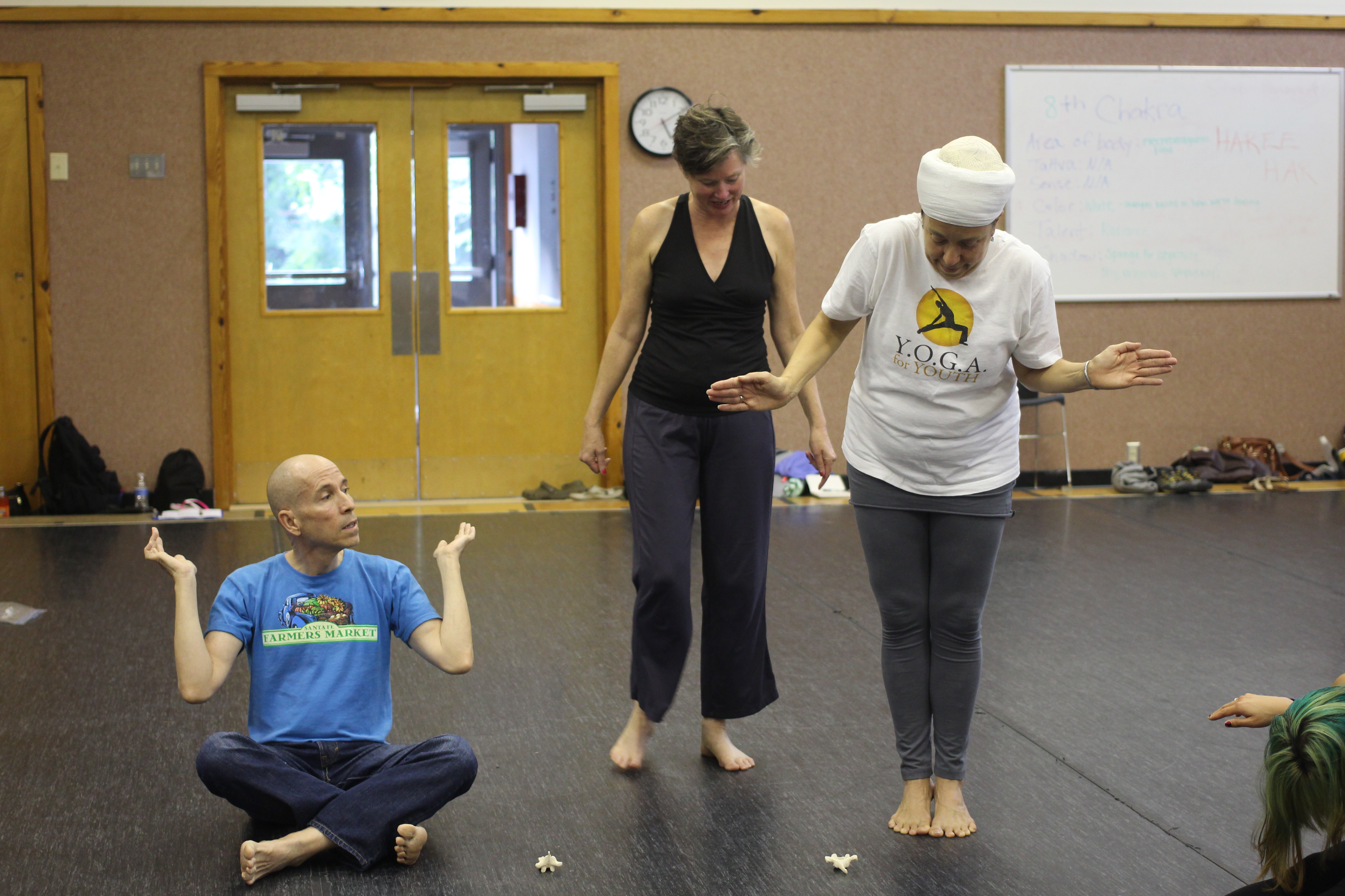
Photos by Rita Lo; Writing by Robin Smith

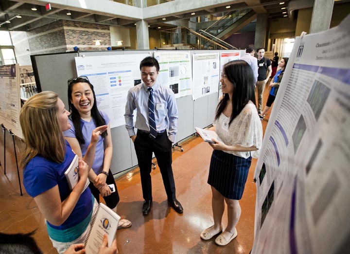
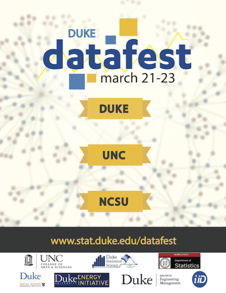
While many students’ eyes were on the NCAA Tournament this weekend, a different kind of tournament was taking place at the Edge. Students from Duke and five other area schools set up camp amidst a jumble of laptops and power cords and white boards for DataFest, a 48-hour stats competition with real-world data. Now in its fourth year at Duke, the event has grown from roughly two dozen students to more than 220 participants.

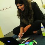
Teams of two to five students had 48 hours to make sense of a single data set. The data was kept secret until the start of the competition Friday night. Consisting of visitor info from a popular comparison shopping site, it was spread across five tables and several million rows.

“The size and complexity of the data set took me by surprise,” said junior David Clancy.

For many, it was their first experience with real-world data. “In most courses, the problems are guided and it is very clear what you need to accomplish and how,” said Duke junior Tori Hall. “DataFest is much more like the real world, where you’re given data and have to find your own way to produce something meaningful.”

“I didn’t expect the challenge to be so open-ended,” said Duke junior Greg Poore. “The stakeholder literally ended their ‘pitch’ to the participants with the company’s goals and let us loose from there.”

As they began exploring the data, the Poke.R team discovered that 1 in 4 customers spend more than they planned. The team then set about finding ways of helping the company identify these “dream customers” ahead of time based on their demographics and web browsing behavior — findings that won them first place in the “best insight” category.

“On Saturday afternoon, after 24 hours of working, we found all the models we tried failed miserably,” said team member Hong Xu. “But we didn’t give up and brainstormed and discussed our problems with the VIP consultants. They gave us invaluable insights and suggestions.”

Consultants from businesses and area schools stayed on hand until midnight on both Friday and Saturday to answer questions. Finally, on Sunday afternoon the teams presented their ideas to the judges.

Seniors Matt Tyler and Justin Yu of the Type 3 Errors team combined the assigned data set with outside data on political preferences to find out if people from red or blue cities were more likely to buy eco-friendly products.

“I particularly enjoyed DataFest because it encouraged interdisciplinary collaboration, not only between members from fields such as statistics, math, and engineering, but it also economics, sociology, and, in our case, political science,” Yu said.

The Bayes’ Anatomy team won the best visualization category by illustrating trends in customer preferences with a flow diagram and a network graph aimed at improving the company’s targeting advertising.

“I was just very happily surprised to win!” said team member and Duke junior Michael Lin.

Mapping Science: The Power of Visualization

By Lyndsey Garcia

Mobile Landscapes: Using Location Data from Cell Phones for Urban Analysis

Mobile Landscapes: Using Location Data from Cell Phones for Urban Analysis

We are constantly surrounded by visuals: television, advertisements and posters. Humans have been using visuals such as cartographic maps of the physical world to help guide our exploration and serve as a reminder of what we have already learned.

But as research has moved into more abstract environments that are becoming more difficult to interact with or visualize, the art of science mapping has emerged to serve as a looking glass to allow us to effectively interpret the data and discern apparent outliers, clusters and trends.

Now on display from from January 12 to April 10, 2015, the exhibit Places & Spaces: Mapping Science serves as a fascinating and intriguing example of the features and importance of science mapping.

The end result of a ten-year effort with ten new maps added each year, all one hundred maps are present at Duke at three different locations: the Edge in Bostock Library, the third floor of Gross Hall, and the second floor of Bay 11 in Smith Warehouse.

Visualizing Bible Cross-References

Visualizing Bible Cross-References

Science maps take abstract concepts of science and make them more visible, concrete, and tangible. The scope of the exhibit is broad, including science maps of the internet, emerging pandemics in the developing world, even the mood of the U.S. based on an analysis of millions of public tweets. Science mapping is not limited to the natural or technological sciences. Several maps visualize social science data such as Visualizing Bible Cross Connections and Similarities Throughout the Bible, where the axis represents the books of the Bible and the arches portray connections or similar phraseology between the books.

Angela Zoss, the exhibit ambassador who brought the project to Duke, comments, “The visualization helps at multiple phases of the research process. It helps the researcher communicate the data and understand his or her data better. When we try to summarize things with equations or summary statistics, such as the average, the mean, or the median, we could be glossing over very important patterns or trends in the data. With visualization, we can often visualize every single point in space for small data sets. One might be able to detect a pattern that you would never have been lost in simple summary statistics.”

The physical exhibit holds importance to the Places & Spaces project due to the physical printing of the maps. Some of the details on the maps are so intricate that they require an in-person viewing of the map in order to appreciate and understand the information portrayed. Such as, A Chart Illustrating Some of the Relations Between the Branches of Natural Science and Technology, is a hand-drawn map from 1948 showing the relationships between the branches of natural sciences and technology by using a distance-similarity metaphor, in which objects more similar to each other are more proximate in space.

A Chart Illustrating Some of the Relations between the Branches of Natural Science and Technology. Used by permission of the Royal Society

The maps look more like works of art in a museum than a collection of maps to interpret data. Angela Zoss explains her love of visualization as, “Visual graphics can inspire an emotion and excitement in people. It can encourage people to feel for information that would otherwise seem dry or intangible. The exhibit heightens those emotions even more because you see so many wonderful examples from so many different viewpoints. Every visualizing person is going to make a different choice in the details they want represented. Being able to see that variety gives people a better idea of how much more is possible.”

Fruit flies get their close-up shot, Nobel style

By Robin Ann Smith

Any movie that begins with an extreme close-up of the back side of a fruit fly — the same kind found feeding on over-ripe tomatoes and bananas in your kitchen — may seem like an unlikely candidate for action blockbuster of the year. But this is no typical movie.

https://www.youtube.com/watch?v=fwzIUnKNw0s

Duke biologists Dan Kiehart and Serdar Tulu recorded this 3D close-up of a developing fly embryo using new super-resolution microscope technology developed by Eric Betzig, one of the winners of the 2014 Nobel Prize in Chemistry.

Cutting-edge microscopes available on many campuses today allow researchers to take one or two images a second, but with a new technique called lattice light-sheet microscopy — developed by Betzig and colleagues and reported in the Oct. 24, 2014, issue of Science — researchers can take more than 50 images a second, and in the specimen’s natural state, without smooshing it under a cover slip.

Kiehart and Tulu traveled to the Howard Hughes Medical Institute’s Janelia Farm research campus in Ashburn, Virginia, where the new microscope is housed, to capture the early stages of a fruit fly’s development from egg to adult in 3D.

Fruit fly embryos are smaller than a grain of rice. By zooming in on an area of the fly embryo’s back that is about 80 microns long and 80 microns wide — a mere fraction of the size of the period at the end of this sentence — the researchers were able to watch a line of muscle-like cells draw together like a purse string to close a gap in the fly embryo’s back.

The process is a crucial step in the embryo’s development into a larva. It could help researchers better understand wound healing and spina bifida in humans.

Their movie was assembled from more than 250,000 2D images taken over 100 minutes. The hundreds of thousands of 2D snapshots were then transferred to a computer, which used image-processing software to assemble them into a 3D movie.

“This microscope gives us the highest combination of spatial and temporal resolution that we can get,” Kiehart said.

Betzig won this year’s Nobel Prize for his work on techniques that allow researchers to peer inside living cells and resolve structures smaller than 200 nanometers, or half the wavelength of light — a scale once thought impossible using traditional light microscopes.

Even finer atomic-scale resolution has long been possible with microscopes that use beams of electrons rather than light, but only by killing and slicing the specimen first, so living cells and the tiny structures in motion inside them couldn’t be observed.

Betzig and collaborators Wesley Legant, Kai Wang, Lin Shao and Bi-Chang Chen of Janelia Farm Research Campus all played a role in developing this newest microscope, which creates an image using a thin sheet of patterned light.

The fly movie is part of a collection of videos recorded with the new technology and published in the Oct. 24 Science paper.

One video in the paper shows specialized tubes inside cells called microtubules — roughly 2,000 times narrower than a human  hair — growing and shrinking as they help one cell split into two.

Other videos reveal the motions of individual cilia in a single-celled freshwater creature called Tetrahymena, or cells of a soil-dwelling slime mold banding together to form multicellular slugs.

Kiehart and Tulu will be going back to Janelia Farm in January to use the microscope again.

“For this visit we’re going to zoom in to a smaller area to look at individual cells,” Tulu said.

“Waking up the morning of October 8 and hearing on the radio that our paper includes a Nobel Prize winner was pretty special,” Kiehart said.

CITATION: “Lattice light-sheet microscopy: Imaging molecules to embryos at high spatiotemporal resolution,” Chen, B.-C., et al. Science, October 2014. http://www.sciencemag.org/content/346/6208/1257998

3D Storytelling of Livia’s Villa

by Anika Radiya-Dixit

blog1pic

Eva Pietroni is in charge of the 3D modeling project, “Livia’s Villa Reloaded”

Have you ever pondered upon how 3D virtual realities are constructed? Or the potential to use them to tell stories about architectural masterpieces built millenniums ago?

The 5th International Conference on Remote Sensing in Archaeology held in the Fitzpatrick Center this weekend explored new technologies such as remote sensing, 3D reconstruction, and 3D printing used by the various facets of archaeology.

In her talk about a virtual archeology project called “Livia’s Villa Reloaded,” Eva Pietroni, art historian and co-director of the Virtual Heritage Lab in Italy, explored ways to integrate 3D modeling techniques into a virtual reality to best describe the history behind the reconstruction of the villa. The project is dedicated to the Villa Ad Gallinas Albas, which Livia Drusilla took as dowry when she married Emperor Augustus in the first century B.C.

The archeological landscape and the actual site have been modeled with 3D scenes in a Virtual Reality application with guides situated around the area to explain to tourists details of the reconstruction. The model combined images from the currently observable landscape and the potential ancient landscape — derived from both hypotheses and historical references. Many parts of the model have been implemented in the Duke Immersive Virtual Environment (DiVE).

Instead of using simple 3D characters to talk to the public, the team decided to try using real actors who talked in front of a small virtual set in front of a green screen. They used a specialized cinematic camera and played around with lighting and filtering effects to obtain the best shots of the actor that would later be put into the virtual environment. Pietroni expressed her excitement at the numerous feats the team was able to accomplish especially since they were not limited by rudimentary technology such as joysticks and push buttons. As a result, the 3D scenes have been implemented by testing the “grammar of gesture” — or in other words, the interactivity of the actor performing mid-air gestures — in a virtual environment. Hearteningly, the public has been “attracted by this possibility,” encouraging the team to work on better enhancing the detailed functionalities that the virtual character is able to perform. In her video demonstration, Pietroni showed the audience the Livia’s villa being reconstructed in real time with cinematographic paradigms and virtual set practices. It was extremely fascinating to watch as the video moved smoothly over the virtual reality, giving a helicopter view of the reconstruction.


Screen Shot 2014-10-14 at 9.24.55 PM

Helicopter view of the villa

One important point that Pietroni emphasized was testing how much freedom of exploration to give to the user. Currently, the exploration mode — indicated by the red dots hovering over the bird in the bottom left corner of the virtual reality — has a predefined camera animation path, since the site is very large, to prevent the user from getting lost. At the same time, the user has the ability to interrupt this automated navigation to look around and rotate the arm to explore the area. As a result, the effect achieved is a combination of a “movie and a free exploration” that keeps the audience engaged for the most optimal length of time.

Another feature provided in the menu options allows the user to navigate to a closer view of a specific part of the villa. Here, the user can walk through different areas of the villa, through kitchens and gardens, with guides located in specific areas that activate once the user has entered the desired region. This virtual storytelling is extremely important in being able to give the user a vicarious thrill in understanding the life and perspective of people living in ancient times. For example, a guide dressed in a toga in a kitchen explained the traditions held during mealtimes, and another guide in the private gardens detailed the family’s sleeping habits. The virtual details of the private garden were spectacular and beautiful, each leaf realistically swaying in the wind, each flower so well created that one could almost feel the texture of the petals as they strolled past.


Screen Shot 2014-10-14 at 9.24.39 PM

Guide talking about a kitchen in the villa

Screen Shot 2014-10-14 at 9.25.15 PM

Strolling through the gardens

The novelty of the “Livia’s Villa Reloaded” project is especially remarkable because the team was able to incorporate new archeological findings about the villa, rather than simply creating a system from old data without ever updating the visual aspects. Sometimes, as the speaker noted, this required the team to entirely reconfigure the lighting of a certain part of the villa when new data came in, so unfortunately, the project is not yet automatic. Of course, to ultimately improve the application, the team often queries the public on specific aspects they liked and disliked, and perhaps in the future, the virtual scenes of the villa may be developed to a perfection that they will be confused with reality itself.


See details about the conference at: http://space2place.classicalstudies.duke.edu/program/dive

Artistic Anatomy: An Exploration of the Spine

By Olivia Zhu

How many times have you acted out the shape of a vertebra with your body? How many times have you even imagined what each of your vertebrae looks like?

On Wednesday, October 1, Kate Trammell and Sharon Babcock held a workshop on the spine as part of the series, Namely Muscles. In the interactive session, they pushed their audience members to gain a greater awareness of their spines.

Participants assemble vertebrae and discs of the spine

Participants assemble vertebrae and discs of the spine

Trammell and Babcock aim to revolutionize the teaching of anatomy by combining art, mainly through dance, and science. They imagine that a more active, participatory learning style will allow students from all backgrounds to learn and retain anatomy information much better. Babcock, who received her Ph.D. in anatomy from Duke, emphasized how her collaboration with Trammell, a dancer and choreographer, allowed her to truly internalize her study of anatomy. The workshop participants, who included dancers and scientists alike, also reflected a fusion of art and science.

Trammell observes the living sculptures of thoracic vertebrae

Trammell observes the living sculptures of thoracic vertebrae

To begin the exploration of the spine, Trammell and Babcock had participants close their eyes and feel models of individual vertebrae to gain tactile perception. Trammell and Babcock then instructed participants to make the shape of the vertebrae they felt with their bodies, creating a living sculpture garden of various interpretations of vertebrae–they pointed out key aspects of vertebrae as they walked through the sculptures.

Finally, Trammell and Babcock taught movement: in small groups, people played the roles of muscles, vertebrae, and spinal discs. They worked on interacting with accurate movements (for example, muscles only pull; they cannot push) to illustrate different movements of the spine.

Interactive illustration of a muscle pulling vertebrae

Interactive illustration of a muscle pulling vertebrae


To complete the series, Trammell performed Namely, Muscles, choreographed by Claire Porter, on October 4th  at the Ark.

Mathematical Restoration of Renaissance Masterpieces

Screen Shot 2014-09-21 at 10.41.22 PM

The Ghissi Masterpiece, missing the ninth panel

By Olivia Zhu

Ninth panel of the Ghissi masterpiece, as reconstructed by Charlotte Caspers

Ninth panel of the Ghissi masterpiece, as reconstructed by Charlotte Caspers

What do Renaissance masterpieces and modern medical images have in common?

The same mathematical technique, “oriented elongated filters,” originally developed to detect blood vessels in medical images can actually be used to detect cracks in digital images of antiquated Renaissance paintings.

On September 19, Henry Yan, Rowena Gan, and Ethan Levine, three undergraduate students at Duke, presented their work on oriented elongated filters and many other techniques to the Math Department. Yan, Gan, and Levine performed summer research to detect and correct cracks in the digitized Ghissi masterpiece, an altarpiece done by 14-century Italian painter Francescuccio di Cecco Ghissi. The altarpiece originally consisted of nine panels, but one was lost in the annals of history and has been recently reconstructed by artist and art historian Charlotte Caspers.

The role of the three undergrads was to digitally rejuvenate the panels of the Ghissi masterpiece, which had faded and accumulated cracks in paint layers because of weathering factors like pressure and temperature. Using various mathematical analysis techniques based in Matlab, including oriented elongated filters, linear combinations of 2-D

Henry Yan's K-SVD analysis to detect cracks in the image at left

Henry Yan’s K-SVD analysis to detect cracks in the image at left

Gaussian kernels (which essentially create directional filters), K-SVD (which updates atoms to better fit an image), and multi-scale top-hat (which extracts small elements and details from an image), the research group created a “crack map,” which they overlaid on the original image.

Then they instructed the computer to fill in the cracks with the colors directly adjacent to the cracks, thereby creating a smoother, crack-free image—this method is called inpainting.

In the future, Yan, Gan, and Levine hope to optimize the procedures they have already developed to accomplish color remapping to digitally age or refurbish images so that they look contemporary to their historical period, and to digitally restore gilding, the presence of gold leaf on paintings.

Visibly Thinking about Undergrad Research

By Karl Leif Bates

Undergraduate research is kind of a big deal at Duke.

The grand finale of nearly 200 of this year’s undergrad projects was a giant poster session called “Visible Thinking,” hosted by the Office of Undergraduate Research Support  on April 22.

Happy and relieved students sharing posters at Visible Thinking 2014. (Megan Morr, Duke Photo)

Happy and relieved students sharing posters at Visible Thinking 2014. (Megan Morr, Duke Photo)

This annual showcase just keeps getting bigger, louder and more crowded, which is a great testament to the involvement of undergrads in all areas of Duke’s research enterprise.

The posters and proud students wearing their interview suits filled all the common areas of the first and second levels of the French Family Science Center on Tuesday and spilled into a few out-of-the-way corners as well.

“For many of the students this is the culmination of their four years, in which they’ve made that transition from student to scholar,” said Ron Grunwald, director of the URS office. “They’re no longer simply learning what other people have discovered, they’re discovering things on their own.”

Indeed, Rebecca Leylek wasn’t the least bit discouraged by having to check her experiment every six hours around the clock for days on end to see how the mice’s wounds were healing. The second phase of her project was a protocol she developed and got approval for and it didn’t have the six-hour part. She’s off to grad school at Stanford in immunology.

Ani Saraswathula, who co-chaired the Duke Undergraduate Research Society, apparently missed the deadline for getting his poster into the printed program, but his science on brain tumors was pretty awesome. He’s sticking around after graduation for an MD/PhD at Duke.

The new Bass Connections research teams brought nearly two dozen posters, showing off projects about energy, environmental health, art history, online education, cognitive development,  and decision-making.

And then, there was just an amazing assortment of stinky lemurs and pathogenic yeast and budding investigators talking curious faculty and students through amazing posters like this: Understanding the role of BNP signaling in pak-3 mediated suppression of synaptic bouton defects in spastin null Drosophila.

So, in addition to quizzing the young scientists about their findings, we thought we’d ask a few of them to recite their impressive poster titles from memory:

[youtube http://www.youtube.com/watch?v=HWJWEs427WM?rel=0]

Sign Up For Datafest 2014 to Work on Mystery Big Data

DATAFESTFLYER


Heads up Duke undergrads and graduate students — here’s an opportunity to hang out in the beautifully renovated Gross Hall, get creative with your friends using big data and compete for cash prizes and statistics fame.

Datafest, a data analysis competition that started at UCLA, is in its third year in the Triangle. Every year, a mystery client provides a dataset that teams can analyze, tinker with and visualize however they’d like over the course of a weekend. Think hackathon, but for data junkies.

“The datasets are bigger and more complex than what you’ll see in a classroom, but they’re of general interest,” said organizer Mine Çetinkaya-Rundel, an assistant professor of the practice in the Duke statistics department. “We want to encourage students from all levels.”

Last year’s mystery client was online dating website eHarmony (you can read about it here), and teams investigated everything from heightism to Myers-Briggs personality matches in online dating. In 2012, the dataset came from Kiva, the  microlending site.

This year’s dataset provider will be revealed on the first day of Datafest. Sign up ends this Friday, March 7, Monday, March 10, so assemble your team and register here!


Students DiVE into the Body to Learn about Addiction

By: Nonie Arora

Dr. Schwartz-Bloom explains the mechanics of the DiVe. Credit: Nonie Arora

Dr. Schwartz-Bloom explains the mechanics of the DiVE. Credit: Nonie Arora

There are not many six-sided, immersive virtual environments in the world–but one of them is at Duke.

Students had the opportunity to dive into pharmacology visualizations with Dr. Rochelle Schwartz-Bloom last week during a tour of the Duke immersive Virtual Environment (DiVE). She explained that the 3D in the DiVE is different from the 3D of a typical movie theater: the glasses have a refresh rate that’s out of sync between the two eyes.

It’s like being inside of a video game. You use a Nintendo-like wand and press buttons to interact with the environment.

We walked through two simulations modeling different aspects of addiction. In the first, we learned why some people are more likely to become alcoholics than others. In the second, we observed the brain changes that underpin addiction to nicotine.

We dove right into the body of an avatar drinking a beer. Some people metabolize alcohol differently than others, depending on their genetic code, Schwartz-Bloom explained.

The simulation was created by a team of students working with Schwartz-Bloom: she assembled a team of students studying biology, chemistry, computer science, electrical and computer engineering and visual arts. They worked together for a year to build the simulation, which explains how alcohol gets oxidized depending on genetics and whether the changes in metabolism increase or decrease the risk for alcoholism.

Students dragging NAD into the active site of the alcohol metabolizing enzyme in the DiVE. Credit: Nonie Arora

Students dragging NAD into the active site of the alcohol metabolizing enzyme in the DiVE. Credit: Nonie Arora

Dr. Schwartz-Bloom explained the advantages of learning about this reaction with a 3D visualization. “Students made this as a game so that others could go in there to make the changes happen – they’d have to grab and move the atoms. The game gives students a real sense of why you need zinc and NAD for this chemical reaction,” Schwartz-Bloom said.

Through the second visualization, we realized why smokers who are addicted generally increase their consumption of cigarettes over time. We saw how repeated exposure to nicotine changes the brain, causing smokers to need more cigarettes over time to get the same pleasurable feelings. The tool can be used in schools to educate students how smoking actually changes the brain, Schwartz-Bloom said.

In the DiVE, I felt like I was on the Magic School Bus, jumping right into the action to learn about pharmacology principles! Free group tours are available at the DiVE between 4:30 and 5:30 on Thursdays.

The Catastrophic Origins of Our Moon

This still from a model shows a planet-sized object just after collision with earth. The colors indicate temperature. (Photo: Robin Canup)

This still from a model shows Earth just after collision with a planet-sized object. The colors indicate temperature. (Photo: Robin Canup)

By Erin Weeks

About 65 million years ago, an asteroid the size of Manhattan collided with the Earth, resulting in the extinction of 75% of the planet’s species, including the dinosaurs.

Now imagine an impact eight orders of magnitude more powerful — that’s the shot most scientists believe formed the moon.

One of the leading researchers of the giant impact theory of the moon’s origin is Robin Canup, associate vice president of the Planetary Science Directorate at the Southwest Research Institute. Canup was elected to the National Academy of Sciences in 2012, and she’s also a graduate of Duke University — where she returned yesterday to give the fifth Hertha Sponer Lecture, named for the physicist and first woman awarded a full professorship in science at Duke.

According to the giant impact hypothesis, another planet-sized object crashed into Earth shortly after its formation 4.5 billion years ago. The catastrophic impact sent an eruption of dust and vaporized rock into space, which coalesced into a disk of material rotating around Earth’s smoldering remains (see a very cool video of one model here).  Over time, that wreckage accreted into larger and larger “planetesimals,” eventually forming our moon.

Physics professor Horst Meyer took this photo of Robin Canup, who was his student as an undergraduate,

Robin Canup (Photo: Horst Meyer, who taught Canup as an undergrad at Duke)

Scientists favor this scenario, Canup said, because it answers a number of questions about our planet’s unusual lunar companion.

For instance, our moon has a depleted iron core, with 10% instead of the usual 30% iron composition. Canup’s models have shown the earth may have sucked up the molten core of the colliding object, leaving the dust cloud from which the moon originated with very little iron in it.

Another mystery is the identical isotopic signature of the moon and the earth’s mantle, which could be explained if the two original bodies mixed, forming a hybrid isotopic composition from the collision.

Canup’s models of the moon’s formation help us understand the evolution of just one (albeit important) cosmic configuration in our galaxy. As for the rest out there, she says scientists are just beginning to plump the depths of how they came to be. Already, the models show “they’re even crazier than the theoreticians imagined.”

Page 6 of 10

Powered by WordPress & Theme by Anders Norén