Reversing more than a decade of flat growth in research funding, the federal budget proposal announced Wednesday includes a $2 billion increase for the National Institutes of Health, the major source of Duke’s federal research funding. The increase would bring NIH’s budget to $32.1 billion.
Budget trends by agency. Graph courtesy of AAAS.
The budget must pass both houses of Congress and be signed by the president to take effect, but the figures being announced are the result of negotiations between House and Senate budget committees.
According to Chris Simmons, Duke’s associate vice president for government relations, other research funds Duke relies on are also slated to increase.
The National Science Foundation’s budget would increase to $7.46 billion, up $119.3 million over 2015.
The Department of Energy’s Office of Science would grow 5.6 percent to $5.35 billion.
NASA science programs would increase 6.6 percent to $5.6 billion.
Simmons added that most of the major research accounts at the Department of Defense (Basic, Applied and Advanced Technology Development) will receive increased funding. “Unfortunately Air Force Research and DARPA will see a cut in their funding by $20 and $25 million, respectively.”
“This expansion of R&D funding is very encouraging news,” said Duke Vice Provost for Research Larry Carin. “Federal investments in university research have long been a powerful engine of the American economy and we’re heartened to see policymakers returning to that commitment.”
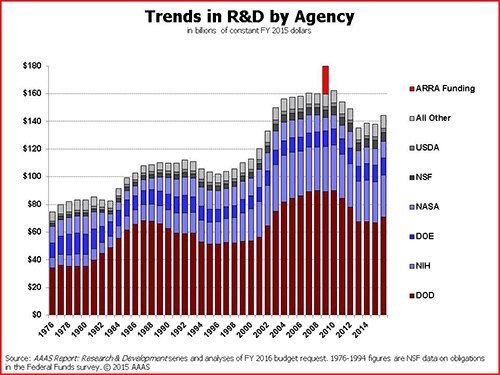
Long-term trends by R&D purpose. Note the little spike for the economic stimulus package. Graph courtesy of AAAS.
Within the increased NIH funding, the budget includes $200 million for the Precision Medicine Initiative, a $350 million increase for Alzheimer’s disease research and an $85 million increase for the BRAIN Initiative.
“Duke has strong research positions in all three of these areas, so we’re pleased by those particular expansions,” Carin said. “Now, of course, our faculty will have to get out there and write the grants that bring that money to North Carolina.”
Duke students are trying to help doctors find a faster way to pinpoint the cause of their patients’ coughs, sore throats and sniffles.
The goal is to better determine if and when to give antibiotics in order to stem the rise of drug-resistant superbugs, said senior Kelsey Sumner.
For ten weeks this summer, Sumner and fellow Duke student Christopher Hong teamed up with researchers at Duke Medicine to identify blood markers that could be used to tell whether what’s making someone sick is a bacteria, or a virus.
More than half of children who go to the doctor for a sore throat, ear infection, bronchitis or other respiratory illness leave with a prescription for antibiotics, even though the majority of these infections — more than 70% — turn out to be caused by viruses, which antibiotics can’t kill.
The end result is that antibiotics are prescribed roughly twice as often as they should be, to the tune of 11.4 million unnecessary prescriptions a year.
“It’s a big problem,” said Emily Ray Ko, MD, PhD, a physician at Duke Regional Hospital who worked with Sumner and Hong on the project, alongside biostatistician Ashlee Valente and infectious disease researcher Ephraim Tsalik of Duke’s Center for Applied Genomics and Precision Medicine.
Prescribing antibiotics when they aren’t needed can make other infections trickier to treat.
Fast, accurate genetic tests may soon help doctors tell if you really need antibiotics. Photo from the Centers for Disease Control and Prevention.
That’s because antibiotics wipe out susceptible bacteria, but a few bacteria that are naturally resistant to the drugs survive, which allows them to multiply without other bacteria to keep them in check.
More than two million people develop drug-resistant bacterial infections each year.
A single superbug known as methicillin-resistant Staphylococcus aureus, or MRSA, kills more Americans every year than emphysema, HIV/ AIDS, Parkinson’s disease and homicide combined.
Using antibiotics only when necessary can help, Ko said, but doctors need a quick and easy test that can be performed while the patient is still in the clinic or the emergency room.
“Most doctors need to know within an hour or two whether someone should get antibiotics or not,” Ko said. “Delaying treatment in someone with a bacterial infection could have serious and potentially life threatening consequences, which is one of the main reasons why antibiotics are over-prescribed.”
With help from Sumner and Hong, the team has identified differences in patients’ bloodwork they hope could eventually be detected within a few hours, whereas current tests can take days.
The researchers made use of the fact that bacteria and viruses trigger different responses in the immune system.
They focused on the genetic signature generated by tiny snippets of genetic material called microRNAs, or miRNAs, which play a role in controlling the activity of other genes within the cell.
Using blood samples from 31 people, ten with bacterial pneumonia and 21 with flu virus, they used a technique called RNA sequencing to compare miRNA levels in bacterial versus viral infections.
So far, the researchers have identified several snippets of miRNA that differ between bacterial and viral infections, and could be used to discriminate between the two.
“Hopefully it could be used for a blood test,” Sumner said.
“One goal of these types of assays could be to identify infections before symptoms even appear,” Ko said. “Think early detection of viral infections like Ebola, for example, where it would be helpful to screen people so you know who to quarantine.”
Sumner and Hong were among 40 students selected for a summer research program at Duke called Data+. They presented their work at the Data+ Final Symposium on July 23 in Gross Hall.
Many students spend their summer breaks going on vacations and relaxing, but not the 40 students selected to participate in Data+, a summer research program at Duke.
They meet twice a week for lunch to share their work on the third floor of Gross Hall.
A pair of pigs and their piglets. Photo by Alan Fryer via Wikimedia commons
Mercy Fang and Mike Ma are working on a research project involving prolific pigs, those that make a lot of piglets. They are trying to determine if the pigs are being priced rationally, whether or not the livestock market is efficient and the number of offspring per pig.
Fang said the most challenging part is the research data. “Converting PDF files of data into words has been hard,” said Fang.
The students are using four agricultural databases to determine the information on the pigs, including pedigrees.
Most of the students in Data+ are rising sophomores and juniors majoring in a variety of majors that include math, statistics, sociology and computer science. The program started in mid-May and runs for 10 weeks and allows students to work on projects using different research methods.
Another group of student that presented on June 18 is working on a research project involving data on food choices.
A produce stand in New York City, photo by Anderskev via Wikimedia Commons.
Kang Ni, Kehan Zhang and Alex Hong are using quantitative methods of study using the “clustering process” to determine a recommendation system for consumers to help them choose healthier food choices. The students are working with The Duke-UNC USDA Center for Behavioral Economics and Healthy Food Choice Research (BECR) center.
“Consumers already recognize a system to get a certain snack,” said Zhang. “We want to re-do a system to help consumers make better choices.”
The students are basing their research on nutrition information and food purchases from the BECR Data warehouse, which comes from consumer information from throughout the US. This includes food purchases and nutrition information from 2008-2012.
Zhang added that the hardest part was keeping up with information.
“It’s a lot of data in the future, and it will be challenging putting it into use,” said Zhang.
Students in attendance said the food choices data research group provided good information.
“I liked the quantitative methods they used to categorize food,” said Ashlee Valante.
The Data+ research program is sponsored and hosted by the Information Initiative at Duke (iiD) and the Social Science Research Institute (SSRI). The funding comes from Bass Connections and from a National Science Foundation grant managed by the Department of Statistical Science.
Ellie Burton’s summer job might be described as “dental detective.”
Using 3-D images of bones, she and teammates Kevin Kuo and GiSeok Choi are teaching a computer to calculate similarities between the fine bumps, grooves and ridges on teeth from dozens of lemurs, chimps and other animals.
They were among more than 50 students — majoring in everything from political science to engineering — who gathered on the third floor of Gross Hall this week for a lunch to share status updates on some unusual summer jobs.
The budding data scientists included 40 students selected for a summer research program at Duke called Data+. For ten weeks from mid-May to late July, students work in small teams on projects using real-world data.
Using a method called “topological data analysis,” Joy Patel and Hans Riess are trying to predict the trajectory and intensity of tropical cyclones based on data from Hurricane Isabel, a deadly hurricane that struck the eastern U.S. in 2003.
The student teams are finding that extracting useful information from noisy and complex data is no simple feat.
Some of the datasets are so large and sprawling that just loading them onto their computers is a challenge.
“Each of our hurricane datasets is a whopping five gigabytes,” said Patel, pointing to an ominous cloud of points representing things like wind speed and pressure.
They encounter other challenges along the way, such as how to deal with missing data.
Andy Cooper, Haoyang Gu and Yijun Li are analyzing data from Duke’s massive open online courses (MOOCs), not-for-credit courses available for free on the Internet.
Duke has offered dozens of MOOCs since launching the online education initiative in 2012. But when the students started sifting through the data there was just one problem: “A lot of people drop out,” Li said. “They log on and never do anything again.”
Some of the datasets also contain sensitive information, such as salaries or student grades. These require the students to apply special privacy or security measures to their code, or to use a special data repository called the SSRI Protected Research Data Network (PRDN).
Lucy Lu and Luke Raskopf are working on a project to gauge the success of job development programs in North Carolina.
One of the things they want to know is whether counties that receive financial incentives to help businesses relocate or expand in their area experience bigger wage boosts than those that don’t.
To find out, they’re analyzing data on more than 450 grants awarded between 2002 and 2012 to hundreds of companies, from Time Warner Cable to Ann’s House of Nuts.
By looking at past giving history, YunChu Huang, Mike Gao and Army Tunjaicon are developing algorithms similar to those used by Netflix to help donors identify other nonprofits that might interest them (i.e., “If you care about Habitat for Humanity, you might also be interested in supporting Heifer International.”)
One of the cool things about the experience is if the students get stuck, they already know other students using the same programming language who they can turn to for help, said Duke mathematician Paul Bendich, who coordinates the program.
…
The other students in the 2015 Data+ program are Sachet Bangia, Nicholas Branson, David Clancy, Arjun Devarajan, Christine Delp, Bridget Dou, Spenser Easterbrook, Manchen (Mercy) Fang, Sophie Guo, Tess Harper, Brandon Ho, Alex Hong, Christopher Hong, Ethan Levine, Yanmin (Mike) Ma, Sharrin Manor, Hannah McCracken, Tianyi Mu , Kang Ni, Jeffrey Perkins, Molly Rosenstein, Raghav Saboo, Kelsey Sumner, Annie Tang, Aharon Walker, Kehan Zhang and Wuming Zhang.
LinkedIn, the social media platform for career-related connections, has a huge problem. The company has a grand vision of making the world economy more efficient at matching workers and jobs by completely mapping the data its 364 million users have posted about their skills, work history, education and professional networks.
The LinkedIn network of blogger Dr. Stephen Chan, circa 2013. (click to view larger)
But that turns out to be a much more gnarly problem than anyone expected. So, the company has done the Internet-age thing and crowd-sourced it.
Two Duke teams are among 11 selected last month from hundreds of proposals to participate in the company’s economic graph challenge. Selection means each team gets $25,000 (not quite enough for one grad student), a special secure LinkedIn laptop granting access to “a monitored sandbox environment,” and a mentor within the company who will stay in regular contact.
They’re supposed to deliver results in a year.
David Dunson, professor of statistical science
A Duke team lead by statistics professor David Dunson seeks to draw a richly detailed 3-D map of the network, making connections by education, skill set, employers and so on. “That’s incredibly difficult,” Dunson said. “With hundreds of millions of users, even a simple network would have 100 million-squared nodes, which is absurd.” His team hopes to develop algorithms to break the computation problems into manageable chunks.
This project, called “Find and change your position in a virtual professional world,” also includes statistics PhD student Joseph Futoma and Yan Shang, a PhD student in operations management at the Fuqua School of Business.
Katherine Heller, assistant professor of statistical and computer science
The other team is trying to pair whole-language analysis of user profiles with a three-dimensional map of a user’s network to speed job connections.
“We could have an awesome algorithm, but if it takes the age of the universe to run: ‘Hey, we’ve got a job for you — if you’re still alive!’” said Katherine Heller, an assistant professor of statistics and computer science. Her team, “Text Mining on Dynamic Graphs” also includes David Banks, professor of the practice in statistical science, and statistics PhD student Sayan Patra.
What the Duke teams are most excited about is the chance to tackle real-world data on a scale that few academics ever get a chance to work with. “These data are super-more interesting,” Dunson said. “It’s amazing to think of all the different things you could do with it.” If the academic teams come up with good solutions, they might be tools that could be used on other big-data problems, he added.
Even if the problems aren’t solved, LinkedIn’s contest has also built a good connection to the Duke campus, Heller notes. “It gives them access to seeing what’s going on in the department and possibly meeting some of the students,” she said.
And that’s the sort of thing that might lead to some new career connections.
LinkedIn logo in their offices. (photo by Search Engine Journal)
Art historians look beyond the big buyers of 18th century paintings
By Robin A. Smith
Coverage of the art market tends to focus on the highest-priced works, like this painting by Paul Gauguin, which fetched a record-breaking $300 million in 2015. Duke researchers are delving beyond the biggest bidders and the most prominent artists to better understand what factors drive the price of art.
Of the billions of dollars of art bought and sold at auctions in New York, London, Paris and Hong Kong this spring, most of the buzz has centered on the highest-priced works. But these are a tiny fraction of what’s up for sale.
An analysis of thousands of painting sales in 18th century Paris looks beyond the top sellers to find out why people were willing to pay more for some works of art than others.
It turns out that then, as now, marketing meant a lot.
“Previous research has tended to focus on the tastes of the most prominent collectors as if they applied to all buyers,” said Duke University art historian Sandra van Ginhoven. “But looking only at the highest-priced paintings does not reveal the full scope of the market. We wanted to go beyond the big names.”
Van Ginhoven and doctoral student Hilary Cronheim of the Duke Art, Law and Markets Initiative analyzed auction catalogs and sales records from art auctions held in Paris over 16 years from 1764 to 1780, compiling a dataset of nearly 3400 paintings.
Unlike the glossy sales catalogs produced by auction houses today, the auction catalogs of the 1700s included text descriptions but no images of the art for sale. Potential buyers had to rely on the descriptions alone, sight unseen, much like a restaurant menu.
By scouring the descriptions of each painting in the sales catalogs that dealers distributed to potential buyers in the months before the auctions, the researchers were able to characterize each painting along 30 traits, including school, dealer and subject matter.
The most expensive painting in the data set was “The Prodigal Son,” by David Teniers, which sold for 29,000 French livres.
Dutch and Flemish paintings commanded some of the steepest prices, bringing in 50 percent more on average than other paintings.
Among the most coveted works was a 1776 painting by top-selling Flemish artist David Teniers, whose “Prodigal Son” fetched a whopping 29,000 French livres.
At the other end of the spectrum were works like a 1768 painting of three rabbits on canvas by an unknown French artist, which was a bargain at one livre, or roughly the price of a gallon of wine.
“The prices varied a lot,” van Ginhoven said.
While the average sale price was 891 livres, half of the paintings auctioned in Paris in the late 1700s sold for 150 livres or less.
While a fraction of the paintings fetched 10,000 livres or more, the vast majority of the paintings sold for less than 200 livres. Flower still life by Jean-Baptiste Monnoyer.
By including these less expensive works by little-known or underappreciated artists and the people who bought them, the researchers were able to get a more complete picture of what drove sales.
Font size mattered, for one.
Using a supersized font in the catalog descriptions to draw attention to certain aspects of a painting, such as its polished finish, boosted sales. Buyers were willing to pay almost six times more for a painting described in big, bold lettering than one described in a normal font.
“It was a very conscious decision on the part of the dealers,” van Ginhoven said. “One dealer started doing it and then it spread to other dealers because it was such a successful marketing strategy.”
Including information about the chain of ownership brought higher bids, too. The tactic was new at the time. Dealers soon discovered that buyers were willing to pay twice as much for a painting when they knew who the previous owner was.
“It meant the painting had already been vetted,” van Ginhoven said.
The researchers shared their findings at the 2015 College Art Association conference in New York in a session titled, “The Meaning of Prices in the History of Art.”
Like impressionist art – such as Monet’s work Sunset – impressionist music does not have fixed structures. Both artforms use the art of abstraction to give a sense of the theme of the work.
On the other hand, classical music, such as sonatas, flows with a rhythmic beat with a clear beginning, middle, and end to the work.
Since there is little theoretical study on the compositional patterns of the contemporary style of music, Duke senior Rowena Gan finds the mathematical exploration of impressionist music quite exciting, as she expressed in her senior thesis presentation April 17.
Sunset: Impressionist art by Claude Monet
Classical music is well known for its characteristic chord progressions, which can be geometrically represented with a torus – or a product of circles – as shown in the figure below.
Torus depicting C major in orange highlight and D minor in blue highlight
By numbering each note, the Neo-Riemannian theory can be used to explain chord progressions in classical music by finding mathematical operations to describe the transitions between the chords.
Expressing chord progressions as mathematical operations
Basic transformations between chords described by the Neo-Riemannian theory.
Similar to a chord, a scale is also a collection of notes. In classical music, scales typically played have seven notes, such as the C major scale below:
C Major Scale.
Impressionist music, however, is marked by the use of exotic scales with different numbers of notes that tend to start at notes off the key center. In that case, how do we represent scales in Impressionist music? One of the ways of representation that Gan explored is by determining the distance between the scales – called interscalar distance – by depicting each scale as a point, and comparing this value to the modulation frequency.
Essentially, the modulation frequency is determined by varying the frequency of the audio wave in order to carry information; a wider range of frequencies corresponds to a higher modulation frequency. For example, the modulation frequency is the same for the pair of notes of D and E as well as F and G, which both have lower modulation frequencies than between notes D and G.
Gan calculated the correlation between modulation frequency and interscalar distance for various musical pieces and found the value to be higher for classical music than for impressionist music. This means that impressionist music is less homogenous and contains a greater variety of non-traditional scale forms.
Gan explores more detailed findings in her paper, which will be completed this year.
Rowena Gan is a senior at Duke in Mathematics. She conducted her research under Professor Ezra Miller, who can be contacted via email here.
While many students’ eyes were on the NCAA Tournament this weekend, a different kind of tournament was taking place at the Edge. Students from Duke and five other area schools set up camp amidst a jumble of laptops and power cords and white boards for DataFest, a 48-hour stats competition with real-world data. Now in its fourth year at Duke, the event has grown from roughly two dozen students to more than 220 participants.
Teams of two to five students had 48 hours to make sense of a single data set. The data was kept secret until the start of the competition Friday night. Consisting of visitor info from a popular comparison shopping site, it was spread across five tables and several million rows.
“The size and complexity of the data set took me by surprise,” said junior David Clancy.
For many, it was their first experience with real-world data. “In most courses, the problems are guided and it is very clear what you need to accomplish and how,” said Duke junior Tori Hall. “DataFest is much more like the real world, where you’re given data and have to find your own way to produce something meaningful.”
“I didn’t expect the challenge to be so open-ended,” said Duke junior Greg Poore. “The stakeholder literally ended their ‘pitch’ to the participants with the company’s goals and let us loose from there.”
Winners of best visualization: Greg Poore, Tori Hall, Michael Lin and David Clancy of the team Bayes’ Anatomy
Winners of best insight:, Yang Su, Ruofei Wang, Yiyun Gu, Hong Xu and Yikun Zhou of the team Poke.R
Winners of best use of outside data: Matt Tyler and Justin Yu of the team Type 3 Errors
As they began exploring the data, the Poke.R team discovered that 1 in 4 customers spend more than they planned. The team then set about finding ways of helping the company identify these “dream customers” ahead of time based on their demographics and web browsing behavior — findings that won them first place in the “best insight” category.
“On Saturday afternoon, after 24 hours of working, we found all the models we tried failed miserably,” said team member Hong Xu. “But we didn’t give up and brainstormed and discussed our problems with the VIP consultants. They gave us invaluable insights and suggestions.”
Consultants from businesses and area schools stayed on hand until midnight on both Friday and Saturday to answer questions. Finally, on Sunday afternoon the teams presented their ideas to the judges.
Seniors Matt Tyler and Justin Yu of the Type 3 Errors team combined the assigned data set with outside data on political preferences to find out if people from red or blue cities were more likely to buy eco-friendly products.
“I particularly enjoyed DataFest because it encouraged interdisciplinary collaboration, not only between members from fields such as statistics, math, and engineering, but it also economics, sociology, and, in our case, political science,” Yu said.
The Bayes’ Anatomy team won the best visualization category by illustrating trends in customer preferences with a flow diagram and a network graph aimed at improving the company’s targeting advertising.
“I was just very happily surprised to win!” said team member and Duke junior Michael Lin.