Following the people and events that make up the research community at Duke

Students exploring the Innovation Co-Lab

Category: Data Page 10 of 11

Geography and the Web: A new frontier for data vizualization

A GIS Day earth cake made by the Collegiate Baker

You might be forgiven if you missed GIS Day at The Levine Science Research Center Nov. 18, but it was your loss. Students and faculty enjoyed a delightful geography-themed afternoon of professional panels, lightning talks, and even a geospatial research-themed cake contest.

What is GIS and why is it important?

Geographic information systems (GIS) give us the power to visualize, question, analyze, and interpret data to understand relationships, patterns, and trends in the world around us. Those who work with data and analytics have a responsibility to contribute to this change by helping us make the right decisions for our future. As noted during ESRI’s 2015 User Conference in the video below, “We have a unique ability to impact and shape the world around us. [Yet] for all of our wisdom, our vast intellectual marvels, we still choose a path of unsustainability and continue to make decisions that negatively impact the Earth and ourselves. […]We must accept our responsibility as stewards of the Earth. […] We must apply our best technology, our best thinking, our best values. Now is the time to act. Now is the time for change.”


How does GIS help?

Doreen Whitley Rogers, Geospatial Information Officer for the National Audubon Society, led a lively discussion about GIS and the World Wide Web at Duke’s GIS Day. She said GIS is essential to understand what is happening in the geographic space around us. As GIS becomes increasingly web-based, efficiently distributing the system to other people is crucial in a time when new data about the environment is being created every second.

3D map displaying the height of buildings that birds hit windows

3D map displaying the height of buildings at which birds fly into windows in Charlotte, NC

Rogers and her team are aiming to move authoritative GIS data to web for visualizations and create a centralized system with the potential to change our culture and transform the world. As the technology manager, she is working on bringing the information to people with proper security and integrity.

In order to get people to use GIS data in a generalized way, Rogers needed to implement several core capabilities to assist those integrating GIS into their workflow. These include socializing GIS as a technology to everybody, creating mobile apps to work with data in real time, and 3D maps such as this one of bird-strikes in downtown Charlotte.

Case Studies

ClimateWatch helps us predict the seasonal behaviour plants and animals.

Mobile apps connecting to the GIS platform promise a strong “return on mission” due to the vast number of people using maps on phones. By mobilizing everyone to use GIS and input data about birds and geography in their area, the platform quickly scales over millions of acres. In the Bahamas, an  app allows users to take pictures to support bird protection programs.

ClimateWatch is an app that gives us a better understanding of how bird habitats are affected during temperature and rainfall variations – motivating people to speak up and act towards minimizing anthropogenic climate change. Developed by Earthwatch with the Bureau of Meteorology and The University of Melbourne, the app enables every Australian to be involved in collecting and recording data to help shape the country’s scientific response to climate change.

Virtual simulation of scenic flights as an endangered bird.

Virtual simulation of scenic flights from the perspective of an endangered bird.

Apps such as the 3-D flight map give users the vicarious thrill of cruising through nature landscapes from the view of endangered birds.

With the movements toward cleaning air and water in our communities, our planet’s birds will once again live in healthier habitats. As the Audubon Society likes to say: “Where birds thrive, people prosper.”


For more information about bird-friendly community programs, you can visit Audubon‘s site or send them a message.

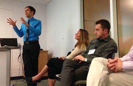
Doreen Rogers after her presentation on National GIS day.


To learn more about data visualization in GIS, you can contact Doreen Whitley Rogers via email here.

Anika_RD_hed100_2

Post by Anika Radiya-Dixit

Duke co-hosts THInC: Triangle Health Innovation Challenge

Blue Devils and Tar Heels may be rivals on the court, but there is little doubt they can be partners in research and innovation.

DSC_0937

Participants broke into teams, and spent the weekend working on their solutions.

Last weekend, the Duke School of Medicine Innovation and Entrepreneurship Activity Group and the Carolina Health Entrepreneurship Initiative jointly organized the first ever Triangle Health Innovation Challenge (THInC), a 48-hour ‘hackathon’  that brought together students, clinicians, engineers, and business people from around the Triangle to collaborate on solving problems in healthcare and medicine.

The organizers wanted to tap into the collective knowledge of the Triangle to tackle healthcare problems in novel ways, and to engage individuals who did not necessarily see themselves as healthcare innovators.

“We realized that the Triangle has an immense pool of academic, clinical, and technical talent, but these groups of people rarely interact,” said co-organizer Tanmay Gokhale, an M.D./Ph.D. student in Biomedical engineering at Duke. “We wanted to bring them all into the same room and empower them to make a difference in healthcare.”

DSC_0991

Teams had the chance to meet with mentors, who advised them on their ideas and business strategies.

On Friday, the first evening of the event, 127 participants pitched 44 different healthcare problems, proposed 25 solutions, and broke into 15 teams that were, for the most part, interdisciplinary and involved members from across the Triangle.

Many Pratt School of Engineering students, both undergraduate and graduate, participated in the event, and several were members of  winning teams.

Each team worked through the weekend, designing and creating a product that delivered on a proposed solution. The projects ranged from evaluating treatment and clinic options for patients through a mobile app, to informing future patients by crowdsourcing opinions and advice from people who had experienced similar medical situations.

IMG_2786

Teams, judges, and audience members gathered in the Trent Semans Center for Health Education on Sunday afternoon for the final presentations.

The ingenuity and quality of the solutions that were presented on Sunday afternoon was stunning; each team had drawn from their own firsthand experiences with the shortcomings and challenges of the healthcare system to deliver targeted, nuanced products that tackled meaningful issues.

In a time-cap of three minutes, each team presented the fruits of their weekend of hacking, and were judged not only on their creativity and technical complexity, but also on clinical and business feasibility. Four winners were awarded $13,000 in cash and credits to work with the API (programming interface) of Validic, a Durham company that collects de-identified patient data from medical devices, wearables and apps.

Team Tiba, the winner of the grand prize, created a wearable physical therapy activity tracker to ensure that patients performed their physical therapy exercises regularly and correctly.

Team Breeze, winner of the runner-up prize, presented a smart lung function trainer and app to encourage pursed-lip breathing exercises in patients with chronic obstructive pulmonary disease (COPD).

Team Leia, the winners of the Mosaic Health Solutions prize, developed a digital to-do list for physicians, which integrated intimately with stores of data in order to send live push notifications about patient updates and prioritize different actions for different studies. The team hoped to improve

Team Tiba, winners of the Grand Prize and the Validic mHealth Prize, pose after the awards ceremony.

Team Tiba, winners of the Grand Prize and the Validic mHealth Prize, pose after the awards ceremony.

patient and physician satisfaction as well as patient safety, by assuring that doctors were up to date on conditions and constantly in sync with changes and improvements. Their prototype piggybacked off of current medical APIs, and queried existing data, making it easy for the roughly 150,000 clinicians who already store their data online to easily transition to the app.

Given the immense success of THInC, the organizers said they’re already planning to do it again next year. They’d like to recruit more students as well as more professional developers and programmers so that more teams could come away with a functioning prototype of their solution.

For any questions regarding the event, or planning, promoting, or executing next year’s event, please contact info@thincweekend.org. Interested individuals can also join the Health 2.0 NC Triangle group to participate in other similar events and meet similarly minded people in the area – all are welcome!

Anika Ayyar_100Post By Anika Ayyar

Life and Death on the Frontiers of Global Health

IMG_3461Vision, according to Mark Dybul, is the biggest problem in public health.

Dybul, the Executive Director of the Global Fund to Fight AIDS, Tuberculosis, and Malaria, and former head of the President’s Emergency Plan for AIDS Relief (PEPFAR), appeared at Duke on Sept. 16 for the Sanford School of Public Policy’s Egan lecture. The event was co-sponsored by the Duke Global Health Institute and the Kenan Institute for Ethics.

The format was like a meeting of the minds as Michael Gerson, Washington Post columnist, former speechwriter for George W. Bush, and Pamela and Jack Egan Visiting Professor at Duke, interviewed Dybul.

Gerson and Dybul probed fundamental questions such as how to effectively empower health efforts, socioeconomic disparity in health aid efforts, the role of science in public health, and trends in AIDS treatment methods.

Dybul opened by painting a picture of the landscape of AIDS in Africa in the epoch before serious AIDS efforts. He described the streets of Uganda “clogged with coffins,” an atmosphere thick with the expectation of imminent death.  He said the implications of this desolate psychology spread far beyond the human body, decreasing motivation for education or investment.

Dybul stressed that a program focused on vision, methods, and results is necessary in order to alleviate the AIDS epidemic, rather than a paternalistic approach gauged  only by the sheer amount of money given to an issue and the amount of aid distributed.

He said that bilateral aid organizations, many of which are based in the U.S., are necessarily attached to governments across oceans and thus inspire a certain degree of distrust with local communities. Global Fund, for example, serves as a mechanism for countries to organize anti-AIDS efforts, rather than the directing organization.

The reasons for the measured success of Global Fund, Dybul admitted, are unclear, largely due to the inability of separating variables in live populations. “Public health is art,” he added. The positive impact of Global Fund is indisputable, with decreased numbers of casual sex partners and increased use of condoms contributing to the reduced spread of AIDS in African nations.

When Gerson asked about the future of public health, Dybul predicted a relative increase in the prevalence of non-communicable disease; however, he forecasted that the more important question will be: “Who pays [for treatment]?”

Dybul also projected a vision of a worldwide, cohesive data management system to provide surveillance as a preventative measure in communities — “being smart” about epidemics. Dybul emphasized that public health extends deep into the community and suggested that the term “global health” may evolve into “country health” as relief efforts become more locally-based.

Dybul advised aspiring students to focus on what excites you, yet be open to new opportunities.

View a video of the entire talk (1:18) —

[youtube https://www.youtube.com/watch?v=-HHZyraZ574]


Olivia_Zhu_100 By Olivia Zhu

Visualizing Crystals of the Cosmos

The beautiful mathematical structure of Penrose patterns have advanced our understanding of quasicrystals, a new breed of high-tech physical materials discovered in meteorites. Like all physical materials, these are collections of one or a few types of “particles” – atoms, molecules, or larger units – that are arranged in some pattern. The most familiar patterns are crystalline arrangements in which a simple unit is repeated in a regular way.

Periodic pattern of the honeycomb

During last Friday’s Visualization Forum, Josh Socolar, a Duke physics professor, conveyed his enthusiasm for the exotic patterns generated by non-periodic crystalline structures to a large audience munching on barbecue chicken and Alfredo pasta in the LSRC (Levine Science Research Center). Unlike many of the previous talks on visualizing data, Professor Socolar is not trying to find a new technique of visualization, but rather aims to emphasize the importance of visualizing certain structures.

Equations in chemistry for calculating vibrations when a material is heated are often based on the assumption that the material has a uniform structure such as the honeycomb pattern above. However, the atoms of a non-periodic crystalline object will behave differently when heated, making it necessary to revise the simplified mathematical models – since they can no longer be applied to all physical materials.

Quasicrystals, one type of non-periodic structured material, can be represented by the picture below. The pattern contains features with 5-fold symmetry of various sizes (highlighted in red, magenta, yellow, and green).

Quasicrystal structure with 5-fold symmetry

Quasicrystal structure with 5-fold symmetry

Drawing straight lines within each tile – as shown on the bottom half of the diagram below – produces lines running straight through the material with various lengths. Professor Socolar computed the lengths of these line segments and was amazed to discover that they follow the Fibonacci sequence. This phenomenon was recently discovered to occur naturally in icosahedrite, a rare and exotic mineral found in outer space.

Lines drawn through a quasicrystal structure

Lines drawn through a quasicrystal structure

By using software programs like Mathematica, we can create 3D images and animations for the expansion of such quasicrystal structures (a) as well as computing Sierpinski patterns formed when designing other types of non-periodic tile shapes (b).

Still of animation of expanding quasicrystal tiles - that looks like a cup of coffee.

(a) Still of animation of expanding quasicrystal tiles – that looks like a cup of coffee.

(b)

(b) Sierpinski triangle pattern drawn for other non-periodic tile shapes

(b) Recolored diagram of

(b) Recolored diagram of Sierpinski triangle pattern

Most importantly, Professor Socolar concludes, neither the Fibonacci nor non-periodic Penrose patterns would have been identified in quasicrystal structures without the visualization tools we have today. With Fibonacci sequence patterns discovered in the sunflower seed spiral as well as in the structure of the icosahedrite meteorite, we have found yet another mathematical point of unity between our world and the rest of the cosmos.

Professor Socolar taking questions from the audience.

Professor Socolar taking questions from the audience.

Post by Anika Radiya-Dixit

Pinpointing the Cause of Coughs and Sneezes

Duke students are trying to help doctors find a faster way to pinpoint the cause of their patients’ coughs, sore throats and sniffles.

The goal is to better determine if and when to give antibiotics in order to stem the rise of drug-resistant superbugs, said senior Kelsey Sumner.

For ten weeks this summer, Sumner and fellow Duke student Christopher Hong teamed up with researchers at Duke Medicine to identify blood markers that could be used to tell whether what’s making someone sick is a bacteria, or a virus.

More than half of children who go to the doctor for a sore throat, ear infection, bronchitis or other respiratory illness leave with a prescription for antibiotics, even though the majority of these infections — more than 70% — turn out to be caused by viruses, which antibiotics can’t kill.

The end result is that antibiotics are prescribed roughly twice as often as they should be, to the tune of 11.4 million unnecessary prescriptions a year.

“It’s a big problem,” said Emily Ray Ko, MD, PhD, a physician at Duke Regional Hospital who worked with Sumner and Hong on the project, alongside biostatistician Ashlee Valente and infectious disease researcher Ephraim Tsalik of Duke’s Center for Applied Genomics and Precision Medicine.

Prescribing antibiotics when they aren’t needed can make other infections trickier to treat.

Fast, accurate genetic tests may soon help doctors tell if you really need antibiotics. Photo from the Centers for Disease Control and Prevention.

Fast, accurate genetic tests may soon help doctors tell if you really need antibiotics. Photo from the Centers for Disease Control and Prevention.

That’s because antibiotics wipe out susceptible bacteria, but a few bacteria that are naturally resistant to the drugs survive, which allows them to multiply without other bacteria to keep them in check.

More than two million people develop drug-resistant bacterial infections each year.

A single superbug known as methicillin-resistant Staphylococcus aureus, or MRSA, kills more Americans every year than emphysema, HIV/ AIDS, Parkinson’s disease and homicide combined.

Using antibiotics only when necessary can help, Ko said, but doctors need a quick and easy test that can be performed while the patient is still in the clinic or the emergency room.

“Most doctors need to know within an hour or two whether someone should get antibiotics or not,” Ko said. “Delaying treatment in someone with a bacterial infection could have serious and potentially life threatening consequences, which is one of the main reasons why antibiotics are over-prescribed.”

With help from Sumner and Hong, the team has identified differences in patients’ bloodwork they hope could eventually be detected within a few hours, whereas current tests can take days.

The researchers made use of the fact that bacteria and viruses trigger different responses in the immune system.

They focused on the genetic signature generated by tiny snippets of genetic material called microRNAs, or miRNAs, which play a role in controlling the activity of other genes within the cell.

Using blood samples from 31 people, ten with bacterial pneumonia and 21 with flu virus, they used a technique called RNA sequencing to compare miRNA levels in bacterial versus viral infections.

So far, the researchers have identified several snippets of miRNA that differ between bacterial and viral infections, and could be used to discriminate between the two.

“Hopefully it could be used for a blood test,” Sumner said.

“One goal of these types of assays could be to identify infections before symptoms even appear,” Ko said. “Think early detection of viral infections like Ebola, for example, where it would be helpful to screen people so you know who to quarantine.”

Sumner and Hong were among 40 students selected for a summer research program at Duke called Data+. They presented their work at the Data+ Final Symposium on July 23 in Gross Hall.

Data+ is sponsored by the Information Initiative at Duke, the Social Sciences Research Institute and Bass Connections. Additional funding was provided by the National Science Foundation via a grant to the departments of mathematics and statistical science.

RobinSmith_hed100


Writing by Robin Smith; photos and video by Christine Delp and Hannah McCracken


Summer Data+ Groups Pursue Pigs and Purchases

Many students spend their summer breaks going on vacations and relaxing, but not the 40 students selected to participate in Data+, a summer research program at Duke.

They meet twice a week for lunch to share their work on the third floor of Gross Hall.

A pair of pigs and their piglets. Photo by Alan Fryer via Wikimedia commons

A pair of pigs and their piglets. Photo by Alan Fryer via Wikimedia commons

Mercy Fang and Mike Ma are working on a research project involving prolific pigs, those that make a lot of piglets. They are trying to determine if the pigs are being priced rationally, whether or not the livestock market is efficient and the number of offspring per pig.

Fang said the most challenging part is the research data. “Converting PDF files of data into words has been hard,” said Fang.
The students are using four agricultural databases to determine the information on the pigs, including pedigrees.

Most of the students in Data+ are rising sophomores and juniors majoring in a variety of majors that include math, statistics, sociology and computer science. The program started in mid-May and runs for 10 weeks and allows students to work on projects using different research methods.

Another group of student that presented on June 18 is working on a research project involving data on food choices.

A produce stand in New York City, photo by Anderskev via Wikimedia Commons.

A produce stand in New York City, photo by Anderskev via Wikimedia Commons.

Kang Ni, Kehan Zhang and Alex Hong are using quantitative methods of study using the “clustering process” to determine a recommendation system for consumers to help them choose healthier food choices. The students are working with The Duke-UNC USDA Center for Behavioral Economics and Healthy Food Choice Research (BECR) center.

“Consumers already recognize a system to get a certain snack,” said Zhang. “We want to re-do a system to help consumers make better choices.”

The students are basing their research on nutrition information and food purchases from the BECR Data warehouse, which comes from consumer information from throughout the US. This includes food purchases and nutrition information from 2008-2012.

Zhang added that the hardest part was keeping up with information.
“It’s a lot of data in the future, and it will be challenging putting it into use,” said Zhang.

Students in attendance said the food choices data research group provided good information.

“I liked the quantitative methods they used to categorize food,” said Ashlee Valante.

The Data+ research program is sponsored and hosted by the Information Initiative at Duke (iiD) and the Social Science Research Institute (SSRI).  The funding comes from Bass Connections and from a National Science Foundation grant managed by the Department of Statistical Science.

Warren_Shakira_hed100Guest post by Shakira Warren, NCCU Summer Intern

So You Want to Be a Data Scientist

Ellie Burton’s summer job might be described as “dental detective.”

Using 3-D images of bones, she and teammates Kevin Kuo and GiSeok Choi are teaching a computer to calculate similarities between the fine bumps, grooves and ridges on teeth from dozens of lemurs, chimps and other animals.

They were among more than 50 students — majoring in everything from political science to engineering — who gathered on the third floor of Gross Hall this week for a lunch to share status updates on some unusual summer jobs.

The budding data scientists included 40 students selected for a summer research program at Duke called Data+. For ten weeks from mid-May to late July, students work in small teams on projects using real-world data.

Another group of students is working as high-tech weather forecasters.

Using a method called “topological data analysis,” Joy Patel and Hans Riess are trying to predict the trajectory and intensity of tropical cyclones based on data from Hurricane Isabel, a deadly hurricane that struck the eastern U.S. in 2003.

The student teams are finding that extracting useful information from noisy and complex data is no simple feat.

Some of the datasets are so large and sprawling that just loading them onto their computers is a challenge.

“Each of our hurricane datasets is a whopping five gigabytes,” said Patel, pointing to an ominous cloud of points representing things like wind speed and pressure.

They encounter other challenges along the way, such as how to deal with missing data.

Andy Cooper, Haoyang Gu and Yijun Li are analyzing data from Duke’s massive open online courses (MOOCs), not-for-credit courses available for free on the Internet.

Duke has offered dozens of MOOCs since launching the online education initiative in 2012. But when the students started sifting through the data there was just one problem: “A lot of people drop out,” Li said. “They log on and never do anything again.”

Some of the datasets also contain sensitive information, such as salaries or student grades. These require the students to apply special privacy or security measures to their code, or to use a special data repository called the SSRI Protected Research Data Network (PRDN).

Lucy Lu and Luke Raskopf are working on a project to gauge the success of job development programs in North Carolina.

One of the things they want to know is whether counties that receive financial incentives to help businesses relocate or expand in their area experience bigger wage boosts than those that don’t.

To find out, they’re analyzing data on more than 450 grants awarded between 2002 and 2012 to hundreds of companies, from Time Warner Cable to Ann’s House of Nuts.

Another group of students is analyzing people’s charitable giving behavior.

By looking at past giving history, YunChu Huang, Mike Gao and Army Tunjaicon are developing algorithms similar to those used by Netflix to help donors identify other nonprofits that might interest them (i.e., “If you care about Habitat for Humanity, you might also be interested in supporting Heifer International.”)

One of the cool things about the experience is if the students get stuck, they already know other students using the same programming language who they can turn to for help, said Duke mathematician Paul Bendich, who coordinates the program.

The other students in the 2015 Data+ program are Sachet Bangia, Nicholas Branson, David Clancy, Arjun Devarajan, Christine Delp, Bridget Dou, Spenser Easterbrook, Manchen (Mercy) Fang, Sophie Guo, Tess Harper, Brandon Ho, Alex Hong, Christopher Hong, Ethan Levine, Yanmin (Mike) Ma, Sharrin Manor, Hannah McCracken, Tianyi Mu , Kang Ni, Jeffrey Perkins, Molly Rosenstein, Raghav Saboo, Kelsey Sumner, Annie Tang, Aharon Walker, Kehan Zhang and Wuming Zhang.

Data+ is sponsored by the Information Initiative at Duke, the Social Sciences Research Institute and Bass Connections. Additional funding was provided by the National Science Foundation via a grant to the departments of mathematics and statistical science.

Writing by Robin Smith; video by Christine Delp and Hannah McCracken


Two Duke Teams Attempting to Map LinkedIn Universe

LinkedIn, the social media platform for career-related connections, has a huge problem.  The company has a grand vision of making the world economy more efficient at matching workers and jobs by completely mapping the data its 364 million users have posted about their skills, work history, education and professional networks.

http://www.stevenchanmd.com/weblog/2013/08/visualize-your-connections-through-linkedin/

The LinkedIn network of blogger Dr. Stephen Chan, circa 2013. (click to view larger)

But that turns out to be a much more gnarly problem than anyone expected. So, the company has done the Internet-age thing and crowd-sourced it.

Two Duke teams are among 11 selected last month from hundreds of proposals to participate in the company’s economic graph challenge. Selection means each team gets $25,000 (not quite enough for one grad student), a special secure LinkedIn laptop granting access to “a monitored sandbox environment,” and a mentor within the company who will stay in regular contact.

They’re supposed to deliver results in a year.

David Dunson of Duke

David Dunson, professor of statistical science

A Duke team lead by statistics professor David Dunson seeks to draw a richly detailed 3-D map of the network, making connections by education, skill set, employers and so on. “That’s incredibly difficult,” Dunson said. “With hundreds of millions of users, even a simple network would have 100 million-squared nodes, which is absurd.” His team hopes to develop algorithms to break the computation problems into manageable chunks.

This project, called “Find and change your position in a virtual professional world,” also includes statistics PhD student Joseph Futoma and Yan Shang, a PhD student in operations management at the Fuqua School of Business.

Katherine Heller, assistant professor of statistical and computer science

Katherine Heller, assistant professor of statistical and computer science

The other team is trying to pair whole-language analysis of user profiles with a three-dimensional map of a user’s network to speed job connections.

“We could have an awesome algorithm, but if it takes the age of the universe to run: ‘Hey, we’ve got a job for you — if you’re still alive!’” said Katherine Heller, an assistant professor of statistics and computer science. Her team, “Text Mining on Dynamic Graphs” also includes David Banks, professor of the practice in statistical science, and statistics PhD student Sayan Patra.

What the Duke teams are most excited about is the chance to tackle real-world data on a scale that few academics ever get a chance to work with. “These data are super-more interesting,” Dunson said. “It’s amazing to think of all the different things you could do with it.” If the academic teams come up with good solutions, they might be tools that could be used on other big-data problems, he added.

Even if the problems aren’t solved, LinkedIn’s contest has also built a good connection to the Duke campus, Heller notes. “It gives them access to seeing what’s going on in the department and possibly meeting some of the students,” she said.

And that’s the sort of thing that might lead to some new career connections.

http://www.searchenginejournal.com/

LinkedIn logo in their offices. (photo by Search Engine Journal)

-By Karl Leif Bates

What Affordable Art Can Tell Us About Taste

Art historians look beyond the big buyers of 18th century paintings

By Robin A. Smith

Coverage of the art market tends to focus on the highest-priced works, like this painting by Paul Gauguin, which fetched a record-breaking $300 million in 2015. A new Duke study goes beyond the biggest bidders and the most prominent artists to better understand the factors that drive the price of art.

Coverage of the art market tends to focus on the highest-priced works, like this painting by Paul Gauguin, which fetched a record-breaking $300 million in 2015. Duke researchers are delving beyond the biggest bidders and the most prominent artists to better understand what factors drive the price of art.

Of the billions of dollars of art bought and sold at auctions in New York, London, Paris and Hong Kong this spring, most of the buzz has centered on the highest-priced works. But these are a tiny fraction of what’s up for sale.

An analysis of thousands of painting sales in 18th century Paris looks beyond the top sellers to find out why people were willing to pay more for some works of art than others.

It turns out that then, as now, marketing meant a lot.

“Previous research has tended to focus on the tastes of the most prominent collectors as if they applied to all buyers,” said Duke University art historian Sandra van Ginhoven. “But looking only at the highest-priced paintings does not reveal the full scope of the market. We wanted to go beyond the big names.”

Van Ginhoven and doctoral student Hilary Cronheim of the Duke Art, Law and Markets Initiative analyzed auction catalogs and sales records from art auctions held in Paris over 16 years from 1764 to 1780, compiling a dataset of nearly 3400 paintings.

Unlike the glossy sales catalogs produced by auction houses today, the auction catalogs of the 1700s included text descriptions but no images of the art for sale. Potential buyers had to rely on the descriptions alone, sight unseen, much like a restaurant menu.

By scouring the descriptions of each painting in the sales catalogs that dealers distributed to potential buyers in the months before the auctions, the researchers were able to characterize each painting along 30 traits, including school, dealer and subject matter.

The most expensive painting in the data set was "The Prodigal Son," by David Teniers, which sold for 29,000 French livres.

The most expensive painting in the data set was “The Prodigal Son,” by David Teniers, which sold for 29,000 French livres.

Analyzing the data with Duke statistician Mine Çetinkaya-Rundel and the 16 students in her course, “Sta 112: Better Living with Data Science,” turned up some surprising results.

Dutch and Flemish paintings commanded some of the steepest prices, bringing in 50 percent more on average than other paintings.

Among the most coveted works was a 1776 painting by top-selling Flemish artist David Teniers, whose “Prodigal Son” fetched a whopping 29,000 French livres.

At the other end of the spectrum were works like a 1768 painting of three rabbits on canvas by an unknown French artist, which was a bargain at one livre, or roughly the price of a gallon of wine.

“The prices varied a lot,” van Ginhoven said.

While the average sale price was 891 livres, half of the paintings auctioned in Paris in the late 1700s sold for 150 livres or less.

While a fraction of the paintings fetched 10,000 livres or more, the vast majority of the paintings sold for less than 200 livres, like this flower still life by Jean-Baptiste Monnoyer.

While a fraction of the paintings fetched 10,000 livres or more, the vast majority of the paintings sold for less than 200 livres. Flower still life by Jean-Baptiste Monnoyer.

By including these less expensive works by little-known or underappreciated artists and the people who bought them, the researchers were able to get a more complete picture of what drove sales.

Font size mattered, for one.

Using a supersized font in the catalog descriptions to draw attention to certain aspects of a painting, such as its polished finish, boosted sales. Buyers were willing to pay almost six times more for a painting described in big, bold lettering than one described in a normal font.

“It was a very conscious decision on the part of the dealers,” van Ginhoven said. “One dealer started doing it and then it spread to other dealers because it was such a successful marketing strategy.”

Including information about the chain of ownership brought higher bids, too. The tactic was new at the time. Dealers soon discovered that buyers were willing to pay twice as much for a painting when they knew who the previous owner was.

“It meant the painting had already been vetted,” van Ginhoven said.

The researchers shared their findings at the 2015 College Art Association conference in New York in a session titled, “The Meaning of Prices in the History of Art.”


Bringing a Lot of Energy to Research

By Karl Leif Bates

The Duke Energy Initiative‘s annual research collaboration workshop on May 5 was an update on how the campus-wide alliance of more than 130 faculty has been pursuing its goals of making energy  “accessible, affordable, reliable and clean.” In short, they’ve been busy!

energy posters

Energetic discussion swirled around research posters from graduate student projects and Bass Connections. (Photo: Margaret Lillard)

At the afternoon session in Gross Hall, David Mitzi, professor of mechanical engineering and materials science, led a panel of five-minute updates on energy materials including engineered microbes, computational modeling of materials, solar cells built on plastic rather than glass, and a nanomaterial-based sheet of material that would combine photovoltaics with storage on a single film.

Kyle Bradbury, managing director of the new Energy Data Analytics Lab that works with the ‘big data’ folks at iiD and the social scientists at SSRI, led a panel on the lab’s latest projects. As smart meters and Internet-enabled appliances enter the market, energy analysts will be flooded with new data, Bradbury explained. There should be great potential to improve efficiency and provide customers with useful real-time feedback, but first the torrent of information has to be corralled and analyzed.

energy panel

Kyle Bradbury (standing) moderated a data analytics panel with Leslie Collins and Matt Harding (right).

For one example of what big energy data might do, Bradbury and Electrical and Computer Engineering professor Leslie Collins (his former advisor) have done a pilot study to see if computers could be taught to  pick out roof-top solar arrays in satellite photos.  Nobody actually knows how many arrays there are or how much power they’re producing, Collins said. But without too much fussing around, their first visual search algorithm spotted 92 percent of the arrays correctly in some hand-picked images of California neighborhoods. Ramped up and tweaked, such an automated search could begin to identify just how much residential solar there is, where it is, and roughly how much energy it’s producing.

The third group of researchers, moderated by Energy Initiative associate Daniel Raimi, is working on energy markets and policy, including energy systems modeling and the regulation of green house gasses through the Clean Air Act.

Energy Initiative director Richard Newell said there were 1,400 Duke students enrolled in energy-related courses this year. A first round of six seed-funded research projects was completed and seven new projects have been selected. Eight Bass Connections teams in the energy theme were very productive as well, examining smart grids, solar energy and household energy conservation with teams of undergraduates, graduate students and faculty.

Page 10 of 11

Powered by WordPress & Theme by Anders Norén