Following the people and events that make up the research community at Duke

Students exploring the Innovation Co-Lab

Tag: Data+

Student Wealth and Poverty Across Durham Public Schools, Mapped

New maps of Durham released by students in Duke’s Data+ research program show the Bull City as a patchwork of red, white and pink. But what looks like a haphazardly assembled quilt is actually a picture of the socioeconomic realities facing Durham’s 32,000-plus public school students.

The color patches represent the home values across Durham, showing roughly where more and less affluent students live. The darker the red, the higher-priced their housing.

Like cities and neighborhoods, schools face economic disparities too. Research shows that school segregation by race and class in North Carolina has gotten steadily worse over the last three decades.

A 2024 study by North Carolina State University revealed that the typical low-income student attends schools where more than 70% of their classmates are low-income too — a trend that worsens the achievement gap between the richest and poorest children.

A new student assignment plan that Durham Public Schools is rolling out this year aims to combat that trend by redrawing district boundary lines — the thick black lines on the map — to make schools more diverse and equitable.

But if schools are to tackle economic segregation, they’ll need accurate ways to measure it as Durham continues to grow and change.

As kids across Durham head back to class, some 1500 elementary school students are changing schools this year under the Durham Public Schools Growing Together plan, which aims to increase equity and access across schools.

That was the challenge facing a team in Duke’s Data+ program this summer. For 10 weeks, Duke students Alex Barroso and Dhaval Potdar collaborated with school planners at Durham Public Schools to look at how family wealth and poverty are distributed across the school system.

“Socioeconomic status is a complicated thing,” said Barroso, a Duke junior majoring in statistical science.

For years, the standard way to identify children in need was using free and reduced-price lunch statistics from the National School Lunch Program, along with published income data from the U.S. Census Bureau.

But those numbers can be unreliable, Barroso said.

Changing state and federal policies mean that more districts — including Durham Public Schools — are providing free meals to all students, regardless of their family income. But as a result, schools no longer have an exact count of how many students qualify.

And Census estimates are based on geographic boundaries that can mask important variation in the data when we look more closely.

At a symposium in Gross Hall in July, Barroso pointed to several dark red patches (i.e., more expensive housing) bordering white ones (i.e., more affordable) on one of the team’s maps.

In some parts of the city, homes worth upwards of a million dollars abut modest apartments worth a fraction of that, “which can skew the data,” he said.

The problem with Census estimates “is that everyone who lives in that area is reported as having the same average income,” said team lead Vitaly Radsky, a PhD student at UNC’s School of Education and school planner with Durham Public Schools.

So they took a different approach: using homes as a proxy for socioeconomic status.

Research has confirmed that students from higher-value homes perform better in school as measured by standardized math tests.

The team created a custom script that fetches publicly available data on every home in Durham from sources such as Durham Open Data and the Census, and then automatically exports it to a dashboard that shows the data on a map.

“Every single house is accounted for within this project,” Barroso said.

They ran into challenges. For example, Census data are tied to tracts that don’t necessarily align with the district boundaries used by schools, said Dhaval Potdar, a graduate student in Duke’s Master in Interdisciplinary Data Science.

One takeaway from their analysis, Potdar said, is no one yardstick sums up the economic well-being of every student.

In Durham, the typical public school student lives in a home valued at about $300,000.

But the picture varies widely when you zoom in on different geographic scales and footprints.

It’s also a different story if you account for the significant fraction of Durham families who live among neighbors in a larger building such as an apartment, townhouse or condominium, instead of a single-family home.

Considering a home’s age can change the picture too.

Generally speaking, students who live in more expensive homes come from more affluent families. But in many parts of the U.S., home prices have far outpaced paychecks. That means a home that has soared in value in the years since it was purchased may not reflect a family’s true economic situation today, particularly if their income remained flat.

The team’s data visualizations aim to let school planners look at all those factors.

There are still issues to be ironed out. For example, there’s some work to be done before planners can make apples-to-apples comparisons between a student whose family owns their home versus renting a similar property, Barroso said.

“No data source is perfect,” but the research offers another way of anticipating the shifting needs of Durham students, Radsky said.

“The traditional metrics really aren’t getting at the granular fabric of the Durham community,” said Mathew Palmer, the district’s senior executive director of school planning and operational services.

Research like this helps address questions like, “are we putting our resources where the kids need them the most? And are schools equitable?”

“This analysis gives schools more tools moving forward,” Palmer said.

By Robin Smith (writing) and Wil Weldon (video)

Who Makes Duke? Visualizing 50 Years of Enrollment Data

Millions of data points. Ten weeks. Three Duke undergraduates. Two faculty facilitators. One project manager and one pretty cool data visualization website.

Meet 2020 Data+ team “On Being a Blue Devil: Visualizing the Makeup of Duke Students.”

Undergraduates Katherine Cottrell (’21), Michaela Kotarba (’22) and Alexander Burgin (’23) spent the last two and a half months looking at changes in Duke’s student body enrollment over the last 50 years. The cohort, working with project manager Anna Holleman, professor Don Taylor and university archivist Valerie Gillispie, used data from each of Duke’s colleges spanning back to 1970. Within the project, the students converted 30 years of on-paper data to machine-readable data which was a hefty task. “On Being a Blue Devil” presented their final product during a Zoom-style showcase Friday, July 31: An interactive data-visualization website. The site is live now but is still being edited as errors are found and clarifications are added.

The cover page of the launched interactive application.

The team highlighted a few findings. Over the last 20 years, there has been a massive surge in Duke enrollment of students from North Carolina. Looking more closely, it is possible that grad enrollment drives this spike due to the tendency for grad students to record North Carolina as their home-state following the first year of their program. Within the Pratt School of Engineering, the number of female students is on an upward trend. There is still a prevalent but closing gap in the distribution between male and female undergraduate engineering enrollment. A significant drop in grad school and international student enrollment in 2008 corresponds to the financial crisis of that year. The team believes there may be similar, interesting effects for 2020 enrollment due to COVID-19.

However, the majority of the presentation focused on the website and all of its handy features. The overall goal for the project was to create engaging visualizations that enable users to dive into and explore the historic data for themselves. Presentation attendees got a behind-the-scenes look at each of the site’s pages.

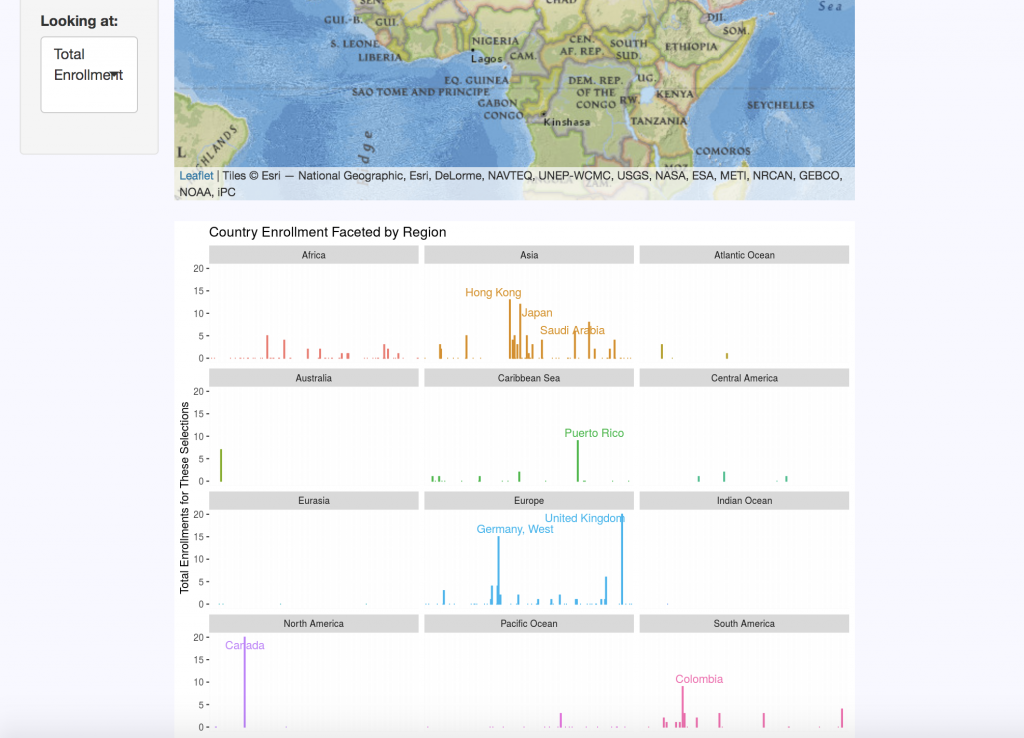
Breakdown of enrollment by region within different countries outside of the United States.

The “Domestic Map” allows website visitors to select the school, year, sex, semester, and state they wish to view. The “International Map” displays the same categories, with regional data replacing state distributions for international countries. Each query returns summary statistics on the number of students enrolled per state or region for the criteria selected.

A “Changes Over Time” tab clarifies data by keeping track of country and territory name changes, as well as changes in programs over the five decades of data. For example, Duke’s nursing program data is a bit complicated: One of its programs ended, then restarted a few years later, there are both undergraduate and graduate nursing schools, and over a decade’s worth of male nursing students are not accounted for in the data sets.

The “Enrollment by Sex” tab displays breakdown of enrollment using the Duke-established binary of male and female categories. This data is visualized in pie charts but can also be viewed as line graphs to look at trends over time and compare trends between schools.

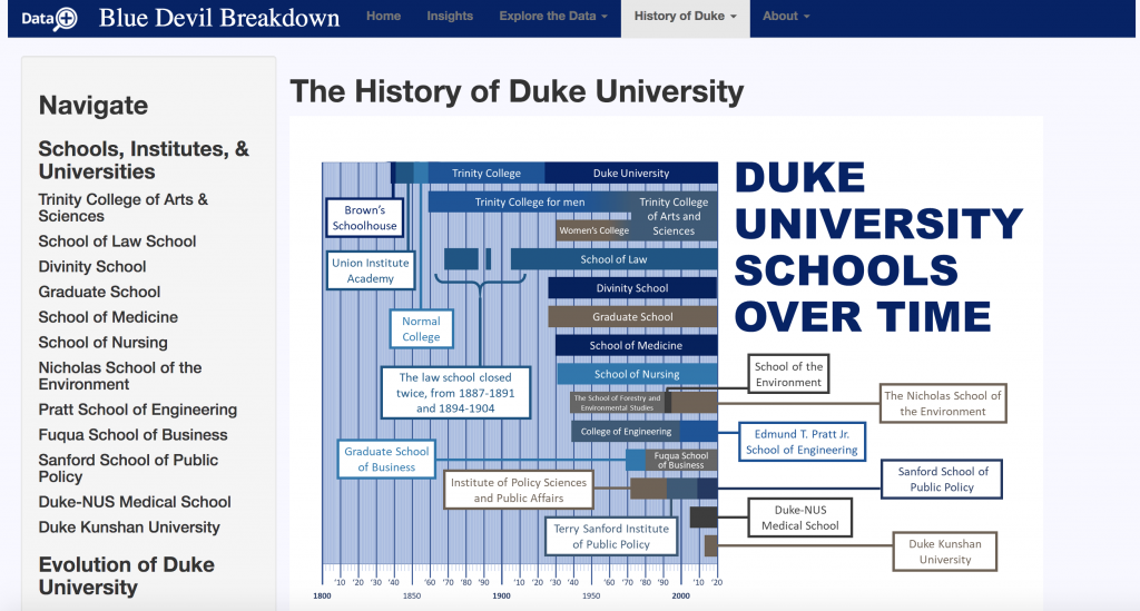
“History of Duke” offers an interactive timeline that contextualizes the origins of each of Duke’s schools and includes a short blurb on their histories. There are also timelines for the history of race and ethnicity at Duke, as well as Duke’s LGBTQ history. Currently, no data on gender identity instead of legal sex was made available for the team. This is why they sought to contextualize the data that they do have. If the project continues, Cottrell, Kotarba, and Burgin strongly suggest that gender identity data be made accessible and included on the site. Racial data is also a top priority for the group, but they simply did not have access to this resource for during the duration of their summer project.  

Timeline of Duke’s various schools since it was founded in the 1830’s.

Of course, like most good websites, there is an “About” section. Here users can meet the incredible team who put this all together, look over frequently asked questions, and even dive deeper into the data with the chance to look at original documents used in the research.

Each of the three undergrads of the “On Being a Blue Devil” team gained valuable transferable skills – as is a goal of Duke’s Data+ program. But the tool they created is likely to go far beyond their quarantined summer. Their website is a unique product that makes data fun to play with and will drive a push for more data to be collected and included. Future researchers could add many more metrics, years, and data points to the tool, causing it to grow exponentially.

Many Duke faculty members are already vying for a chance to talk with the team about their work.  

Powered by WordPress & Theme by Anders Norén