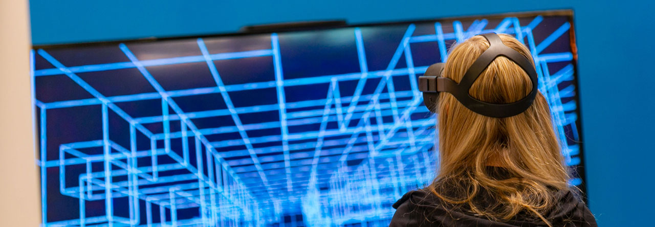
Following the people and events that make up the research community at Duke

Students exploring the Innovation Co-Lab

Category: Visualization Page 5 of 10

The Art of Asking Questions at DataFest 2016

During DataFest, students engaged in intense collaboration. Image courtesy of Rita Lo.

Students engaged in intense collaboration during DataFest 2016, a stats and data analysis competition held from April 1-3 at Duke. Image courtesy of Rita Lo.

On Saturday night, while most students were fast asleep or out partying, Duke junior Callie Mao stayed up until the early hours of the morning pushing and pulling a real-world data set to see what she could make of it — for fun. Callie and her team had planned for months in advance to take part in DataFest 2016, a statistical analysis competition that occurred from April 1 to April 3.

A total of 277 students, hailing from schools as disparate as Duke, UNC Chapel Hill, NCSU, Meredith College, and even one high school, the North Carolina School of Science and Mathematics, gathered in the Edge to extract insight from a mystery data set. The camaraderie was palpable, as students animatedly sketched out their ideas on whiteboard walls and chatted while devouring mountains of free food.

Callie Mao ponders which aspects of data to include in her analysis.

Duke junior Callie Mao ponders which aspects of the data to include in her analysis.

Callie observed that the challenges the students faced at DataFest were extremely unique: “The most difficult part of DataFest is coming up with an idea. In class, we get specific problems, but at DataFest, we are thrown a massive data set and must figure out what to do with it. We originally came up with a lot of ideas, but the data set just didn’t have enough information to fully visualize though.”

At the core, Callie and her team, instead of answering questions posed in class, had to come up with innovative and insightful questions to pose themselves. With virtually no guidance, the team chose which aspects of the data to include and which to exclude.

Another principal consideration across all categories was which tools to use to quickly and clearly represent the data. Callie and her team used R to parse the relevant data, converted their desired data into JSON files, and used D3, a Javascript library, to code graphics to visualize the data. Other groups, however, used Tableau, a drag and drop interface that provided an expedited method for creating beautiful graphics.

Mentors assisted participants with formulating insights and presenting their results

Mentors assisted participants with formulating insights and presenting their results. Image courtesy of Rita Lo.

On Sunday afternoon, students presented their findings to their attentive peers and to a panel of judges, comprised of industry professionals, statistics professors from various universities, and representatives from Data and Visualization Services at Duke Libraries. Judges commended projects based on aspects such as incorporation of other data sources, like Google Adwords, comprehensibility of the data presentation, and the applicability of findings in a real industry setting.

Students competed in four categories:  best use of outside data, best data insight, best visualization, and best recommendation. The Baeesians, pictured below, took first place in best outside data, the SuperANOVA team won best data insight, the Standard Normal team won best visualization, and the Sample Solution team won best recommendation. The winning presentations will be available to view by May 2 at http://www2.stat.duke.edu/datafest/.

Bayesian, the winner of the Best Outside Data category

The Baeasians, winner of the Best Outside Data category at DataFest 2016: Rahul Harikrishnan, Peter Shi, Qian Wang, Abhishek Upadhyaya. (Not pictured Justin Wang) Image courtesy of Rita Lo.


By student writer Olivia Zhu  professionalpicture

When the Data Get Tough, These Researchers Go Visual

Ever wondered what a cleaner shrimp can see?

Or how the force of a footstep moves from particle to particle through a layer of sand?

How about what portion of our renewable energy comes from wind versus solar power?

The winning submission, created by Nicholas School PhD candidate Brandon Morrison, illustrates the flow of agricultural and forestry crops from raw materials to consumer products. The colors correspond to the type of crop – brown for wood, green for vegetables, etc. – and the width of the lines correspond to the quantity of the crop. You can check out the full image and caption on the Duke Data Visualization Flickr Gallery.

The winning submission, created by Nicholas School PhD candidate Brandon Morrison, illustrates the flow of agricultural and forestry crops from raw materials to consumer products. The colors correspond to the type of crop – brown for wood, green for vegetables, etc. – and the width of the lines correspond to the quantity of the crop. You can check out the full image and caption on the Duke Data Visualization Flickr Gallery.

The answers to these questions and more are stunningly rendered in the entries to the 2016 Student Data Visualization Contest, which you can check out now on the Duke Data Visualization Flickr Gallery.

“Visualizations take advantage of our powerful ability to detect and process shapes to reveal detailed trends that you otherwise wouldn’t be able to see,” said Angela Zoss, Data Visualization Coordinator at Duke Data and Visualization Services (DVS), who runs the contest. “This year’s winners were all able to take very complex topics and use visualization to make them more accessible.”

One winner and two finalists were selected from the 14 submissions on the basis of five criteria: insightfulness, broad appeal, aesthetics, technical merit, and novelty. The submissions represent data from all areas of research at Duke – from politics and health to fundamental physics and biology.

“This year’s entrants showed a lot of sophistication and advanced scholarship,” Zoss said.  “We’re seeing more advanced graduate work and multi-year research projects that are really benefiting from visualization.”

Eric Monson, a Data Visualization Analyst with DVS, hopes the contest will inspire more students to consider data visualization when grappling with intricate data sets.

“A lot of this work only gets shared within courses or small academic communities, so it’s exciting to give people this opportunity to have their work reach a broader audience,” Monson said.

Posters of the winning submissions will soon be on display in the Brandaleone Lab for Data and Visualization Services in The Edge on the first floor of Bostock Library.

The second-place entry, by Art History PhD student Katherine McCusker, depicts an archaeological site in Viterbo, Italy. The colored lines indicate the likely locations of buried structures like walls, platforms, and pavement, based on an interpretation of data from ground-penetrating radar (represented by a dark red, yellow, white colormap). You can check out the full image and caption on the Duke Data Visualization Flickr Gallery.

The second-place entry, by Art History PhD student Katherine McCusker, depicts an archaeological site in Viterbo, Italy. The colored lines indicate the likely locations of buried structures like walls, platforms, and pavement, based on an interpretation of data from ground-penetrating radar (represented by a dark red, yellow, white colormap). You can check out the full image and caption on the Duke Data Visualization Flickr Gallery.

Kara J. Manke, PhD

Post by Kara Manke


Geography and the Web: A new frontier for data vizualization

A GIS Day earth cake made by the Collegiate Baker

You might be forgiven if you missed GIS Day at The Levine Science Research Center Nov. 18, but it was your loss. Students and faculty enjoyed a delightful geography-themed afternoon of professional panels, lightning talks, and even a geospatial research-themed cake contest.

What is GIS and why is it important?

Geographic information systems (GIS) give us the power to visualize, question, analyze, and interpret data to understand relationships, patterns, and trends in the world around us. Those who work with data and analytics have a responsibility to contribute to this change by helping us make the right decisions for our future. As noted during ESRI’s 2015 User Conference in the video below, “We have a unique ability to impact and shape the world around us. [Yet] for all of our wisdom, our vast intellectual marvels, we still choose a path of unsustainability and continue to make decisions that negatively impact the Earth and ourselves. […]We must accept our responsibility as stewards of the Earth. […] We must apply our best technology, our best thinking, our best values. Now is the time to act. Now is the time for change.”


How does GIS help?

Doreen Whitley Rogers, Geospatial Information Officer for the National Audubon Society, led a lively discussion about GIS and the World Wide Web at Duke’s GIS Day. She said GIS is essential to understand what is happening in the geographic space around us. As GIS becomes increasingly web-based, efficiently distributing the system to other people is crucial in a time when new data about the environment is being created every second.

3D map displaying the height of buildings that birds hit windows

3D map displaying the height of buildings at which birds fly into windows in Charlotte, NC

Rogers and her team are aiming to move authoritative GIS data to web for visualizations and create a centralized system with the potential to change our culture and transform the world. As the technology manager, she is working on bringing the information to people with proper security and integrity.

In order to get people to use GIS data in a generalized way, Rogers needed to implement several core capabilities to assist those integrating GIS into their workflow. These include socializing GIS as a technology to everybody, creating mobile apps to work with data in real time, and 3D maps such as this one of bird-strikes in downtown Charlotte.

Case Studies

ClimateWatch helps us predict the seasonal behaviour plants and animals.

Mobile apps connecting to the GIS platform promise a strong “return on mission” due to the vast number of people using maps on phones. By mobilizing everyone to use GIS and input data about birds and geography in their area, the platform quickly scales over millions of acres. In the Bahamas, an  app allows users to take pictures to support bird protection programs.

ClimateWatch is an app that gives us a better understanding of how bird habitats are affected during temperature and rainfall variations – motivating people to speak up and act towards minimizing anthropogenic climate change. Developed by Earthwatch with the Bureau of Meteorology and The University of Melbourne, the app enables every Australian to be involved in collecting and recording data to help shape the country’s scientific response to climate change.

Virtual simulation of scenic flights as an endangered bird.

Virtual simulation of scenic flights from the perspective of an endangered bird.

Apps such as the 3-D flight map give users the vicarious thrill of cruising through nature landscapes from the view of endangered birds.

With the movements toward cleaning air and water in our communities, our planet’s birds will once again live in healthier habitats. As the Audubon Society likes to say: “Where birds thrive, people prosper.”


For more information about bird-friendly community programs, you can visit Audubon‘s site or send them a message.

Doreen Rogers after her presentation on National GIS day.


To learn more about data visualization in GIS, you can contact Doreen Whitley Rogers via email here.

Anika_RD_hed100_2

Post by Anika Radiya-Dixit

HTC Vive: A New Dimension of Creativity

“I just threw eggs at the robot!” grad student Keaton Armentrout said to Amitha Gade, a fellow biomedical engineering master’s student.

image2

“He just said, ‘Thank you for the egg, human. Give me another one.’ It was really fun.”

In what world does one throw eggs at grateful robots? In the virtual world of the HTC Vive, a 360 degree room-size virtual reality experience created by Steam and HTC that is now offering demos on the Duke campus from November 9 – 13. There is a noticeable buzz about Vive throughout campus.

I stepped in to the atrium of Fitzpatrick CIEMAS expecting a straightforward demonstration of how to pick up objects and look around in virtual reality. Instead, I found myself standing on the bow of a realistic ship, face to face with a full-size blue whale.

A Tiltbrush drawing I created with HTC Vive during my internship at Google. (Tiltbrush was acquired by Google/Alphabet).

A Tiltbrush drawing I created with HTC Vive during my internship at Google. (Tiltbrush was acquired by Google/Alphabet).

Peering over the side of the shipwreck into a deep ravine, I seriously pondered what would happen if I jumped over the railing –even though both my feet were planted firmly on the ground of CIEMAS.

Armentrout observed that the Vive differentiates itself from other VR devices like Oculus by allowing a full range of motion of the head: “I could actually bend down and look at the floorboards of the ship.”

In Valve’s Aperture Science demo, based on their game Portal, I attempted to repair a broken robot so real it was terrifying. I was nearly blown to bits by my robot overseer when I failed at my task. In total, I progressed through four modules, including the shipwreck, robot repair, a cooking lesson, and Tiltbrush, a three-dimensional drawing experience.

Game developers naturally are pursuing in virtual reality, but technologies like HTC Vive have implications far beyond the gaming realm. One of the applications of the Vive, explained one of the Vive representatives, could be virtual surgeries in medical schools. Medical schools could conserve cadavers by assigning medical students to learn operations on virtual bodies instead of human bodies. The virtual bodies would ideally provide the same experience as the operating room itself, revolutionizing the teaching of hands-on surgical skills.

Gade brainstormed further potential applications, such as using robots controlled by virtual reality to navigate search-and-rescue situations after a crisis, reducing danger to rescue crews.

The first time I tried the HTC Vive was not at Duke; it was at a Tiltbrush art show in San Francisco.

HTC Vive Tiltbrush masterpiece displayed at the San Francisco Tiltbrush art show

HTC Vive Tiltbrush masterpiece displayed at the San Francisco Tiltbrush art show

On the stage, an artist was moving her limbs in grand arcs as she painted the leaves of trees and brushing the ground to create a sparkling river. A large screen projected her virtual 3-D masterpiece for the audience.

Gilded frames on stands emphasized the interactive Vive devices, each of which housed a Tiltbrush masterpiece created by a local artist trained in the technique. Well-dressed attendees marvelled at seemingly invisible waterfalls and starry skies in the virtual reality paintings. Clearly, the Vive, by opening another dimension of artistic creation, is changing our notions of space and pushing the bounds of creativity.

12188016_10204922617616904_5669989382191630573_oBy Olivia Zhu Olivia_Zhu_100

Spice up learning with interactive visualizations

Hannah Jacobs is a Multimedia analyst at the Duke Wired! Lab who aims to change learning the humanities from A to B, much to the excitement of students and faculty packed into the Visualization Friday Forum on Oct. 16. Using visualization as a tool to show connections between space, time, and culture, she hopes to augment the humanities classroom by supplementing lecture with interactive maps and timelines.


BlackAndWhite

Colorful


The virtual maps created for Professor Caroline Bruzelius’ Art History 101 course were built using Omeka’s plugin Neatline, a “geotemporal exhibit builder that allows [the user] to create beautiful, a complex, maps, image annotations, and narrative sequences” such as the Satellite view below.


Demo Neatline visualization


Using the simple interface, Jacobs created a syllabus with an outline of units and individual lectures, each course point connected to written information, point(s) on the map, and period or span on timeline.


Syllabus using Neatline interface


Jacobs also implemented clickable points on the map to display supplementary information, such as specific trade routes used of certain raw materials, video clips, and even links to recent pertinent articles. With such an interface, students are better able to understand how the different lectures move backward and forward in time and make connections with previously learned topics.


Supplementary video clips


For the Art History 101 class,Professor Bruzelius assigned her students a project in which they use Neatline to map the movement of people and materials for a specific culture. One student graphed the Athenian use and acquisition of timber accompanied by an essay with hyperlinks to highlight various parts of the map; another visualized the development of Greek coinage with mapped points of mining locations.


Visualization accompanied by essay

Displaying development of Greek coinage


The students were excited to use the interactive software and found that they learned history more thoroughly than by completing purely paper assignments. Their impressive projects can be viewed on the Art History website.

As we continue to create interactive visualizations for learning, students in the future may study space, time, and culture using a touchscreen display like the one below.


Interactive learning of the future

Interactive learning of the future


hjaccobs

Hannah joined the Wired! Lab in September 2014 after studying Digital Humanities at King’s College London. Previously, she obtained a BA in English/Theatre from Warren Wilson College, and she worked at Duke’s Franklin Humanities Institute from 2011-2013 before departing for London.


Post written by Anika Radiya-Dixit

Visualizing Crystals of the Cosmos

The beautiful mathematical structure of Penrose patterns have advanced our understanding of quasicrystals, a new breed of high-tech physical materials discovered in meteorites. Like all physical materials, these are collections of one or a few types of “particles” – atoms, molecules, or larger units – that are arranged in some pattern. The most familiar patterns are crystalline arrangements in which a simple unit is repeated in a regular way.

Periodic pattern of the honeycomb

During last Friday’s Visualization Forum, Josh Socolar, a Duke physics professor, conveyed his enthusiasm for the exotic patterns generated by non-periodic crystalline structures to a large audience munching on barbecue chicken and Alfredo pasta in the LSRC (Levine Science Research Center). Unlike many of the previous talks on visualizing data, Professor Socolar is not trying to find a new technique of visualization, but rather aims to emphasize the importance of visualizing certain structures.

Equations in chemistry for calculating vibrations when a material is heated are often based on the assumption that the material has a uniform structure such as the honeycomb pattern above. However, the atoms of a non-periodic crystalline object will behave differently when heated, making it necessary to revise the simplified mathematical models – since they can no longer be applied to all physical materials.

Quasicrystals, one type of non-periodic structured material, can be represented by the picture below. The pattern contains features with 5-fold symmetry of various sizes (highlighted in red, magenta, yellow, and green).

Quasicrystal structure with 5-fold symmetry

Quasicrystal structure with 5-fold symmetry

Drawing straight lines within each tile – as shown on the bottom half of the diagram below – produces lines running straight through the material with various lengths. Professor Socolar computed the lengths of these line segments and was amazed to discover that they follow the Fibonacci sequence. This phenomenon was recently discovered to occur naturally in icosahedrite, a rare and exotic mineral found in outer space.

Lines drawn through a quasicrystal structure

Lines drawn through a quasicrystal structure

By using software programs like Mathematica, we can create 3D images and animations for the expansion of such quasicrystal structures (a) as well as computing Sierpinski patterns formed when designing other types of non-periodic tile shapes (b).

Still of animation of expanding quasicrystal tiles - that looks like a cup of coffee.

(a) Still of animation of expanding quasicrystal tiles – that looks like a cup of coffee.

(b)

(b) Sierpinski triangle pattern drawn for other non-periodic tile shapes

(b) Recolored diagram of

(b) Recolored diagram of Sierpinski triangle pattern

Most importantly, Professor Socolar concludes, neither the Fibonacci nor non-periodic Penrose patterns would have been identified in quasicrystal structures without the visualization tools we have today. With Fibonacci sequence patterns discovered in the sunflower seed spiral as well as in the structure of the icosahedrite meteorite, we have found yet another mathematical point of unity between our world and the rest of the cosmos.

Professor Socolar taking questions from the audience.

Professor Socolar taking questions from the audience.

Post by Anika Radiya-Dixit

So You Want to Be a Data Scientist

Ellie Burton’s summer job might be described as “dental detective.”

Using 3-D images of bones, she and teammates Kevin Kuo and GiSeok Choi are teaching a computer to calculate similarities between the fine bumps, grooves and ridges on teeth from dozens of lemurs, chimps and other animals.

They were among more than 50 students — majoring in everything from political science to engineering — who gathered on the third floor of Gross Hall this week for a lunch to share status updates on some unusual summer jobs.

The budding data scientists included 40 students selected for a summer research program at Duke called Data+. For ten weeks from mid-May to late July, students work in small teams on projects using real-world data.

Another group of students is working as high-tech weather forecasters.

Using a method called “topological data analysis,” Joy Patel and Hans Riess are trying to predict the trajectory and intensity of tropical cyclones based on data from Hurricane Isabel, a deadly hurricane that struck the eastern U.S. in 2003.

The student teams are finding that extracting useful information from noisy and complex data is no simple feat.

Some of the datasets are so large and sprawling that just loading them onto their computers is a challenge.

“Each of our hurricane datasets is a whopping five gigabytes,” said Patel, pointing to an ominous cloud of points representing things like wind speed and pressure.

They encounter other challenges along the way, such as how to deal with missing data.

Andy Cooper, Haoyang Gu and Yijun Li are analyzing data from Duke’s massive open online courses (MOOCs), not-for-credit courses available for free on the Internet.

Duke has offered dozens of MOOCs since launching the online education initiative in 2012. But when the students started sifting through the data there was just one problem: “A lot of people drop out,” Li said. “They log on and never do anything again.”

Some of the datasets also contain sensitive information, such as salaries or student grades. These require the students to apply special privacy or security measures to their code, or to use a special data repository called the SSRI Protected Research Data Network (PRDN).

Lucy Lu and Luke Raskopf are working on a project to gauge the success of job development programs in North Carolina.

One of the things they want to know is whether counties that receive financial incentives to help businesses relocate or expand in their area experience bigger wage boosts than those that don’t.

To find out, they’re analyzing data on more than 450 grants awarded between 2002 and 2012 to hundreds of companies, from Time Warner Cable to Ann’s House of Nuts.

Another group of students is analyzing people’s charitable giving behavior.

By looking at past giving history, YunChu Huang, Mike Gao and Army Tunjaicon are developing algorithms similar to those used by Netflix to help donors identify other nonprofits that might interest them (i.e., “If you care about Habitat for Humanity, you might also be interested in supporting Heifer International.”)

One of the cool things about the experience is if the students get stuck, they already know other students using the same programming language who they can turn to for help, said Duke mathematician Paul Bendich, who coordinates the program.

The other students in the 2015 Data+ program are Sachet Bangia, Nicholas Branson, David Clancy, Arjun Devarajan, Christine Delp, Bridget Dou, Spenser Easterbrook, Manchen (Mercy) Fang, Sophie Guo, Tess Harper, Brandon Ho, Alex Hong, Christopher Hong, Ethan Levine, Yanmin (Mike) Ma, Sharrin Manor, Hannah McCracken, Tianyi Mu , Kang Ni, Jeffrey Perkins, Molly Rosenstein, Raghav Saboo, Kelsey Sumner, Annie Tang, Aharon Walker, Kehan Zhang and Wuming Zhang.

Data+ is sponsored by the Information Initiative at Duke, the Social Sciences Research Institute and Bass Connections. Additional funding was provided by the National Science Foundation via a grant to the departments of mathematics and statistical science.

Writing by Robin Smith; video by Christine Delp and Hannah McCracken


Geeky Goggles Let You Take a Field Trip Without Leaving Class

by Robin A. Smith

Kun Li of the Center for Instructional Technology and senior physics major Nicole Gagnon try out a virtual reality headset called Oculus Rift. Photo by Jeannine Sato.

Kun Li of the Center for Instructional Technology and senior physics major Nicole Gagnon try out a virtual reality headset called Oculus Rift. Photo by Jeannine Sato.

On the last day of class, just a few yards from students playing Twister and donning sumo suits, about two dozen people try on futuristic goggles in a windowless conference room.

Behind the clunky headgear, they are immersed in their own virtual worlds.

One woman peers inside a viewer and finds herself underwater, taking a virtual scuba tour.

The sound of breathing fills her headphones and bubbles float past her field of view.

When she looks left or right the image on the screen moves too, thanks to a tiny device called an accelerometer chip — the same gadget built into most smartphones that automatically changes the screen layout from landscape to portrait as the phone moves or tilts.

She turns her head to “swim” past corals and schools of fish. Suddenly a shark lunges at her and bares its razor teeth. “Whoa!” she yelps, taking a half-step back into a table.

A few feet away, virtual reality enthusiast Elliott Miller from Raleigh straps on something that looks like a pair of ski goggles and takes a hyperrealistic roller coaster ride.

He swivels in his office chair for a 100-degree view of the other passengers and the coaster’s corkscrews, twists and turns as he zips along at more than 60 miles per hour, in HD resolution.

“It feels pretty real. Especially when you’re going up a big drop,” Miller said.

Elliott Miller uses a virtual reality headset to take a ride on a real-life roller coaster in Sweden called the Helix. Photo by Jeannine Sato.

Elliott Miller uses a virtual reality headset to take a ride on a real-life roller coaster in Sweden called the Helix. Photo by Jeannine Sato.

Duke senior Nicole Gagnon declines a ride. “I get motion sick,” she said.

Virtual reality headsets like these aren’t in use in Duke classrooms — at least not yet.

Since its beginnings in the mid-1980s, the technology has mostly been developed for the gaming industry.

“[But] with virtual reality becoming more widespread, it won’t be long before it makes it to the classroom,” said Seth Anderson from Duke’s Center for Instructional Technology.

Duke chemistry professor Amanda Hargrove and postdoc Gary Kapral have been testing out ways to use the devices in their chemistry courses.

Thanks to funding from the Duke Digital Initiative, they designed a program that shrinks students down to the size of a molecule and lets them explore proteins and nucleic acids in 3-D.

“We call this demo the ‘Molecular Jungle Gym,’” Kapral said. “You can actually go inside, say, a strand of RNA, and stand in the middle and look around.”

The pilot version uses a standard Xbox-style controller to help students understand how proteins and nucleic acids interact with each other and with other kinds of molecules — key concepts for things like drug design.

Kapral has found that students who use virtual reality show better understanding and retention than students who view the same molecules on a standard computer screen.

“The Duke immersive Virtual Environment (DiVE) facility has been doing this for a long time, but you have to physically go there,” said Elizabeth Evans of the Duke Digital Initiative. “What makes virtual reality headsets like these different is they make virtual reality not only portable but also affordable.”

Duke student Nicole Gagnon peers through a cardboard viewer that turns any smartphone into a virtual reality headset. Photo by Jeannine Sato.

Duke student Nicole Gagnon peers through a cardboard viewer that turns any smartphone into a virtual reality headset. Photo by Jeannine Sato.

Of course, “affordable” is relative. The devices Kapral and Hargrove are using cost more than $300 per headset. But for less than 20 dollars, anyone can turn a smartphone into a virtual reality headset using a simple kit from makers like Google Cardboard, which designs viewers made of folded cardboard.

Critics of virtual reality technology say it’s just another form of escapism, after TV, the Internet and smartphones.

But educational technology advocates see it as a way to help students see and hear and interact with things that would be impossible otherwise, or only available to a lucky few:  to travel back in time and take virtual field trips to historic battlefields as cannon fire fills the air, to visit archeological sites and examine one-of-a-kind cultural artifacts from different angles, or experience different climate change scenarios predicted for the future.

“It’s hard to imagine what one inch versus one foot of sea level rise means unless you stand on a beach and experience it,” Evans said. “Virtual reality could let us give students experiences that are too expensive, too dangerous, or too rare to give them in real life.”

Kapral agrees: “One day students could even do chemistry experiments without worrying about blowing things up.”

Join the mailing list for virtual reality at Duke: https://lists.duke.edu/sympa/subscribe/vr2learn

In a free mobile app called SeaWorld VR, the screen displays two images side by side that the viewer’s brain turns into a 3-D image:

https://www.youtube.com/watch?v=bAlLSGVXLOE

Lights. Camera. Action. Sharpen.

by Anika Radiya-Dixit

On Friday, April 10, while campus was abuzz with Blue Devil Days, a series of programs for newly admitted students, a group of digital image buffs gathered in the Levine Science Research Center to learn about the latest research on image and video de-blurring from Duke electrical and computer engineering professor Guillermo Sapiro. Professor Sapiro specializes in image and signal analysis in the department of Computer and Electrical Engineering in Duke’s Pratt School of Engineering. Working alongside Duke postdoctoral researcher Mauricio Delbracio, Sapiro has been researching methods to remove image blur due to camera shake.

Sapiro’s proposed algorithm is called burst photography, which achieves “state-of-the-art results an order of magnitude faster, with simplicity for on-board implementation on camera phones.” As shown in the image below, this technique combines multiple images, where each has a random camera shake and therefore each image in the burst is blurred slightly differently.

Professor Sapiro explains the basic principle of burst photography.

Professor Sapiro explains the basic principle of burst photography.

To de-blur the image, Sapiro’s algorithm then aligns the images together using a gyroscope and combines them in the Fourier domain. The final result essentially takes the best parts of each slightly-blurred image — such as the ones below — and gives sharpened images a greater weight when averaging blurred images in the burst.

Set of images with varying degrees of linear blur.

Set of images with varying degrees of linear blur.

This technique also produces phenomenal effects in video sharpening by collapsing multiple blurred frames into a single sharpened picture:

Contrast between sample frame of original video (left) with FBA sharpened video (right).

Contrast between sample frame of original video (left) with FBA sharpened video (right).

One impressive feature of burst photography is that it allows the user to obtain a mixed-exposure image by taking multiple images at various levels of exposure, as can be seen in parts (a) and (b) in the figure below, and then combining these images to produce a splendid picture (c) with captivating special effects.

Result of FBA algorithm on combining images with various levels of exposure.

Result of FBA algorithm on combining images with various levels of exposure.

If you are interested in video and image processing, email Professor Sapiro or check out his lab.

Science-Inspired Art

If you’ve ever walked into a biological or medical research lab you might have seen test tubes, pipettes, latex gloves and other gear. Artist and Duke graduate Jessica Johnson walks in and sees… beauty. Her art exhibit “Translating the Exome,” created in collaboration with professor Simon Gregory, PhD, is now on display in the Bryan Center through April 17.

Page 5 of 10

Powered by WordPress & Theme by Anders Norén