Following the people and events that make up the research community at Duke

Students exploring the Innovation Co-Lab

Category: Data

Geometry of Harmony in Impressionist Music

by Anika Radiya-Dixit

Like impressionist art – such as Monet’s work Sunset – impressionist music does not have fixed structures. Both artforms use the art of abstraction to give a sense of the theme of the work.

On the other hand, classical music, such as sonatas, flows with a rhythmic beat with a clear beginning, middle, and end to the work.

Since there is little theoretical study on the compositional patterns of the contemporary style of music, Duke senior Rowena Gan finds the mathematical exploration of impressionist music quite exciting, as she expressed in her senior thesis presentation April 17.

Sunset: Impressionist art by Claude Monet

Sunset: Impressionist art by Claude Monet

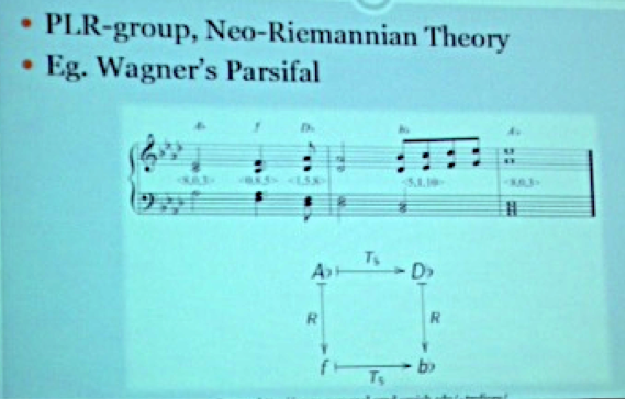
Classical music is well known for its characteristic chord progressions, which can be geometrically represented with a torus – or a product of circles – as shown in the figure below.

Torus depicting C major in orange highlight and D minor in blue highlight

Torus depicting C major in orange highlight and D minor in blue highlight

By numbering each note, the Neo-Riemannian theory can be used to explain chord progressions in classical music by finding mathematical operations to describe the transitions between the chords.

Expressing chord progressions as mathematical operations

Expressing chord progressions as mathematical operations

asic transformations between chords described by the Neo-Riemannian theory.

Basic transformations between chords described by the Neo-Riemannian theory.

Similar to a chord, a scale is also a collection of notes. In classical music, scales typically played have seven notes, such as the C major scale below:

C Major Scale.

C Major Scale.

Impressionist music, however, is marked by the use of exotic scales with different numbers of notes that tend to start at notes off the key center. In that case, how do we represent scales in Impressionist music? One of the ways of representation that Gan explored is by determining the distance between the scales – called interscalar distance – by depicting each scale as a point, and comparing this value to the modulation frequency.

Essentially, the modulation frequency is determined by varying the frequency of the audio wave in order to carry information; a wider range of frequencies corresponds to a higher modulation frequency. For example, the modulation frequency is the same for the pair of notes of D and E as well as F and G, which both have lower modulation frequencies than between notes D and G.

Gan calculated the correlation between modulation frequency and interscalar distance for various musical pieces and found the value to be higher for classical music than for impressionist music. This means that impressionist music is less homogenous and contains a greater variety of non-traditional scale forms.

Gan explores more detailed findings in her paper, which will be completed this year.

Rowena Gan is a senior at Duke in Mathematics. She conducted her research under Professor Ezra Miller, who can be contacted via email here.

Lights. Camera. Action. Sharpen.

by Anika Radiya-Dixit

On Friday, April 10, while campus was abuzz with Blue Devil Days, a series of programs for newly admitted students, a group of digital image buffs gathered in the Levine Science Research Center to learn about the latest research on image and video de-blurring from Duke electrical and computer engineering professor Guillermo Sapiro. Professor Sapiro specializes in image and signal analysis in the department of Computer and Electrical Engineering in Duke’s Pratt School of Engineering. Working alongside Duke postdoctoral researcher Mauricio Delbracio, Sapiro has been researching methods to remove image blur due to camera shake.

Sapiro’s proposed algorithm is called burst photography, which achieves “state-of-the-art results an order of magnitude faster, with simplicity for on-board implementation on camera phones.” As shown in the image below, this technique combines multiple images, where each has a random camera shake and therefore each image in the burst is blurred slightly differently.

Professor Sapiro explains the basic principle of burst photography.

Professor Sapiro explains the basic principle of burst photography.

To de-blur the image, Sapiro’s algorithm then aligns the images together using a gyroscope and combines them in the Fourier domain. The final result essentially takes the best parts of each slightly-blurred image — such as the ones below — and gives sharpened images a greater weight when averaging blurred images in the burst.

Set of images with varying degrees of linear blur.

Set of images with varying degrees of linear blur.

This technique also produces phenomenal effects in video sharpening by collapsing multiple blurred frames into a single sharpened picture:

Contrast between sample frame of original video (left) with FBA sharpened video (right).

Contrast between sample frame of original video (left) with FBA sharpened video (right).

One impressive feature of burst photography is that it allows the user to obtain a mixed-exposure image by taking multiple images at various levels of exposure, as can be seen in parts (a) and (b) in the figure below, and then combining these images to produce a splendid picture (c) with captivating special effects.

Result of FBA algorithm on combining images with various levels of exposure.

Result of FBA algorithm on combining images with various levels of exposure.

If you are interested in video and image processing, email Professor Sapiro or check out his lab.

Got Data? 200+ Crunch Numbers for Duke DataFest

Photos by Rita Lo; Writing by Robin Smith

While many students’ eyes were on the NCAA Tournament this weekend, a different kind of tournament was taking place at the Edge. Students from Duke and five other area schools set up camp amidst a jumble of laptops and power cords and white boards for DataFest, a 48-hour stats competition with real-world data. Now in its fourth year at Duke, the event has grown from roughly two dozen students to more than 220 participants.

Teams of two to five students had 48 hours to make sense of a single data set. The data was kept secret until the start of the competition Friday night. Consisting of visitor info from a popular comparison shopping site, it was spread across five tables and several million rows.

“The size and complexity of the data set took me by surprise,” said junior David Clancy.

For many, it was their first experience with real-world data. “In most courses, the problems are guided and it is very clear what you need to accomplish and how,” said Duke junior Tori Hall. “DataFest is much more like the real world, where you’re given data and have to find your own way to produce something meaningful.”

“I didn’t expect the challenge to be so open-ended,” said Duke junior Greg Poore. “The stakeholder literally ended their ‘pitch’ to the participants with the company’s goals and let us loose from there.”

As they began exploring the data, the Poke.R team discovered that 1 in 4 customers spend more than they planned. The team then set about finding ways of helping the company identify these “dream customers” ahead of time based on their demographics and web browsing behavior — findings that won them first place in the “best insight” category.

“On Saturday afternoon, after 24 hours of working, we found all the models we tried failed miserably,” said team member Hong Xu. “But we didn’t give up and brainstormed and discussed our problems with the VIP consultants. They gave us invaluable insights and suggestions.”

Consultants from businesses and area schools stayed on hand until midnight on both Friday and Saturday to answer questions. Finally, on Sunday afternoon the teams presented their ideas to the judges.

Seniors Matt Tyler and Justin Yu of the Type 3 Errors team combined the assigned data set with outside data on political preferences to find out if people from red or blue cities were more likely to buy eco-friendly products.

“I particularly enjoyed DataFest because it encouraged interdisciplinary collaboration, not only between members from fields such as statistics, math, and engineering, but it also economics, sociology, and, in our case, political science,” Yu said.

The Bayes’ Anatomy team won the best visualization category by illustrating trends in customer preferences with a flow diagram and a network graph aimed at improving the company’s targeting advertising.

“I was just very happily surprised to win!” said team member and Duke junior Michael Lin.

Page 11 of 11

Powered by WordPress & Theme by Anders Norén