Following the people and events that make up the research community at Duke

Students exploring the Innovation Co-Lab

Author: Anika Radiya-Dixit

Spice up learning with interactive visualizations

Hannah Jacobs is a Multimedia analyst at the Duke Wired! Lab who aims to change learning the humanities from A to B, much to the excitement of students and faculty packed into the Visualization Friday Forum on Oct. 16. Using visualization as a tool to show connections between space, time, and culture, she hopes to augment the humanities classroom by supplementing lecture with interactive maps and timelines.


BlackAndWhite

Colorful


The virtual maps created for Professor Caroline Bruzelius’ Art History 101 course were built using Omeka’s plugin Neatline, a “geotemporal exhibit builder that allows [the user] to create beautiful, a complex, maps, image annotations, and narrative sequences” such as the Satellite view below.


Demo Neatline visualization


Using the simple interface, Jacobs created a syllabus with an outline of units and individual lectures, each course point connected to written information, point(s) on the map, and period or span on timeline.


Syllabus using Neatline interface


Jacobs also implemented clickable points on the map to display supplementary information, such as specific trade routes used of certain raw materials, video clips, and even links to recent pertinent articles. With such an interface, students are better able to understand how the different lectures move backward and forward in time and make connections with previously learned topics.


Supplementary video clips


For the Art History 101 class,Professor Bruzelius assigned her students a project in which they use Neatline to map the movement of people and materials for a specific culture. One student graphed the Athenian use and acquisition of timber accompanied by an essay with hyperlinks to highlight various parts of the map; another visualized the development of Greek coinage with mapped points of mining locations.


Visualization accompanied by essay

Displaying development of Greek coinage


The students were excited to use the interactive software and found that they learned history more thoroughly than by completing purely paper assignments. Their impressive projects can be viewed on the Art History website.

As we continue to create interactive visualizations for learning, students in the future may study space, time, and culture using a touchscreen display like the one below.


Interactive learning of the future

Interactive learning of the future


hjaccobs

Hannah joined the Wired! Lab in September 2014 after studying Digital Humanities at King’s College London. Previously, she obtained a BA in English/Theatre from Warren Wilson College, and she worked at Duke’s Franklin Humanities Institute from 2011-2013 before departing for London.


Post written by Anika Radiya-Dixit

Visualizing Crystals of the Cosmos

The beautiful mathematical structure of Penrose patterns have advanced our understanding of quasicrystals, a new breed of high-tech physical materials discovered in meteorites. Like all physical materials, these are collections of one or a few types of “particles” – atoms, molecules, or larger units – that are arranged in some pattern. The most familiar patterns are crystalline arrangements in which a simple unit is repeated in a regular way.

Periodic pattern of the honeycomb

During last Friday’s Visualization Forum, Josh Socolar, a Duke physics professor, conveyed his enthusiasm for the exotic patterns generated by non-periodic crystalline structures to a large audience munching on barbecue chicken and Alfredo pasta in the LSRC (Levine Science Research Center). Unlike many of the previous talks on visualizing data, Professor Socolar is not trying to find a new technique of visualization, but rather aims to emphasize the importance of visualizing certain structures.

Equations in chemistry for calculating vibrations when a material is heated are often based on the assumption that the material has a uniform structure such as the honeycomb pattern above. However, the atoms of a non-periodic crystalline object will behave differently when heated, making it necessary to revise the simplified mathematical models – since they can no longer be applied to all physical materials.

Quasicrystals, one type of non-periodic structured material, can be represented by the picture below. The pattern contains features with 5-fold symmetry of various sizes (highlighted in red, magenta, yellow, and green).

Quasicrystal structure with 5-fold symmetry

Quasicrystal structure with 5-fold symmetry

Drawing straight lines within each tile – as shown on the bottom half of the diagram below – produces lines running straight through the material with various lengths. Professor Socolar computed the lengths of these line segments and was amazed to discover that they follow the Fibonacci sequence. This phenomenon was recently discovered to occur naturally in icosahedrite, a rare and exotic mineral found in outer space.

Lines drawn through a quasicrystal structure

Lines drawn through a quasicrystal structure

By using software programs like Mathematica, we can create 3D images and animations for the expansion of such quasicrystal structures (a) as well as computing Sierpinski patterns formed when designing other types of non-periodic tile shapes (b).

Still of animation of expanding quasicrystal tiles - that looks like a cup of coffee.

(a) Still of animation of expanding quasicrystal tiles – that looks like a cup of coffee.

(b)

(b) Sierpinski triangle pattern drawn for other non-periodic tile shapes

(b) Recolored diagram of

(b) Recolored diagram of Sierpinski triangle pattern

Most importantly, Professor Socolar concludes, neither the Fibonacci nor non-periodic Penrose patterns would have been identified in quasicrystal structures without the visualization tools we have today. With Fibonacci sequence patterns discovered in the sunflower seed spiral as well as in the structure of the icosahedrite meteorite, we have found yet another mathematical point of unity between our world and the rest of the cosmos.

Professor Socolar taking questions from the audience.

Professor Socolar taking questions from the audience.

Post by Anika Radiya-Dixit

A day in the life of a coding bootcamp student

7:45 a.m. – I’m already late. I know I’ve pressed the snooze button at least 4 times again.

8:15 a.m. – Rushing out the door, I balance an omelet sandwich in my right hand and a jumbled set of keys in the other. Already at eight of twelve weeks into the camp, we are learning to write uncomplicated, manageable code when building complex web applications using JavaScript.

8:40 a.m. – I can see sirens on the side of the highway and I resist the urge to groan as I sit impatiently in another traffic jam. The California sun illuminates the dried landscape in a gorgeous golden glow, and I take a moment to enjoy the view.

8:53 a.m. – I’m just in time for the 9:00 am algorithm session. It is my favorite part of the day, when the other students and I work in teams to solve data structure problems on whiteboards. I pair up with a former state trooper and an environmental engineer to figure out an efficient method for creating a linked list. I enjoy discussing our thought processes on finding the solution, sometimes listening to their interpretation, other times explaining my ideas.

10:30 a.m. – Gathering my notebook, I eagerly sit at the front of the room for lecture. Many coding courses are online, but I appreciate the in-person classroom structure where I can easily ask questions about confusing topics. The teacher is clarifying overarching concepts about the flow of instructions through the computer. The lopsided stick figures and feeble diagrams always amuse us, but they do refine my understanding of the subject.

Flow of requests and responses in a typical web application.

11:45 a.m. – “McDonalds?” someone asks, and we give him a look. It’s nearly time for lunch, so some of our classmates head towards the fridge in the kitchen to heat up leftovers, and the rest of us decide where to eat. Compromising on a good lunch spot has proven surprisingly complicated – but quite a useful skill. There’s always a vegetarian, someone who doesn’t like specific foods, someone else who’s already eaten at a place we finally agreed on, and plenty of other variables that can’t be factored into a simple Calculus equation. It feels more along the lines of –

How choosing a place to dine really works.

We end up eating at four different restaurants.

1:00 p.m. – The best part about going to an intensive coding bootcamp are the people. “What do you see as the future of your marketing agency?” “Do you think renting out rooms of your apartment was a good decision?” “How would you recommend negotiating salary?” On our way back to the camp building, I ask my classmates a plethora of questions about the working world, listening to their complaints about housing and tips on building up an enjoyable career life.

2:00 p.m. – We work together on a JavaScript group chat assignment to solidify the learning from morning lecture. I talk with my classmates on which external libraries to use, pair-program the complicated structure of files, and bicker about who changed the code that crashed the app.

6:00 p.m. – As evening ensues, we decide to fuel our minds with soup and sandwiches; despite our mental fatigue after a long day of work, dinner is a pleasant affair.

10:00 p.m. – My partner and I have steadfastly worked the day on our JavaScript online store to sell diamonds, swords, and Lego mugs. It’s gotten late, but I’m still burbling about the features we have yet to code. As I head out the door, keys swinging on my forefinger, I’m already excited for tomorrow – another day to learn, another time to grow with new friends, and another adventure to enjoy.

Advertisement for Lego mugs on my JavaScript online store.

Advertisement for Lego mugs on my JavaScript online store.

Post by Anika Radiya-Dixit, ECE/Comp Sci 2017

Geometry of Harmony in Impressionist Music

by Anika Radiya-Dixit

Like impressionist art – such as Monet’s work Sunset – impressionist music does not have fixed structures. Both artforms use the art of abstraction to give a sense of the theme of the work.

On the other hand, classical music, such as sonatas, flows with a rhythmic beat with a clear beginning, middle, and end to the work.

Since there is little theoretical study on the compositional patterns of the contemporary style of music, Duke senior Rowena Gan finds the mathematical exploration of impressionist music quite exciting, as she expressed in her senior thesis presentation April 17.

Sunset: Impressionist art by Claude Monet

Sunset: Impressionist art by Claude Monet

Classical music is well known for its characteristic chord progressions, which can be geometrically represented with a torus – or a product of circles – as shown in the figure below.

Torus depicting C major in orange highlight and D minor in blue highlight

Torus depicting C major in orange highlight and D minor in blue highlight

By numbering each note, the Neo-Riemannian theory can be used to explain chord progressions in classical music by finding mathematical operations to describe the transitions between the chords.

Expressing chord progressions as mathematical operations

Expressing chord progressions as mathematical operations

asic transformations between chords described by the Neo-Riemannian theory.

Basic transformations between chords described by the Neo-Riemannian theory.

Similar to a chord, a scale is also a collection of notes. In classical music, scales typically played have seven notes, such as the C major scale below:

C Major Scale.

C Major Scale.

Impressionist music, however, is marked by the use of exotic scales with different numbers of notes that tend to start at notes off the key center. In that case, how do we represent scales in Impressionist music? One of the ways of representation that Gan explored is by determining the distance between the scales – called interscalar distance – by depicting each scale as a point, and comparing this value to the modulation frequency.

Essentially, the modulation frequency is determined by varying the frequency of the audio wave in order to carry information; a wider range of frequencies corresponds to a higher modulation frequency. For example, the modulation frequency is the same for the pair of notes of D and E as well as F and G, which both have lower modulation frequencies than between notes D and G.

Gan calculated the correlation between modulation frequency and interscalar distance for various musical pieces and found the value to be higher for classical music than for impressionist music. This means that impressionist music is less homogenous and contains a greater variety of non-traditional scale forms.

Gan explores more detailed findings in her paper, which will be completed this year.

Rowena Gan is a senior at Duke in Mathematics. She conducted her research under Professor Ezra Miller, who can be contacted via email here.

Lights. Camera. Action. Sharpen.

by Anika Radiya-Dixit

On Friday, April 10, while campus was abuzz with Blue Devil Days, a series of programs for newly admitted students, a group of digital image buffs gathered in the Levine Science Research Center to learn about the latest research on image and video de-blurring from Duke electrical and computer engineering professor Guillermo Sapiro. Professor Sapiro specializes in image and signal analysis in the department of Computer and Electrical Engineering in Duke’s Pratt School of Engineering. Working alongside Duke postdoctoral researcher Mauricio Delbracio, Sapiro has been researching methods to remove image blur due to camera shake.

Sapiro’s proposed algorithm is called burst photography, which achieves “state-of-the-art results an order of magnitude faster, with simplicity for on-board implementation on camera phones.” As shown in the image below, this technique combines multiple images, where each has a random camera shake and therefore each image in the burst is blurred slightly differently.

Professor Sapiro explains the basic principle of burst photography.

Professor Sapiro explains the basic principle of burst photography.

To de-blur the image, Sapiro’s algorithm then aligns the images together using a gyroscope and combines them in the Fourier domain. The final result essentially takes the best parts of each slightly-blurred image — such as the ones below — and gives sharpened images a greater weight when averaging blurred images in the burst.

Set of images with varying degrees of linear blur.

Set of images with varying degrees of linear blur.

This technique also produces phenomenal effects in video sharpening by collapsing multiple blurred frames into a single sharpened picture:

Contrast between sample frame of original video (left) with FBA sharpened video (right).

Contrast between sample frame of original video (left) with FBA sharpened video (right).

One impressive feature of burst photography is that it allows the user to obtain a mixed-exposure image by taking multiple images at various levels of exposure, as can be seen in parts (a) and (b) in the figure below, and then combining these images to produce a splendid picture (c) with captivating special effects.

Result of FBA algorithm on combining images with various levels of exposure.

Result of FBA algorithm on combining images with various levels of exposure.

If you are interested in video and image processing, email Professor Sapiro or check out his lab.

Origami-Inspired Chemistry Textbook Brings Molecules To Life

by Anika Radiya-Dixit

Your college textbook pages probably look something like the picture below – traffic jams of black boats on a prosaic white sea.

blackAndWhiteText

Textbook without illustrations.

But instead of reading purely from static texts, what if your chemistry class had 3D touch-screens that allowed you to manipulate the colors and positions of atoms to give you visual sense of how crystal and organic structures align with respect to each other? Or what if you could fold pieces of paper into different shapes to represent various combinations of protein structures? This is the future of science: visualization.

Duke students and staff gathered in the Levine Science Research Center last week to learn more about visualizing chemical compounds while munching on their chili and salad. Robert Hanson, Professor in the Department of Chemistry at St. Olaf College, was enthusiastic to present his research on new ways to visualize and understand experimental data.

Exhibition poster of “Body Worlds”


Hanson opened his talk with various applications of visualization in research. He expressed a huge respect for medical visualization and the people who are able to illustrate medical procedures, because “these artists are drawing what no one can see.” Take “Body Worlds,” for example, he said. One of the most renowned exhibitions displaying the artistic beauty of the human body, it elicited a myriad of reactions from the audience members, from mildly nauseated to animatedly pumped.

Hanson also spoke about the significance of having an effective visualization design. Very simple changes in visualization, such as a table of numbers versus a labeled graph, can make a “big difference in terms of ease of the audience catching on to what the data means.” For example, consider the excerpt of a textbook by J. Willard Gibbs below. One of the earliest chemists to study the relationship between pressure and temperature, Gibbs wrote “incredibly legible, detailed, verbatim notes,” Hanson said. Then he asked the audience: Honestly, would one read the text fervently, and if so, how easy would it be to understand these relationships?

Gibbs'Text

Excerpt of J. Gibbs’ text.

Not very, according to James C. Maxwell, a distinguished mathematician and physicist, who attempted to design a simpler mechanism with his inverted 3D plaster model.

Maxwell'sPlaster

Maxwell’s plaster model of Gibbs’ surface

Subsequent scientists created the graph shown below to represent the relationships. Compared to the text, the diagram gives several different pieces of information about entropy and temperature and pressure that allow the reader to “simply observe and trace the graph to find various points of equilibrium that they couldn’t immediately understand” from a block of black and white text.

Graph

Graphical view of Gibbs’ theory on the relation between temperature and pressure.

Hanson went further in his passion to bring chemistry to the physical realm in his book titled “Molecular Origami.” The reader photocopies or tears out a page from the book, and then folds up the piece of paper according to dotted guidelines in order to form origami molecular “ornaments.” The structures are marked with important pieces of information that allow students to observe and appreciate the symmetry and shapes of the various parts of the molecule.

origami

3D origami model of marcasite (scale: 200 million : 1)


One of his best moments with his work, Hanson recounted, was when he received a telephone call from some students in a high school asking him for directions on how to put together a 3D model of bone. After two hours of guiding the students, he asked the students what the model finally looked like – since he had knowledge of only the chemical components – and was amused to hear a cheeky “He doesn’t know.” Later that year, Hanson was rewarded to see the beautiful physical model displayed in a museum, and was overjoyed when he learned that his book was the inspiration for the students’ project.

More recently, Hanson has worked on developing virtual software to view compounds in 3D complete with perspective scrolling. One of his computer visualizations is located in the “Take a Nanooze Break” exhibition in Disneyland, and allows the user to manipulate the color and location of atoms to explore various possible compounds.

TouchAMolecule

“Touch-A-Molecule” is located in the Epcot Center in Disneyland.

By creating images and interactive software for chemical compounds, Hanson believes that good visualization can empower educators to gain new insights and make new discoveries at the atomic level. By experimenting with new techniques for dynamic imagery, Hanson pushes not only the “boundaries of visualization,” but more importantly, the “boundaries of science” itself.

Hanson

Professor Hanson explains how to visualize points of interaction on a molecule.


Contact Professor Hanson at hansonr@stolaf.edu

Read more about the event details here.

View Hanson’s book on “Molecular Origami” or buy a copy from Amazon.

iGEM: An Exciting Way to Merge Biology and Engineering

Screen Shot 2015-01-12 at 6.41.06 PM

Duke iGEM 2014 team with faculty advisors Nick Buchler, front left, and Charlie Gersbach, front right. Mike is behind Dr. Gersbach.

by Anika Radiya-Dixit

The International Genetically Engineered Machine (iGEM) competition is dedicated to education for students interested in the advancement of synthetic biology, in other words, taking engineering principles and applying them to natural sciences like biology.

Students in the competition explored using a gene or series of genes from E.coli bacteria to create biological devices for applications such as dissolving plastic or filtering water. In November 2014, the Duke iGEM team took part in the annual competition in Boston, proudly leaving with a gold medal on their work in 3D printing technology and DNA synthesis protocol.

This week, I contacted the iGEM team and had the opportunity to talk with one of the members, Mike Zhu, about his experience in the competition. Mike is currently a junior from Northern California studying Biomedical Engineering and Computer Science. He is enthusiastic about researching how biology and computer science interact, and is conducting research with Dr. John Reif on DNA technology. Mike is also involved with the Chinese Dance team, and enjoys cooking, eating, and sleeping. Below is an edited transcript of the interview.


How did you get interested in your project topic?

We wanted to build a binary response platform that uses logic gates or on-off switches in E. coli to make it easier to regulate genes. We used the CRISPr/Cas9 system that allows for specific targeting of any gene, and that enables synthetic biologists to create more complex gene circuits. Personally, I was interested in developing an infrastructure that allows engineering concepts to be applied to cells, such as creating code that allows cells to do arithmetic so they can keep track of the cells around them. I think applications like these open doors to a really cool field.


What was your best moment during the Boston competition?

The competition was four days long, but we had to come back early due to work and midterms, so we missed the last dance and dinner, but overall it was a lot of fun. There were multiple workshops and talks, and the one that stood out most to me was one by someone from MIT who designed a ‘biocompiler’ to take code specifying the behavior of cells [1]. It was essentially like creating a programming language for cells, and I thought that was really cool.

Tell me about someone interesting you met.

There were a lot of people from the industry who came by and asked about our project, and some of them wanted to recruit us for internships. At the competition, there were people from all over the world, and I liked best that they were friendly and genuinely interested in developing tools to work with cells.


Experiment work in a biology lab.

What was the hardest or most frustrating part of working on the project?

Lab work is always the most frustrating because you’re dealing with microscopic parts – things easily go wrong and it’s difficult to debug, so we ended up repeating the experiments over and over to work through it.

 Are you continuing with  the competition this year?

I’m working for Caribou Biosciences in Berkeley, one of the companies that wanted to recruit us during the competition. They are developing tech similar to what we did, so I enjoy that.

It’s a good thing to get into bioengineering. People are trying to make  tech cheaper and easier so we can potentially do experiments in our garage – sort of like ‘biohacking’ or do-it-yourself-biology – and this still has a long way to go, but it’s really cool.

MikeZhu

Mike Zhu, wearing the competition shirt.

Now that you’ve gone through the competition, what would you like to say to future students who are interested in applying their knowledge of BME  learned at Duke?

There are a lot of clubs at Duke that are project-based, but these are primarily in Electrical Engineering or Mechanical Engineering, so the iGEM competition is – as far as I know – the only project-based club for students more interested in biology. You get funding, lab space, and mentors with a team of undergraduates who can work on a project themselves. It’s pretty rare for both PIs [Principal Investigators] to give the undergrads free reign to work on what they want, especially compared to volunteering in a lab. You also get a chance to present your project and meet up with other people, and you’re exposed to topics most students get to experience only in senior year classes. Overall, the club is a great way to be introduced to cutting edge research, and it’s a good opportunity for freshman to find out what’s going on in BME.

Learn More about the Duke iGEM team and project

[1] More about MIT’s Biocomplier can be read at http://web.mit.edu/jakebeal/www/Talks/IBE12-BioCompiler-Feedback-abstract.txt.


RISK: The Adolescent Mind

By Anika Radiya-Dixit

Have you ever been labeled an out-of-control teenager? A risky driver? An impulsive troublemaker? Here’s the bad news: That’s partially correct. The good news? It’s not your fault: blame the brain.

On November 18, the department of Psychology and Neuroscience introduced students to “The Origins of Heightened Risk Behavior in Adolescence.” The presenter, Dustin Albert, is a PhD research scientist at the Center for Child and Family Policy here at Duke University, who is interested in cognitive neuroscience, problem behaviors, and peer influence.

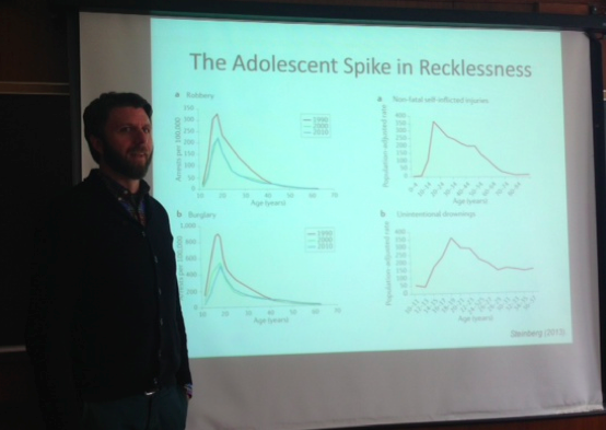
Researchers have identified the stage of adolescence as the peak time of health and performance, but at the same time, they noticed a jump in morbidity and mortality as children approached teen years, as seen in the graphs below. Specifically, adolescents show increased rates of risky behavior, alcohol use, homicide, suicide, and sexually transmitted diseases. However, as Allen tells the audience, “These are only the consequences.” In other words, what teenagers are stereotypically ridiculed for is actually the result of something else. If that’s the case, then what are the causes?

Professor Albert

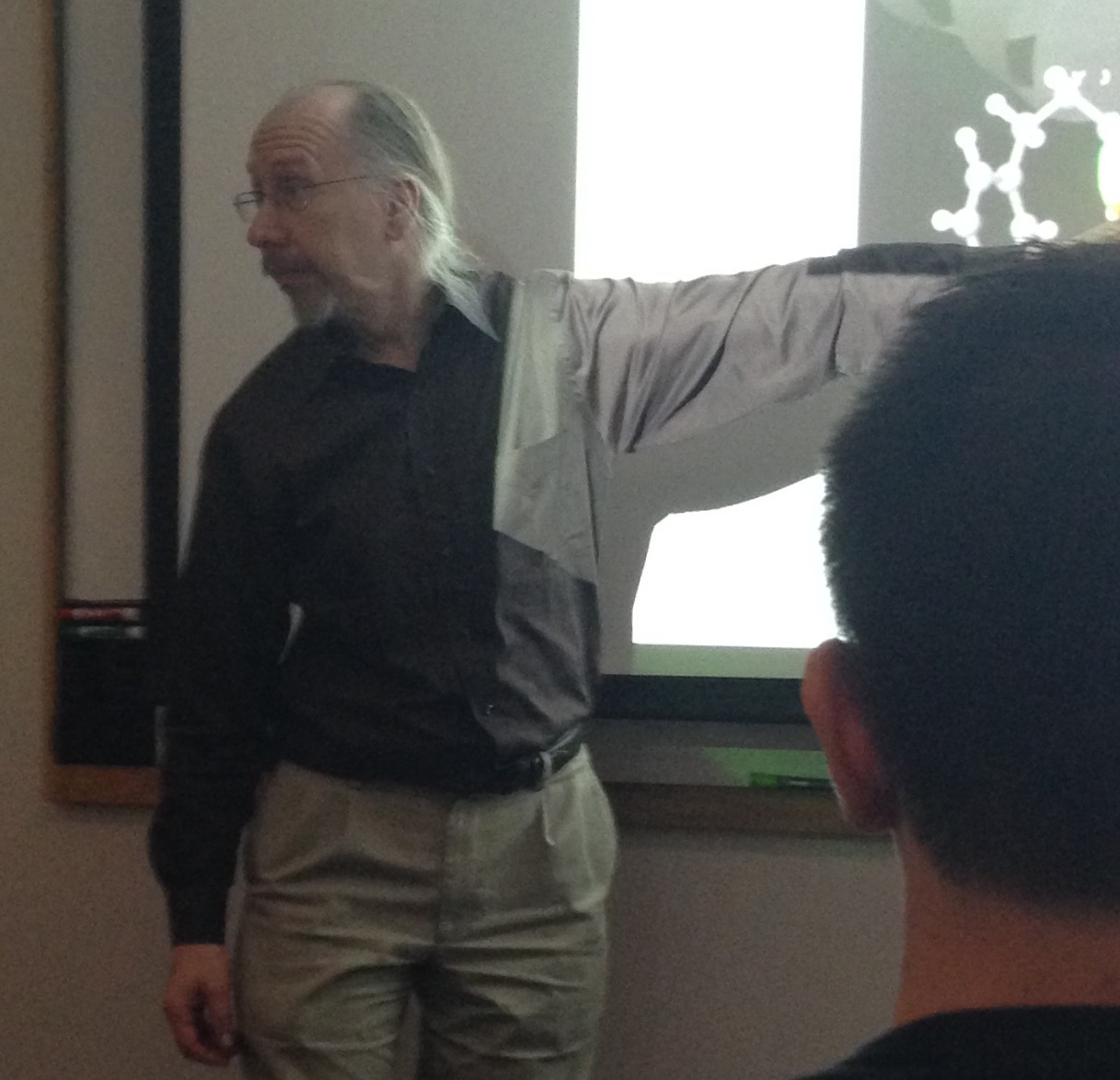
Professor Albert explaining the spike in risky behavior during teenage years.

Psychologically speaking, researchers believed that these behaviors are caused by a lack of rational decision, perhaps because adolescents “are unable to see their own vulnerability” to the outcomes, meaning that teens are apparently inept at identifying consequences to their actions. However, the studies they took demonstrated that adolescents are not only able to see their own vulnerability, but are also able to intelligently evaluate costs and effects to a certain decision. If teenagers are so smart, then what is actually causing this “risky behavior”?

One important reason Professor Albert discussed is brain activity and maturation before, during, and after adolescence. As a child ages from early to middle adolescence, fast maturation of incentive processing circuitry drives sensation seeking – in other words, the willingness to take risks in order to gain a reward increases as the child approaches teen years. In the brain, this occurs due to increased dopamine availability in reward paths as well as heightened sensitivity to monetary and social reward cues. In one interesting study, adolescents were instructed to press a button only when they saw an angry face. However, the researchers noticed that when the teens saw a happy face, they had a “particularly difficult time restraining themselves” to not press the button. Essentially, the happy-angry face study demonstrates that adolescents have more struggle in restraining themselves against impulsive actions, which often translates into responses during driving, alcohol use, and the other aforementioned risky behaviors.

Later in their life, there is a slower maturation of cognitive control circuitry that leaves a window of imbalance in the teen’s life. In the brain, this period is noted by thinning of gray matter and increasingly efficient cortical activation during inhibition tasks. In other words, older people “use smaller parts of [their] cortex to stop inappropriate responses.” Essentially, due to the way the physical and hormonal brain matures, adolescents are more prone to impulsive behavior. The take away: it’s not your fault.

Another influence on teens’ risky behavior is called the peer presence effect, commonly known as “peer pressure.” Based on arrest records, “adolescents, but not adults, [are] riskier in the presence of peers,” pointing out that the percentage of co-offenders arrested for the top eight crimes decreased with age after teenage years (Gardner & Steinberg, 2005). Perhaps the need to “establish their status,” Albert speculated, decreases with age as they gain more experience about living in the real world.

The test to evaluate the result of peer presence simulates the effect of teens taking a driving exam when in the car alone as compared to when with peers. In terms of peer influence, the study shows that adolescents ran more intersections when sitting with a peer than when sitting alone. In terms of risky behavior compared with adults, adolescents when watched by peers showed over 20% increase in risky behavior of running through intersections, as opposed to the 5-10% increase seen for adults in peer presence. Albert partially attributed this effect to the fact that “teens driving the first time could assess the probability of crashing less than adults do,” but he doesn’t have specific evidence for this claim.

While Albert claimed that the study was valid because the adolescents participating were made aware of the outcome of driving recklessly – damage to the car, injury, time it would take to get a new car, insurance problems – I believe that the study should have taken into account the fact that the teens may have subconsciously known the simulated driving test wasn’t real – viewing it as a mere video game – and so may have succumbed more into peer pressure as the true fear of dying in a crash would not have been present.

Albert ended his talk by giving one last piece of advice to people working with teens: It’s “not enough to [simply] increase their knowledge,” but rather to “understand and work towards developing impulse control and reward sensitivity.”

Below are some of the thought-provoking questions raised by audience members during the Q&A session:

Q: What would be the result of peer presence effect for same-sex peers as compared to peers of the opposite sex?

A: While Albert admitted that this particular situation has not been tested yet, he believes it may be based on personal perceptions of what the peer thinks, and what the opposite person likes.

Q: What would be the result of risky behavior for the simulated driving test if the participant’s parent(s) and peer(s) were both present in the car?

A: On one hand, the participant might drive more carefully due to the presence of an authoritative figure. However, if the participant opinionates the peer as a stronger influence, he / she would effectively neutralize the effect the parent has and drive more recklessly. Other audience members claimed that they would drive more cautiously irrespective of who was sitting with them in the car because they are aware there is another life at stake for every decision they made behind the wheel. “It would be interesting to see the [results of the study] based on this internal conflict,” the audience member who posed this question said. Overall, Albert said the results would be primarily influenced by the type of person participating – whether they would “take the small amount of money or be willing to wait for the big amount” in front of peers – that would determine whether the parent or peer becomes a stronger influence in risky behavior.

Q: How could someone going into education help keep high school students away from risky behaviors?

A: Albert noted that these behaviors are more the result of personal experience rather than something that can be quickly taught. In a school setting, teachers could introduce the practice of challenging situations to help the kids acting ‘in-the-moment’ recognize and understand “changes in their own thought patterns for decision making,” but simply giving them a “lesson in health class is not necessarily going to translate into the Friday night situation.”

If you are interested in these type of topics, Professor Albert is teaching PUBPOL 241: METHODS SOCIAL POLICY RESEARCH  this Spring (2015).

More details about the presenter can be read at: http://fds.duke.edu/db/Sanford/ccfp/william.albert

3D Storytelling of Livia’s Villa

by Anika Radiya-Dixit

blog1pic

Eva Pietroni is in charge of the 3D modeling project, “Livia’s Villa Reloaded”

Have you ever pondered upon how 3D virtual realities are constructed? Or the potential to use them to tell stories about architectural masterpieces built millenniums ago?

The 5th International Conference on Remote Sensing in Archaeology held in the Fitzpatrick Center this weekend explored new technologies such as remote sensing, 3D reconstruction, and 3D printing used by the various facets of archaeology.

In her talk about a virtual archeology project called “Livia’s Villa Reloaded,” Eva Pietroni, art historian and co-director of the Virtual Heritage Lab in Italy, explored ways to integrate 3D modeling techniques into a virtual reality to best describe the history behind the reconstruction of the villa. The project is dedicated to the Villa Ad Gallinas Albas, which Livia Drusilla took as dowry when she married Emperor Augustus in the first century B.C.

The archeological landscape and the actual site have been modeled with 3D scenes in a Virtual Reality application with guides situated around the area to explain to tourists details of the reconstruction. The model combined images from the currently observable landscape and the potential ancient landscape — derived from both hypotheses and historical references. Many parts of the model have been implemented in the Duke Immersive Virtual Environment (DiVE).

Instead of using simple 3D characters to talk to the public, the team decided to try using real actors who talked in front of a small virtual set in front of a green screen. They used a specialized cinematic camera and played around with lighting and filtering effects to obtain the best shots of the actor that would later be put into the virtual environment. Pietroni expressed her excitement at the numerous feats the team was able to accomplish especially since they were not limited by rudimentary technology such as joysticks and push buttons. As a result, the 3D scenes have been implemented by testing the “grammar of gesture” — or in other words, the interactivity of the actor performing mid-air gestures — in a virtual environment. Hearteningly, the public has been “attracted by this possibility,” encouraging the team to work on better enhancing the detailed functionalities that the virtual character is able to perform. In her video demonstration, Pietroni showed the audience the Livia’s villa being reconstructed in real time with cinematographic paradigms and virtual set practices. It was extremely fascinating to watch as the video moved smoothly over the virtual reality, giving a helicopter view of the reconstruction.


Screen Shot 2014-10-14 at 9.24.55 PM

Helicopter view of the villa

One important point that Pietroni emphasized was testing how much freedom of exploration to give to the user. Currently, the exploration mode — indicated by the red dots hovering over the bird in the bottom left corner of the virtual reality — has a predefined camera animation path, since the site is very large, to prevent the user from getting lost. At the same time, the user has the ability to interrupt this automated navigation to look around and rotate the arm to explore the area. As a result, the effect achieved is a combination of a “movie and a free exploration” that keeps the audience engaged for the most optimal length of time.

Another feature provided in the menu options allows the user to navigate to a closer view of a specific part of the villa. Here, the user can walk through different areas of the villa, through kitchens and gardens, with guides located in specific areas that activate once the user has entered the desired region. This virtual storytelling is extremely important in being able to give the user a vicarious thrill in understanding the life and perspective of people living in ancient times. For example, a guide dressed in a toga in a kitchen explained the traditions held during mealtimes, and another guide in the private gardens detailed the family’s sleeping habits. The virtual details of the private garden were spectacular and beautiful, each leaf realistically swaying in the wind, each flower so well created that one could almost feel the texture of the petals as they strolled past.


Screen Shot 2014-10-14 at 9.24.39 PM

Guide talking about a kitchen in the villa

Screen Shot 2014-10-14 at 9.25.15 PM

Strolling through the gardens

The novelty of the “Livia’s Villa Reloaded” project is especially remarkable because the team was able to incorporate new archeological findings about the villa, rather than simply creating a system from old data without ever updating the visual aspects. Sometimes, as the speaker noted, this required the team to entirely reconfigure the lighting of a certain part of the villa when new data came in, so unfortunately, the project is not yet automatic. Of course, to ultimately improve the application, the team often queries the public on specific aspects they liked and disliked, and perhaps in the future, the virtual scenes of the villa may be developed to a perfection that they will be confused with reality itself.


See details about the conference at: http://space2place.classicalstudies.duke.edu/program/dive

Joining the team: Anika Radiya-Dixit

By Anika Radiya-Dixit

ProfileAnikaOct2014

Hello! My name is Anika Radiya-Dixit, and I am currently a sophomore in the Pratt School of Engineering, pursuing a double major in Electrical Engineering and Computer Science.

I have been interested in science and technology since a young age. My love for science and its integration with constantly changing electronic devices has propelled me to seek a deeper understanding of technology — both in theory and practical applications. I am most passionate about mobile development and entrepreneurship, and enjoy learning about advancements in Big Data and Internet of Things (IoT).

Throughout my high school years, I worked on several projects at various research laboratories in Stanford University, including understanding the advantages of adipose-derived stem cells for diabetic patients in a biomedical lab, as well as re-designing the Foldscope — a paper microscope to diagnose diseases — using concepts from mechanical engineering. Most recently, I worked for a startup project in the Silicon Valley on front-end technologies with Adobe’s Creative Cloud.

My passion for science and technology didn’t remain in reality — they spread to the world of science fiction and literature. I love reading, especially novels by A. Clarke, I. Asimov, R. Bradbury, J.K. Rowling, that pull the reader into a fictional world concocted so beautifully that sometimes I want to remain in those worlds forever. I also love creating such worlds of my own, and I enjoy writing poems, short stories, and novels in my free time.

My other hobbies include playing piano, composing songs, drawing, and tennis, and I look forward to being part of the Duke Research Blog!

Page 2 of 2

Powered by WordPress & Theme by Anders Norén