Following the people and events that make up the research community at Duke

Students exploring the Innovation Co-Lab

Category: Statistics Page 2 of 5

Student Team Quantifies Housing Discrimination in Durham

Home values and race have an intimate connection in Durham, NC. From 1940 to 2020, if mean home values in Black-majority Census tracts had appreciated at rates equal to those in white Census tracts, the mean home value for homes in Black tracts would be $94,642 higher than it is.

That’s the disappointing, but perhaps not shocking, finding of a Duke Data+ team.

Because housing accounts for the biggest portion of wealth for families that fall outside of the top 10% of wealth in the U.S., this figure on home values represents a pervasive racial divide in wealth.

What started as a Data+ project in the summer of 2020 has expanded into an ongoing exploration of the connection between persistent wealth disparities across racial lines through housing. Omer Ali (Ph.D.), a postdoctoral associate with The Samuel Dubois Cook Center on Social Equity, is leading undergraduates Nicholas Datto and Pei Yi Zhuo in the continuation of their initial work. The trio presented an in-depth analysis of their work and methods Friday, February 5th during a Data Dialogue.

The team used a multitude of data to conduct their analyses, including the 1940 Census, Durham County records, CoreLogic data for home sales and NC voter registrations. Aside from the nearly $100,000 difference between mean home values between Black census tracts (defined as >50% Black homeowners from 1940-2020) and white census tracts (defined as >50% white homeowners from 1940-2020), Ali, Datto, and Zhou also found that over the last 10 years, home values have risen in Black neighborhoods as they have been losing Black residents. Within Census tracts, the team said that Black home-buyers in Durham occupy the least valuable homes.

Home Owners Loan Corporation data

Datto introduced the concept of redlining — systemic housing discrimination — and explained how this historic issue persists. From 1930-1940, the Home Owners’ Loan Corporation (HOLC) and Federal Housing Administration (FHA) designated certain neighborhoods unsuitable for mortgage lending. Neighborhoods were given a desirability grade from A to D, with D being the lowest.

In 1940, no neighborhoods with Black residents were designated as either A or B districts. That meant areas with non-white residents were considered more risky and thus less likely to receive FHA-guaranteed mortgages.

Datto explained that these historic classifications persist because the team found significant differences in the amount of accumulated home value over time by neighborhood rating. We are “seeing long-lasting effects of these redlined maps on homeowners in Durham, “ said Datto, with even “significant differences between white [and non-white] homeowners, even in C and D neighborhoods.”

Zhou explained the significance of tracking the changes of each Census tract – Black, white, or integrated – over the last 50 years. The “white-black disparity [in home value] has grown by 287%” in this time period, he said. Homes of comparable structural design and apparent worth are much less valuable for simply existing in Black neighborhoods and being owned by Black people. And the problem has only expanded.

Along with differences in home value, both Black and white neighborhoods have seen a decline in Black homeowners in the 21st Century, pointing to a larger issue at hand. Though the work done so far merely documents these trends, rather than looking for correlation that may get at the underlying causes of the home-value disparity, the trends pair closely with other regions across the country being impacted by gentrification.

“Home values are going up in Black neighborhoods, but the number of Black people in those neighborhoods is going down,” said Datto.

Ali pointed out that there are evaluation practices that include evaluation of the neighborhood “as opposed to the structural properties of the home.” When a house is being evaluated, he said a home of similar structure owned by white homeowners would never be chosen as a comparator for a Latinx- or Black-owned home. This perpetuates historical disparities, as “minority neighborhoods have been historically undervalued” it is a compounding, systemic cycle.

The team hopes to export their methodology to a much larger scale. Thus far, this has presented some back-end issues with data and computer science, however “there is nothing in the analysis itself that couldn’t be [applied to other geographical locations,” they said.

Large socioeconomic racial disparities prevail in the U.S., from gaps in unemployment to infant mortality to incarceration rates to life expectancy itself. Though it should come as no surprise that home-values represent another area of inequity, work like Ali, Datto, and Zhou are conducting needs more traction, support, and expansion.

Post by Cydney Livingston

Quantifying the effects of structural racism on health

Photo from Scholars@Duke

America is getting both older and Blacker. The proportion of non-white older adults is increasing, and by 2050 the majority of elderly people will be racial minorities. In his Langford Lecture “Who gets sick and why? How racial inequality gets under the skin” on November 10, Professor Tyson H. Brown discussed the importance of studying older minorities when learning about human health. His current project aims to address gaps in research by quantifying effects of structural racism on health. 

Health disparities result in unnecessary fatalities. Dr. Brown estimates that if we took away racial disparities in health, we could avoid 229 premature deaths per day. Health disparities also have substantial economic costs that add up to about 200 billion dollars annually. Dr. Brown explained that the effects of structural racism are so deadly because it is complex and not the same as the overt, intentional, interpersonal racism that most people think of. Thus, it is easier to ignore or to halt attempts to fix structural racism. Dr. Brown’s study posits that structural racism has five key tenets: it is multifaceted, interconnected, an institutionalized system, involves relational subordination and manifests in racial inequalities in life chances. 

A motivator for Brown’s research was that less than 1% of studies of the effects of race on health have focused on structural racism, even though macro level structural racism has deleterious effects on health of Black people. When thinking about inequalities, the traditional mode of thinking is the group that dominates (in this case, white people) receives all benefits and the subordinates (in Dr. Brown’s study, Black people) receive all of the negative effects of racism. In this mode of thinking, whites actively benefit from social inequality. However, Dr. Brown discussed another theory: that structural racism and its effects on health undermines the fabric of our entire society and has negative impacts on both whites and Blacks. It is possible for whites to be harmed by structural racism, but not to the same extent as Black people. 

Dr. Brown identified states as “important institutional actors that affect population health.” As a part of his research, he made a state level index of structural racism based off of data from 2010. The index was composed of nine indicators of structural racism, which combine to make an overall index of structural racism in states. In mapping out structural racism across the domains, the results were not what most people might expect. According to Dr. Brown’s study, structural racism tends to be highest in the midwest of the United States, rather than the south. These higher levels of structural racism were associated with worse self-rated health: one standard deviation increase in level of structural racism correlated with the equivalent of two standard deviation increases in age. In other words, a person who is affected by structural racism has similar self-rated health to people two age categories above them who do not experience negative effects of structural racism. 

As the structural racism index increases, the Black-white difference in COVID-19 related deaths also increases. Overall, Dr. Brown found that structural racism is a key driver of inequalities in COVID-19 deaths between whites and Blacks. Looking forward, Dr. Brown is interested in learning more about how contemporary forms of racism contribute to inequality—such as searching racial slurs on Google and implicit bias, both of which are high in the southern United States. 

After his discussion, colleagues raised questions about what can be done to eliminate negative effects of structural racism. Dr. Brown listed options such as rent protection, COVID-19 test sites in lower income communities and another stimulus bill. He also explained that the distribution of a COVID-19 vaccine needs to be done in an ethical manner and not exclude those who are less fortunate who really need the vaccine. We also need better data collection in general—the more we know about the effects of structural racism, the better we will be able to adapt equity practices to mitigate harm on Black communities.

By Victoria Priester

Contact Tracing Is a Call for Ingenuity and Innovation

The sudden need for contact-tracing technologies to address the Covid-19 pandemic is inspiring some miraculous human ingenuity.

Wednesday, December 16th, Rodney Jenkins, Praudman Jain, and Kartik Nayak discussed Covid-19 contact tracing and the role of new technologies in a forum organized by the Duke Mobile App Gateway team.

Jenkins is the Health Director of Durham County’s Department of Public Health, Jain is CEO and founder of Vibrent Health. And Nayak is an Assistant Professor in Duke’s Computer Science department. The panel was hosted by Leatrice Martin (M.B.A.), Senior Program Coordinator for Duke’s Mobile App Gateway with Duke’s Clinical and Translational Science Institute.

Contact tracing is critical to slowing the spread of Covid, and Jenkins says it’s not going away anytime soon. Jenkins, who only began his position with Durham County Public Health in January 2020, said Durham County’s contact tracing has been… interesting. As the virus approached Durham, “Durham County suffered a severe malware attack that really rendered platforms…useless.”

Eventually, though, the department developed its own method of tracing through trial and error. North Carolina’s Department of Health and Human Services (NC HHS), like many other health departments across the nation in March, was scrambling to adjust. NC HHS was not able to provide support for Durham’s contact tracing until July, when Jenkins identified a serious need for reinforcement due to disproportionate Covid cases amongst Latinx community members. In the meantime, Durham county received help from Duke’s Physician Assistant students and the Blue Cross Blue Shield Foundation. They expanded their team of five to 95 individuals investigating and tracing Durham County’s positive cases.

Rodney Jenkins MPH is the health director of the Durham County Public Health Department.

Jenkins proclaimed contact tracing as “sacred to public health” and a necessary element to “boxing in” Covid-19 – along with widespread testing.

Durham’s tracing tool is conducted through a HIPPA-compliant, secure online portal. Data about individuals is loaded into the system, transmitted to the contact tracing team, and then the team calls close contacts to enable a quick quarantine response. The department had to “make a huge jump very quickly,” said Jenkins. It was this speedy development and integration of new technology that has helped Durham County Public Health better manage the pandemic.

Jain, along with colleague Rachele Peterson, spoke about his company, Vibrent Health.  Vibrent, which was recently awarded a five-year grant from the National Institutes of Health’s ‘ll of Us Research Program, is focused on creating and dispersing digital and mobile platforms for public health.

Naturally, this includes a new focus on Covid. With renewed interest in and dependency on contact tracing, Jain says there is a need for different tools to help various stakeholders – from researchers to citizens to government.  He believes technology can “become the underlying infrastructure for accelerating science.”

Vibrent identified needs for a national tracing model, including the labor intensity of manual processes, disparate tools, and lack of automation.

Peterson said that as we “are all painfully aware,” the U.S. was not prepared for Covid, resulting in no national tracing solution. She offered that the success of tracing has been mostly due to efforts of “local heroes” like Jenkins. Through their five-year award, Vibrent is developing a next-generation tracing solution that they hope will better target infectious spread, optimize response time, reduce labor burden in managing spread, and increase public trust.

Along with an online digital interface, the company is partnering with Virginia Commonwealth University to work on a statistical modeling system. Peterson likened their idea to the Waze navigation app, which relies on users to add important, real-time data. They hope to offer a visualization tool to identify individuals in close contact with infected or high-risk persons and identify places or routes where users are at higher risk.

Nayak closed the panel by discussing his work on a project complementary to contact tracing, dubbed Poirot. Poirot will use aggregated private contact summary data. Because physical distancing is key to preventing Covid spread, Nayak said it is both important and difficult to measure physical interactions through contact events due to privacy concerns over sensitive data. Using Duke as the case study, Poirot will help decision makers answer questions about which buildings have the most contact events or which populations – faculty versus students – are at higher risk. The technology can also help individuals identify how many daily contacts they have or the safest time of day to visit a particular building.

Nayak said users will only be able to learn about their own contact events, as well as aggregate stats, while decision makers can only access aggregate statistics and have no ability to link data to individuals.

Users will log into a Duke server and then privately upload their data using a technology called blinded tokens. Contact events will be discovered with the help of continuously changing, random identifiers with data summation at intermittent intervals. Data processing will use multiparty computation and differential privacy to ensure information is delinked from individuals. The tool is expected for release in the spring.

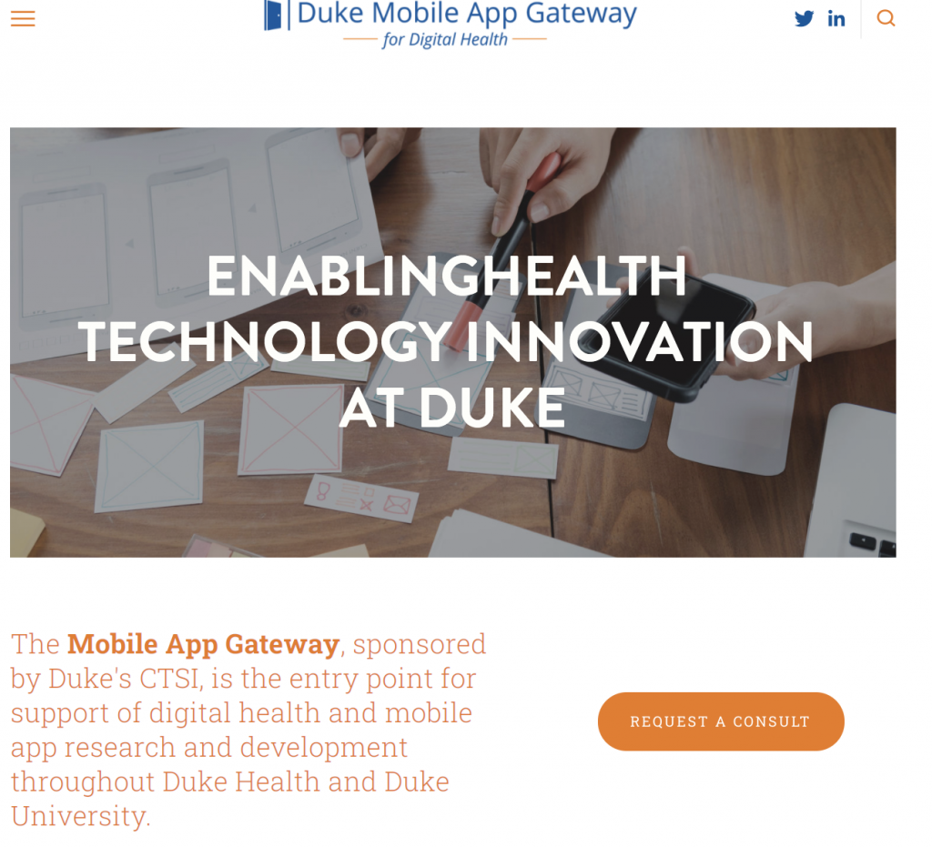
Screenshot of Duke’s Mobile App Gateway site.

Although we are just starting vaccination, the need for nationwide resources “will be ongoing,” Martin said.

We should continue to embrace contact tracing because widespread vaccination will take time, Jenkins said.

Jenkins, Jain, and Nayak are but a few who have stepped up to respond innovatively to Covid. It becomes increasingly apparent that we will continue to need individuals like them, as well as their technological tools, to ease the burden of an overworked and unprepared health system as the pandemic prevails in America.

Post by Cydney Livingston

Who Makes Duke? Visualizing 50 Years of Enrollment Data

Millions of data points. Ten weeks. Three Duke undergraduates. Two faculty facilitators. One project manager and one pretty cool data visualization website.

Meet 2020 Data+ team “On Being a Blue Devil: Visualizing the Makeup of Duke Students.”

Undergraduates Katherine Cottrell (’21), Michaela Kotarba (’22) and Alexander Burgin (’23) spent the last two and a half months looking at changes in Duke’s student body enrollment over the last 50 years. The cohort, working with project manager Anna Holleman, professor Don Taylor and university archivist Valerie Gillispie, used data from each of Duke’s colleges spanning back to 1970. Within the project, the students converted 30 years of on-paper data to machine-readable data which was a hefty task. “On Being a Blue Devil” presented their final product during a Zoom-style showcase Friday, July 31: An interactive data-visualization website. The site is live now but is still being edited as errors are found and clarifications are added.

The cover page of the launched interactive application.

The team highlighted a few findings. Over the last 20 years, there has been a massive surge in Duke enrollment of students from North Carolina. Looking more closely, it is possible that grad enrollment drives this spike due to the tendency for grad students to record North Carolina as their home-state following the first year of their program. Within the Pratt School of Engineering, the number of female students is on an upward trend. There is still a prevalent but closing gap in the distribution between male and female undergraduate engineering enrollment. A significant drop in grad school and international student enrollment in 2008 corresponds to the financial crisis of that year. The team believes there may be similar, interesting effects for 2020 enrollment due to COVID-19.

However, the majority of the presentation focused on the website and all of its handy features. The overall goal for the project was to create engaging visualizations that enable users to dive into and explore the historic data for themselves. Presentation attendees got a behind-the-scenes look at each of the site’s pages.

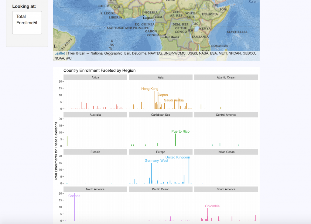
Breakdown of enrollment by region within different countries outside of the United States.

The “Domestic Map” allows website visitors to select the school, year, sex, semester, and state they wish to view. The “International Map” displays the same categories, with regional data replacing state distributions for international countries. Each query returns summary statistics on the number of students enrolled per state or region for the criteria selected.

A “Changes Over Time” tab clarifies data by keeping track of country and territory name changes, as well as changes in programs over the five decades of data. For example, Duke’s nursing program data is a bit complicated: One of its programs ended, then restarted a few years later, there are both undergraduate and graduate nursing schools, and over a decade’s worth of male nursing students are not accounted for in the data sets.

The “Enrollment by Sex” tab displays breakdown of enrollment using the Duke-established binary of male and female categories. This data is visualized in pie charts but can also be viewed as line graphs to look at trends over time and compare trends between schools.

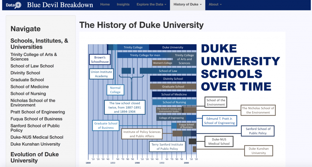
“History of Duke” offers an interactive timeline that contextualizes the origins of each of Duke’s schools and includes a short blurb on their histories. There are also timelines for the history of race and ethnicity at Duke, as well as Duke’s LGBTQ history. Currently, no data on gender identity instead of legal sex was made available for the team. This is why they sought to contextualize the data that they do have. If the project continues, Cottrell, Kotarba, and Burgin strongly suggest that gender identity data be made accessible and included on the site. Racial data is also a top priority for the group, but they simply did not have access to this resource for during the duration of their summer project.  

Timeline of Duke’s various schools since it was founded in the 1830’s.

Of course, like most good websites, there is an “About” section. Here users can meet the incredible team who put this all together, look over frequently asked questions, and even dive deeper into the data with the chance to look at original documents used in the research.

Each of the three undergrads of the “On Being a Blue Devil” team gained valuable transferable skills – as is a goal of Duke’s Data+ program. But the tool they created is likely to go far beyond their quarantined summer. Their website is a unique product that makes data fun to play with and will drive a push for more data to be collected and included. Future researchers could add many more metrics, years, and data points to the tool, causing it to grow exponentially.

Many Duke faculty members are already vying for a chance to talk with the team about their work.  

World Bank takes on big data for development

Apparently, data is the new oil.

Like oil, data might be considered a productive asset capable of generating innovation and profit. It also needs to be refined to be useful. And according to Haishan Fu, Director of the World Bank’s Development Data Group, data is, much like oil, a development issue. She was the keynote speaker for a Feb. 25 program at Duke, “Rethinking Development: Big Data for Development.”

Image
Haishan Fu, Director of the World Bank Development Data Group

While big data is… well, big, Fu explains that it has a more focused quality as well. “When you go deeper, you can see something really personal,” she says. Numbers don’t have to be quite so intimidating in their largesse and clutter: everything is integrated in some way. All of the numbers address the same questions: who, what, when, where?

That’s why the World Bank and countless other organizations and individuals across the globe have begun moving toward big data for the purpose of social and economic development studies. It helps tackle the whowhat-when-where of real and complex global issues with increased precision, greater efficiency, and a fresh perspective.

For example, the World Bank’s 2019 Tanzania Poverty Assessment integrated household survey results and geospatial data to estimate poverty within a small region of Tanzania. Despite lacking exact data for that area, using big data to make this estimation was still extremely powerful. In fact, its precision increase was equivalent to doubling the survey’s sample size.

A bit further northwest in Africa, the World Bank has also been using big data in Cote d’Ivoire to predict population density based on cellphone subscriber data.

In Cote d’Ivoire, making predictions from big data (figure on right) has actually allowed for more precision than predictions from census data (left).

In Yemen, integrated data from multiple sources is being used to determine road networks and physical accessibility of hospitals. The World Bank can estimate this kind of information without actually having any ground contact, improving both time- and money-efficiency. Studies have made it evident that less road access is linked to poverty, so they’re hoping to improve road networks as well as update population estimates and further other local developments.

And Brazil has served as a case study in “how social media can provide economic insight,” Fu explains. There, the World Bank has been using Twitter to detect early variations in labor market activities, searching for key words and hashtags in tweets and determining if users’ later employment statuses future have any sort of relationship to the content of their earlier tweets. Interestingly, the Twitter index and unemployment rates in Brazil display similar trends.

These examples are just a few of many big data initiatives the World Bank has been working toward. And though they have proven valuable for lower-income countries across the world, the lack of data in certain areas still poses a huge problem. The data deficit has been contributing to global inequalities, with higher-income countries being able to provide and have access to more data and thus also new improvement technologies. Ending poverty requires eradicating data deprivation, Fu says.

Image result for world bank twin goals
The World Bank’s twin goals: (1) end poverty, (2) promoted shared prosperity.
Image from the World Bank

Eradicating data deprivation is a collaborative effort between the public and private sectors, which is also an issue of its own. On the one hand, there’s a major under-investment in public sector data. On the other, today’s winner-take-most economics and the dominance of select superstar firms have led some private companies to avoid sharing data and favored only those companies able to produce the biggest of datasets.

Fu says working toward data partnerships is a learning process for everyone involved; it’s still a work in progress and probably will be for a while. The potential of big data is already there—it’s just waiting to be totally harnessed. “We will collectively have this platform to increase efficiency, promote responsible use, and come up with sustainable initiatives,” Fu says of the future.

In other words, the World Bank is just getting started.

by Irene Park

Digging Into Durham’s Eviction Problem

This is what 20 years of evictions looks like. It’s an animated heat map of Durham, the streets overlaid with undulating blobs of red and orange and yellow, like a grease stain.

Duke students in the summer research program Data+ have created a time-lapse map of the more than 200,000 evictions filed in Durham County since 2000.

Dark red areas represent eviction hotspots. These neighborhoods are where families cook their favorite meals, where children do their homework, where people celebrate holidays. They’re also where many people live one crisis away from losing their neighbors, or becoming homeless themselves.

Duke junior Samantha Miezio points to a single census tract along NC 55 where, in the wake of an apartment building sale, more than 100 households received an eviction notice in that spot in one month alone. It “just speaks to the severity of the issue,” Miezio said.

Miezio was part of a team that spent 10 weeks this summer mapping and analyzing evictions data from the Durham County Sheriff’s Office, thanks to an effort by DataWorks NC to compile such data and make it more accessible.

The findings are stark.

Every hour in Durham, at least one renter is threatened with losing their home. About 1,000 eviction cases were filed a month against tenants between 2010 and 2017. That’s roughly one for every 280 residents in Durham, where evictions per capita is one of the highest in the state and double the national average.

The data tell us that while Durham’s evictions crisis has actually improved from where it was a few years ago, stubborn hotspots persist, said team member Ellis Ackerman, a math major at North Carolina State University.

When the students looked at the data month by month, a few things stood out. For one, winter evictions are common. While some countries such as France and Austria ban winter evictions to keep from pushing people onto the street in the cold, in Durham, “January is the worst month by far,” said team member Rodrigo Araujo, a junior majoring in computer science. “In the winter months utility bills are higher; they’re struggling to pay for that.”

Rodrigo Araujo (Computer Science, 2021) talks about the Durham evictions project.

The team also investigated the relationship between evictions and rents from 2012 to 2014 to see how much they move in tandem with each other. Their initial results using two years’ worth of rent data showed that when rents went up, evictions weren’t too far behind.

“Rents increased, and then two months later, evictions increased,” Miezio said.

But the impacts of rising rents weren’t felt evenly. Neighborhoods with more residents of color were significantly affected while renters in white neighborhoods were not. “This crisis is disproportionately affecting those who are already at a disadvantage from historical inequalities,” Miezio said.

A person can be evicted for a number of reasons, but most evictions happen because people get behind on their rent. The standard guideline is no more than 30% of your monthly income before taxes should go to housing and keeping the lights on.

But in Durham, where 47% of households rent rather than own a home, only half of renters meet that goal. As of 2019 an estimated 28,917 households are living in rentals they can’t afford.

The reason is incomes haven’t kept pace with rents, especially for low-wage workers such as waiters, cooks, or home health aides.

Durham’s median rents rose from $798 in 2010 to $925 in 2016. That’s out of reach for many area families. A minimum wage worker in Durham earning $7.25/hour would need to work a staggering 112 hours a week — the equivalent of nearly three full-time jobs — to afford a modest two-bedroom unit in 2019 at fair market rent, according to a report by the National Low Income Housing Coalition.

Spending a sizable chunk of your income on housing means having less left over for food, child care, transportation, savings, and other basic necessities. One unexpected expense or emergency — maybe the kid gets sick or the car needs repairs, or there’s a cut back on hours at work — can mean tenants have a harder time making the rent.

“Evictions are traumatic life experiences for the tenants,” and can have ripple effects for years, Miezio said.

Tenants may have only a few days to pay what’s due or find a new place and move out. The Sheriff may come with movers and pile a person’s belonging on the curb, or move them to a storage facility at the tenant’s expense.

A forced move can also mean children must change schools in the middle of the school year.

Benefits may go to the wrong address. Families are uprooted from their social support networks of friends and neighbors.

Not every case filed ends with the tenant actually getting forced out, “but those filings can still potentially inhibit their ability to find future housing,” Miezio said. Not to mention the cost and hassle of appearing in court and paying fines and court fees.

Multiple groups are working to help Durham residents avoid eviction and stay in their homes. In a partnership between Duke Law and Legal Aid of North Carolina, the Civil Justice Clinic’s 2-year-old Eviction Diversion Program provides free legal assistance to people who are facing eviction.

“The majority of people who have an eviction filed against them don’t have access to an attorney,” Miezio said.

In a cost-benefit analysis, the team’s models suggest that “with a pretty small increase in funding to reduce evictions, on the order of $100,000 to $150,000, Durham could be saving millions of dollars” in the form of reduced shelter costs, hospital costs, plus savings on mental health services other social services, Ackerman said.

Ellis Ackerman, a senior math major from NC State University, talks about the Durham evictions research project.

Moving forward, they’re launching a website in order to share their findings. “I’ve learned HTML and CSS this summer,” said Miezio, who is pursuing an individualized degree program in urban studies. “That’s one of the things I love about Data+. I’m getting paid to learn.”

Miezio plans to continue the project this fall through an independent study course focused on policy solutions to evictions, such as universal right to counsel.

“Housing access and stability are important to Durham,” said Duke’s vice president for Durham affairs Stelfanie Williams. “Applied research projects such as this, reflecting a partnership between the university and community, are opportunities for students to ‘learn by doing’ and to collaborate with community leaders on problem-solving.”

Data+ 2019 is sponsored by Bass Connections, the Rhodes Information Initiative at Duke, the Social Science Research Institute, the Duke Energy Initiative, and the departments of Mathematics and Statistical Science.

Other Duke sponsors include DTECH, Science, Law, and Policy Lab, Duke Health, Duke University Libraries, Sanford School of Public Policy, Nicholas School of the Environment, Duke Global Health Institute, Development and Alumni Affairs, the Duke River Center, Representing Migrations Humanities Lab, Energy Initiative, Franklin Humanities Institute, Duke Forge, the K-Lab, Duke Clinical Research, Office for Information Technology and the Office of the Provost, as well as the departments of Electrical & Computer Engineering, Computer Science, Biomedical Engineering, Biostatistics & Bioinformatics and Biology.

Government funding comes from the National Science Foundation. Outside funding comes from Exxon Mobil, the International Institute for Sustainable Development (IISD), Global Financial Markets Center, and Tether Energy.

Writing by Robin Smith; Video by Wil Weldon
Post by Robin Smith Video by Wil Weldon

Science in haiku: // Interdisciplinary // Student poetry

On Friday, August 2, ten weeks of research by Data+ and Code+ students wrapped up with a poster session in Gross Hall where they flaunted their newly created posters, websites and apps. But they weren’t expecting to flaunt their poetry skills, too! 

Data+ is one of the Rhodes Information Initiative programs at Duke. This summer, 83 students addressed 27 projects addressing issues in health, public policy, environment and energy, history, culture, and more. The Duke Research Blog thought we ought to test these interdisciplinary students’ mettle with a challenge: Transforming research into haiku.

Which haiku is your
favorite? See all of their
finished work below!

Eric Zhang (group members Xiaoqiao Xing and Micalyn Struble not pictured) in “Neuroscience in the Courtroom”
Maria Henriquez and Jake Sumner on “Using Machine Learning to Predict Lower Extremity Musculoskeletal Injury Risk for Student Athletes”
Samantha Miezio, Ellis Ackerman, and Rodrigo Aruajo in “Durham Evictions: A snapshot of costs, locations, and impacts”
Nikhil Kaul, Elise Xia, and Mikaela Johnson on “Invisible Adaptations”
Karen Jin, Katherine Cottrell, and Vincent Wang in “Data-driven approaches to illuminate the responses of lakes to multiple stressors”.

By Vanessa Moss

Kicking Off a Summer of Research With Data+

If the May 28 kickoff meeting was any indication, it’s going to be a busy summer for the more than 80 students participating in Duke’s summer research program, Data+.

Offered through the Rhodes Information Initiative at Duke  (iiD), Data+ is a 10-week summer program with a focus on data-driven research. Participants come from varied backgrounds in terms of majors and experience. Project themes range  from health, public policy, energy and environment, and interdisciplinary inquiry.

“It’s like a language immersion camp, but for data science,” said Ariel Dawn, Rhodes iiD Events & Communication Specialist. “The kids are going to have to learn some of those [programming] languages like Java or Python to have their projects completed,” Dawn said.

Dawn, who previously worked for the Office of the Vice Provost for Research, arrived during the program’s humble beginnings in 2015. Data+ began in 2014 as a small summer project in Duke’s math department funded by a grant from the National Science Foundation. The following year the program grew to 40 students, and it has grown every year since.

Today, the program also collaborates with the Code+ and CS+ summer programs, with  more than 100 students participating. Sponsors have grown to include major corporations such as Exxonmobil, which will fund two Data+ projects on oil research within the Gulf of Mexico and the United Kingdom in 2019.

“It’s different than an internship, because an internship you’re kind of told what to do,” said Kathy Peterson, Rhodes iiD Business Manager. “This is where the students have to work through different things and make discoveries along the way,” Peterson said.

From late May to July, undergraduates work on a research project under the supervision of a graduate student or faculty advisor. This year, Data+ chose more than 80 eager students out of a pool of over 350 applicants. There are 27 projects being featured in the program.

Over the summer, students are given a crash course in data science, how to conduct their study and present their work in front of peers. Data+ prioritizes collaboration as students are split into teams while working in a communal environment.

“Data is collected on you every day in so many different ways, sometimes we can do a lot of interesting things with that,” Dawn said.  “You can collect all this information that’s really granular and relates to you as an individual, but in a large group it shows trends and what the big picture is.”

Data+ students also delve into real world issues. Since 2013, Duke professor Jonathan Mattingly has led a student-run investigation on gerrymandering in political redistricting plans through Data+ and Bass Connections. Their analysis became part of a 205-page Supreme Court ruling.

The program has also made strides to connect with the Durham community. In collaboration with local company DataWorks NC, students will examine Durham’s eviction data to help identify policy changes that could help residents stay in their homes.

“It [Data+] gives students an edge when they go look for a job,” Dawn said. “We hear from so many students who’ve gotten jobs, and [at] some point during their interview employers said, ‘Please tell us about your Data+ experience.’”

From finding better sustainable energy to examining story adaptations within books and films, the projects cover many topics.

A project entitled “Invisible Adaptations: From Hamlet to the Avengers,” blends algorithms with storytelling. Led by UNC-Chapel Hill grad student Grant Class, students will make comparisons between Shakespeare’s work and today’s “Avengers” franchise.

“It’s a much different vibe,” said computer science major Katherine Cottrell. “I feel during the school year there’s a lot of pressure and now we’re focusing on productivity which feels really good.”

Cottrell and her group are examining the responses to lakes affected by multiple stressors.

Data+ concludes with a final poster session on Friday, August 2, from 2 p.m. to 4 p.m. in the Gross Hall Energy Hub. Everyone in the Duke Community and beyond is invited to attend. Students will present their findings along with sister programs Code+ and the summer Computer Science Program.

Writing by Deja Finch (left)
Art by Maya O’Neal (right)

Math on the Basketball Court

Boston Celtics data analyst David Sparks, Ph.D, really knew his audience Thursday, November 8, when he gave a presentation centered around the two most important themes at Duke: basketball and academics. He gave the crowd hope that you don’t have to be a Marvin Bagley III to make a career out of basketball — in fact, you don’t have to be an athlete at all; you can be a mathematician.

David Sparks (photo from Duke Political Science)

Sparks loves basketball, and he spends every day watching games and practices for his job. What career fits this description, you might ask? After graduating from Duke in 2012 with a Ph.D. in Political Science, Sparks went to work for the Boston Celtics, as the Director of Basketball Analytics. His job entails analyzing basketball data and building statistical models to ensure that the team will win.

The most important statistic when looking at basketball data is offensive / defensive efficiency, Sparks told the audience gathered for the “Data Dialogue” series hosted by the Information Initiative at Duke. Offensive efficiency translates to the number of points per possession while defensive efficiency measures how poorly the team forced the other offense to perform. These are measured with four factors: effective field goal percentage (shots made/ shots taken), turnover rate, successful rebound percentage, and foul rate. By looking at these four factors for both offensive and defensive efficiency, Sparks can figure out which of these areas are lacking, and share with the coach where there is room for improvement. “We all agree that we want to win, and the way you win is through efficiency,” Sparks said.

Since there is not a lot of room for improvement in the short windows between games during the regular season, a large component of Sparks’ job involves informing the draft and how the team should run practices during preseason.

David Sparks wins over his audience by showing Duke basketball clips to illustrate a point. Sparks spoke as part of the “Data Dialogue” series hosted by the Information Initiative at Duke.

Data collection these days is done by computer software. Synergy Sports Technology, the dominant data provider in professional basketball, has installed cameras in all 29 NBA arenas. These cameras are constantly watching and coding plays during games, tracking the locations of each player and the movements of the ball. They can analyze the amount of times the ball was touched and determine how long it was possessed each time, or recognize screens and calculate the height at which rebounds are grabbed. This software has revolutionized basketball analytics, because the implication of computer coding is that data scientists like Sparks can go back and look for new things later.

The room leaned in eagerly as Sparks finished his presentation, intrigued by the profession that is interdisciplinary at its core — an unlikely combination of sports and applied math. If math explains basketball, maybe we can all find a way to connect our random passions in the professional sphere.

Coding: A Piece of Cake

Image result for cake

Imagine a cake, your favorite cake. Has your interest been piqued?

“Start with Cake” has proved an effective teaching strategy for Mine Cetinkaya-Rundel in her introduction-level statistics classes. In her talk “Teaching Computing via Visualization,” she lays out her classroom approaches to helping students maintain an interest in coding despite its difficulty. Just like a cooking class, a taste of the final product can motivate students to master the process. Cetinkaya-Rundel, therefore, believes that instead of having students begin with the flour and sugar and milk, they should dive right into the sweet frosting. While bringing cake to the first day of class has a great success rate for increasing a class’s attention span (they’ll sugar crash in their next classes, no worries), what this statistics professor actually refers to is showing the final visualizations. By giving students large amounts of pre-written code and only one or two steps to complete during the first few class periods, they can immediately recognize coding’s potential. The possibilities become exciting and capture their attention so that fewer students attempt to vanish with the magic of drop/add period. For the student unsure about coding, immediately writing their own code can seem overwhelming and steal the joy of creating.

Example of a visualization Cetinkaya-Rundel uses in her classes

To accommodate students with less background in coding, Cetinkaya-Rundel believes that skipping the baby steps proves a better approach than slowing the pace. By jumping straight into larger projects, students can spend more time wrestling their code and discovering the best strategies rather than memorizing the definition of a histogram. The idea is to give the students everything on day one, and then slowly remove the pre-written coding until they are writing on their own. The traditional classroom approach involves teaching students line-by-line until they have enough to create the desired visualizations. While Cetinkaya-Rundel admits that her style may not suit every individual and creating the assignments does require more time, she stands by her eat-dessert-first perspective on teaching. Another way she helps students maintain their original curiosity is by cherishing day one through pre-installed packages which allow students to start playing with visualizations and altering code right away.

Not only does Cetinkaya-Rundel give mouth-watering cakes as the end results for her students but she also sometimes shows them burnt and crumbling desserts. “People like to critique,” she explains as she lays out how to motivate students to begin writing original code. When she gives her students a sloppy graph and tells them to fix it, they are more likely to find creative solutions and explore how to make the graph most appealing to them. As the scaffolding falls away and students begin diverging from the style guides, Cetinkaya-Rundel has found that they have a greater understanding of and passion for coding. A spoonful of sugar really does help the medicine go down.  

    Post by Lydia Goff

Page 2 of 5

Powered by WordPress & Theme by Anders Norén